













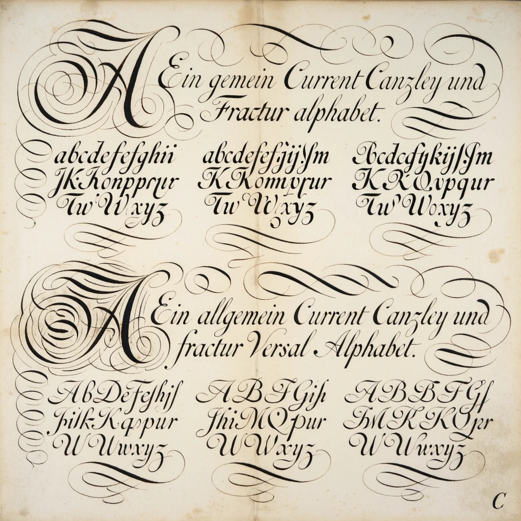
An antique sheet of cream-colored parchment displays elaborate calligraphic examples of German scripts, featuring large ornamental initials and rows of alphabets surrounded by intricate flourishes. The page is divided into two horizontal sections, each beginning with a header and a large, decorative capital letter on the left side. The top section contains the text "Ein gemein Current Canzley und Fractur alphabet." written in a graceful cursive. To its left, a large capital "A" is formed from multiple swirling loops and thin, elegant pen strokes. Below the header are three distinct blocks of lowercase alphabets, showcasing variations of Current, Kanzlei, and Fraktur scripts, characterized by varying weights of lines and sharp, rhythmic strokes. The bottom section is introduced by the heading "Ein allgemein Current Canzley und fractur Versal Alphabet." and features another large, highly stylized capital "A" with even more dense and complex spiral flourishes. Following this heading are three blocks of uppercase letters in corresponding styles, ranging from a flowing, slanted script to a more rigid, decorative gothic form. The deep black ink stands out against the aged paper, which shows subtle signs of foxing, light brown staining, and a vertical crease running down the center. Numerous decorative swirls and hair-thin lines fill the negative space around the text blocks, creating a sense of movement across the page. In the bottom right corner, a small, simple letter "C" is printed. The composition is a flat, frontal view with even lighting that emphasizes the precision of the penmanship and the texture of the weathered paper, typical of an 18th-century calligraphic manual.
Beautiful AI-generated image on Krea. An antique sheet of cream-colored parchment displays elaborate calligraphic examples of German scripts, featuring large ornamental initials and rows of alphabets surrounded by intricate flourishes. The page is divided into two horizontal sections, each beginning with a header and a large, decorative capital letter on the left side. The top section contains the text "Ein gemein Current Canzley und Fractur alphabet." written in a graceful cursive. To its left, a large capital "A" is formed from multiple swirling loops and thin, elegant pen strokes. Below the header are three distinct blocks of lowercase alphabets, showcasing variations of Current, Kanzlei, and Fraktur scripts, characterized by varying weights of lines and sharp, rhythmic strokes. The bottom section is introduced by the heading "Ein allgemein Current Canzley und fractur Versal Alphabet." and features another large, highly stylized capital "A" with even more dense and complex spiral flourishes. Following this heading are three blocks of uppercase letters in corresponding styles, ranging from a flowing, slanted script to a more rigid, decorative gothic form. The deep black ink stands out against the aged paper, which shows subtle signs of foxing, light brown staining, and a vertical crease running down the center. Numerous decorative swirls and hair-thin lines fill the negative space around the text blocks, creating a sense of movement across the page. In the bottom right corner, a small, simple letter "C" is printed. The composition is a flat, frontal view with even lighting that emphasizes the precision of the penmanship and the texture of the weathered paper, typical of an 18th-century calligraphic manual.
- Type
- Image
- Resolution
- 1024 x 1024
- Published
- April 9, 2026
Prompt
Copy