









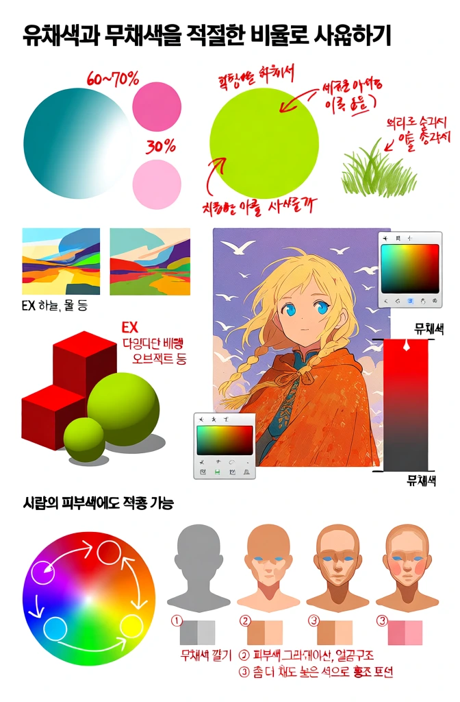
An educational infographic illustrates the use of chromatic and achromatic colors in digital painting through various diagrams and a central character illustration. At the top, a title in large, black Korean text reads "유채색과 무채색을 적절한 비율로 사용하기". Below this, several circular color swatches demonstrate gradients; one circle transitions from teal to white with accompanying pink circles and text "60~70%" and "30%", while another is a lime green circle with handwritten red arrows and text explaining color rotation. To the right of the green circle, a small clump of green grass is drawn with a note about using bright colors for outlines. Below the teal circle, two abstract landscape examples are shown with the label "EX 하늘, 물 등". To the right, an anime-style illustration of a girl with blonde hair and blue eyes, wearing an orange, textured cloak, is set against a background of white birds and purple sky. She is framed by several smaller diagrams, including a color picker interface and a chart showing a vertical gradient from bright red to dark grey labeled "유채색" and "무채색". To the left of the character, a group of 3D-style cubes and spheres in red and green are displayed with the label "EX 다양한 배경 오브젝트 등". The bottom section, titled "사람의 피부색에도 적용 가능", features a color wheel with white arrows and circles indicating color shifts, alongside four simplified human head busts demonstrating a progression of skin tone shading. The first bust is grey, the second adds a base skin tone, the third includes facial structure shading, and the fourth adds a pinkish flush. Small color swatches in grey and orange tones are placed below the busts, and numbered red text explains each step: "① 무채색 깔기", "② 피부색 그라데이션, 얼굴구조", and "③ 좀 더 채도 높은 색으로 홍조 표현". The overall layout is organized against a clean white background with a mix of handwritten red and black Korean text providing instructional guidance.
Beautiful AI-generated image on Krea. An educational infographic illustrates the use of chromatic and achromatic colors in digital painting through various diagrams and a central character illustration. At the top, a title in large, black Korean text reads "유채색과 무채색을 적절한 비율로 사용하기". Below this, several circular color swatches demonstrate gradients; one circle transitions from teal to white with accompanying pink circles and text "60~70%" and "30%", while another is a lime green circle with handwritten red arrows and text explaining color rotation. To the right of the green circle, a small clump of green grass is drawn with a note about using bright colors for outlines. Below the teal circle, two abstract landscape examples are shown with the label "EX 하늘, 물 등". To the right, an anime-style illustration of a girl with blonde hair and blue eyes, wearing an orange, textured cloak, is set against a background of white birds and purple sky. She is framed by several smaller diagrams, including a color picker interface and a chart showing a vertical gradient from bright red to dark grey labeled "유채색" and "무채색". To the left of the character, a group of 3D-style cubes and spheres in red and green are displayed with the label "EX 다양한 배경 오브젝트 등". The bottom section, titled "사람의 피부색에도 적용 가능", features a color wheel with white arrows and circles indicating color shifts, alongside four simplified human head busts demonstrating a progression of skin tone shading. The first bust is grey, the second adds a base skin tone, the third includes facial structure shading, and the fourth adds a pinkish flush. Small color swatches in grey and orange tones are placed below the busts, and numbered red text explains each step: "① 무채색 깔기", "② 피부색 그라데이션, 얼굴구조", and "③ 좀 더 채도 높은 색으로 홍조 표현". The overall layout is organized against a clean white background with a mix of handwritten red and black Korean text providing instructional guidance.
- Type
- Image
- Resolution
- 672 x 1024
- Published
- April 9, 2026
Prompt
Copy