Blog
Krea 2 Technical Report
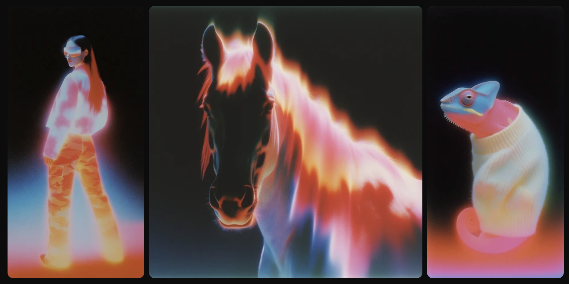
Technical report for Krea 2 (K2), our open-weights text-to-image foundation models for creative exploration. Release includes K2 Raw and K2 Turbo open weights.
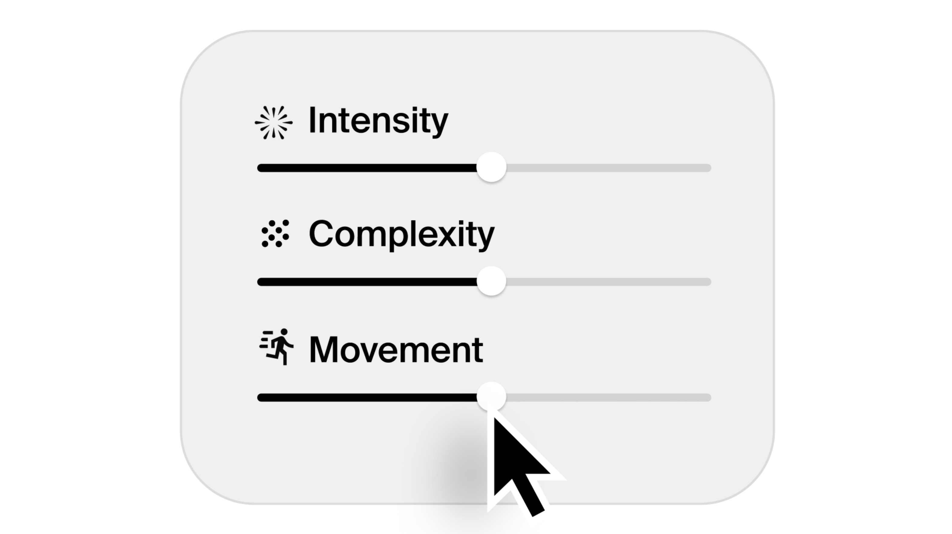
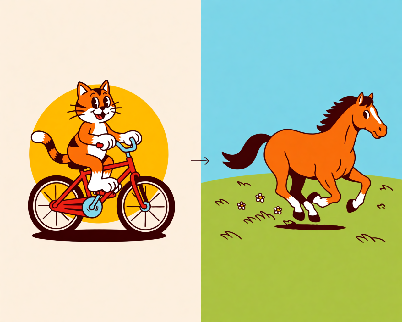
Introducing Generative Sliders
Krea 2 now includes Generative Sliders for shaping intensity, complexity, movement, and prompt creativity while generating images.
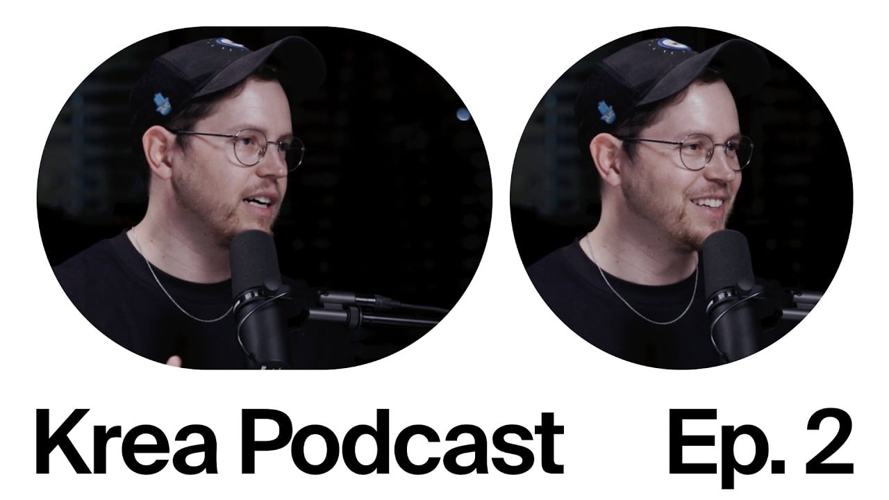
AI in architecture studios – Krea Podcast with Nitsan Bartov
Krea Podcast episode two with Nitsan Bartov on AI in architecture studios, visual communication, video, and design culture.

Introducing Krea 2 Turbo
Generate high-quality images in just 2 seconds with a faster Krea 2 experience, compatible with style references, moodboards, and LoRAs.
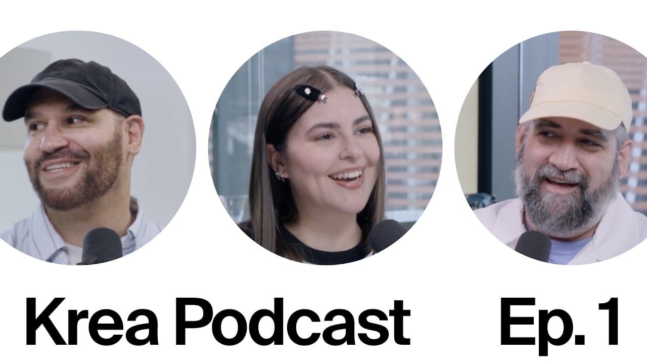
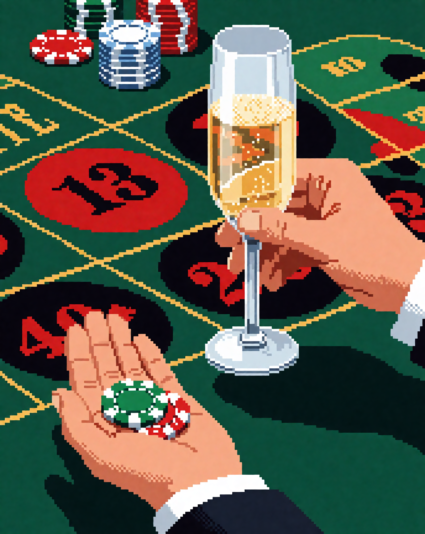
"Reality is so boring" – Krea Podcast with Boldtron, Serialcut, and Remembering_orion
A short Krea podcast interview with Boldtron on AI, creative confidence, surreal image-making and creating the things you wish existed.
We are partnering with Henning Larsen
Krea partners with Henning Larsen Architects to integrate AI-powered design tools into their architectural workflow.
LoRAs for Krea 2 Are Coming to Train Tool
A preview of Krea 2 LoRA training in Krea Train, where creators can train styles, characters, and objects, then keep them private or share them publicly.
Moodboard Gallery in Krea 2 + Preview of Random and Auto
Moodboard Gallery now includes thousands of moodboards in Krea 2, with new Random and Auto moodboard selection modes in preview.
Krea 2 API
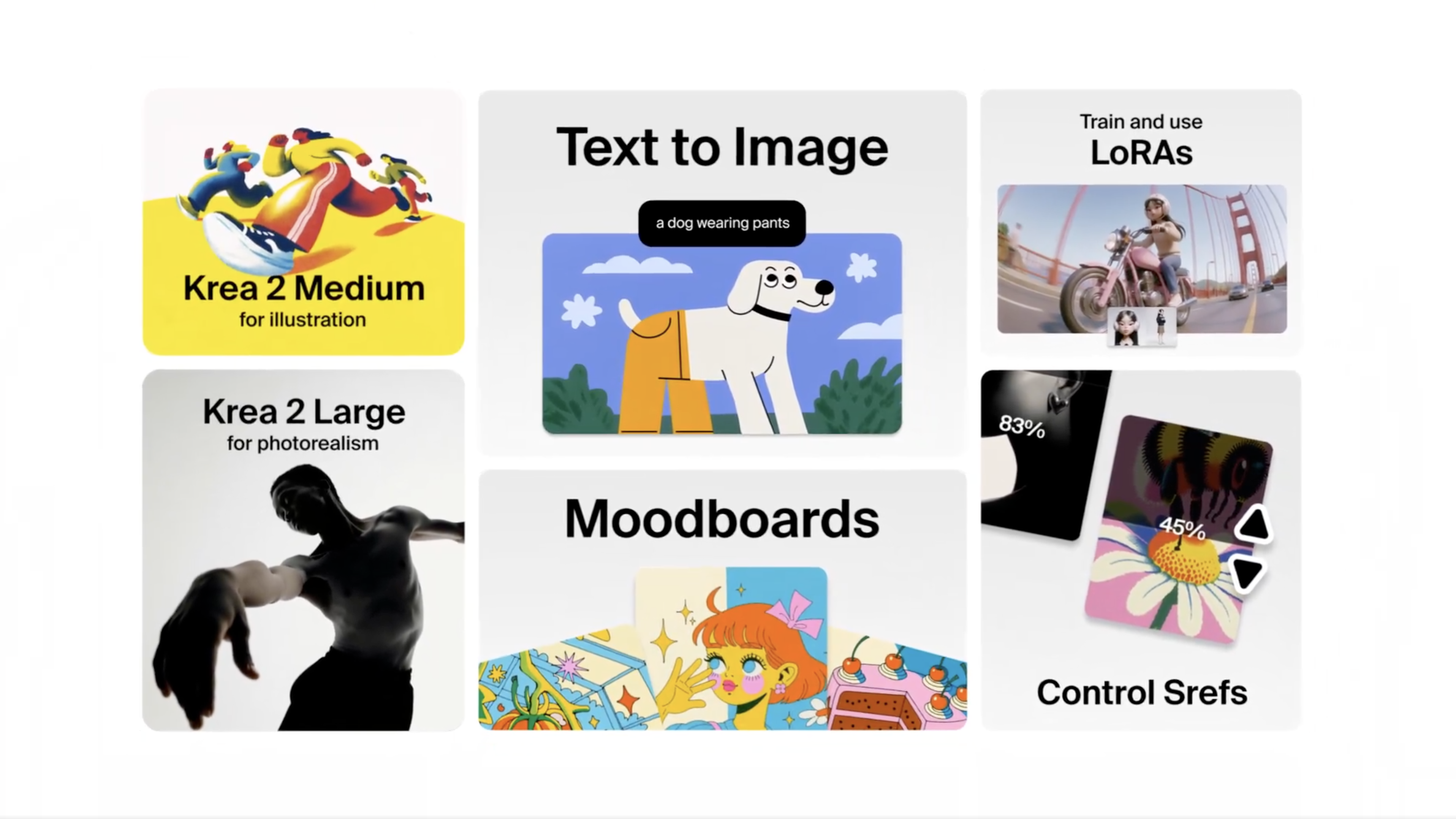
Krea 2 is our first foundation image model, trained completely from scratch to give users full control over the look, feel, and creative direction.
Krea 2 deep dive: exploration, style references, and moodboards
Krea 2 is our first foundation model, built completely from scratch and focused on aesthetics and creative control. When you make an image with AI there are
Krea 2 LoRA training is now available
Train custom Krea 2 LoRAs — styles, characters, or objects — and use them in the Image tool. In beta for Max and Business subscribers.
Mood boards in Krea 2
Mood boards are one of the new tools in Krea 2 — more than four references, deeper style + concept capture, and presets for fast exploration.
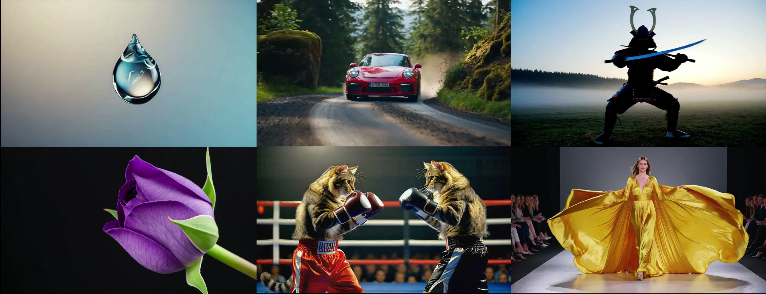
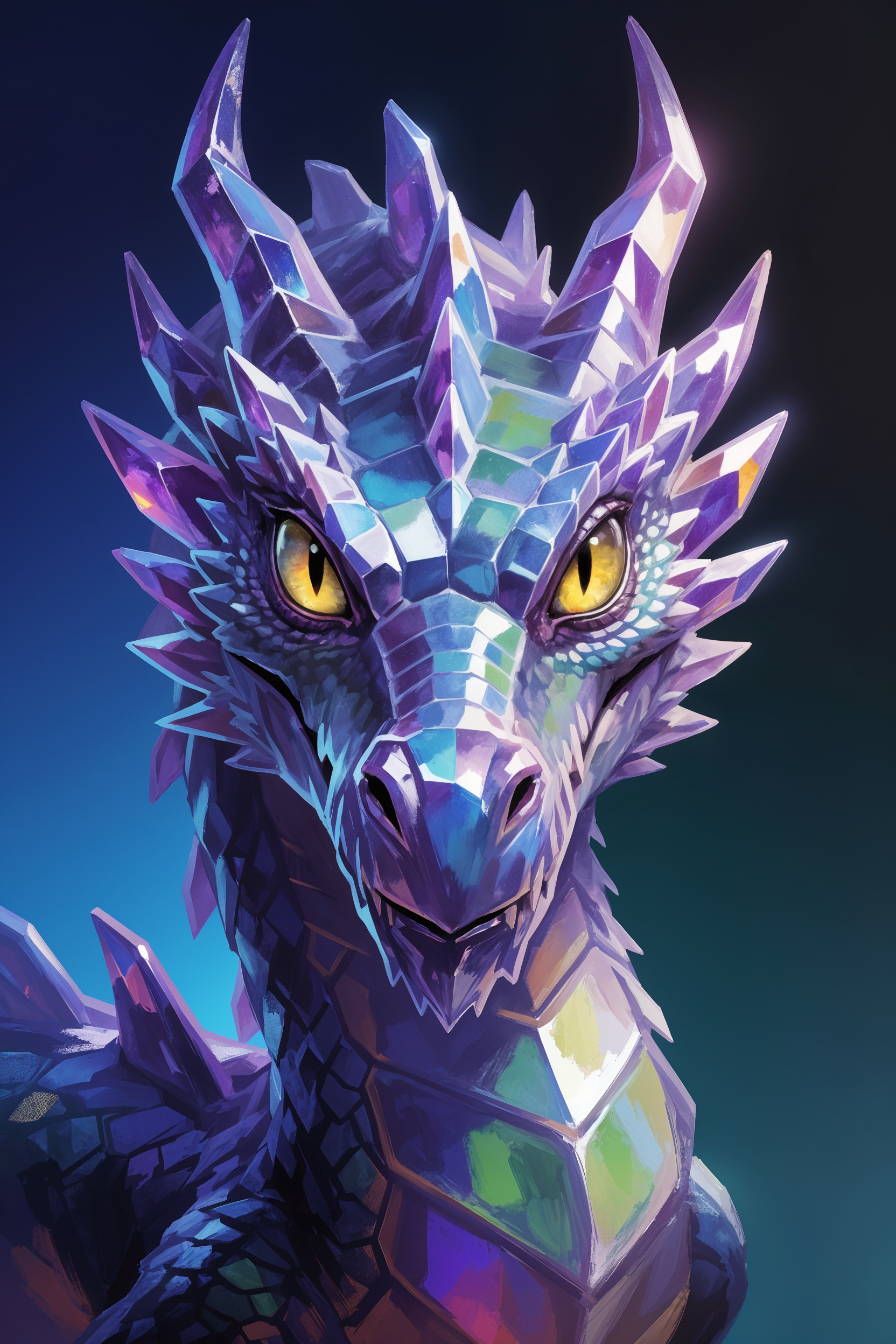
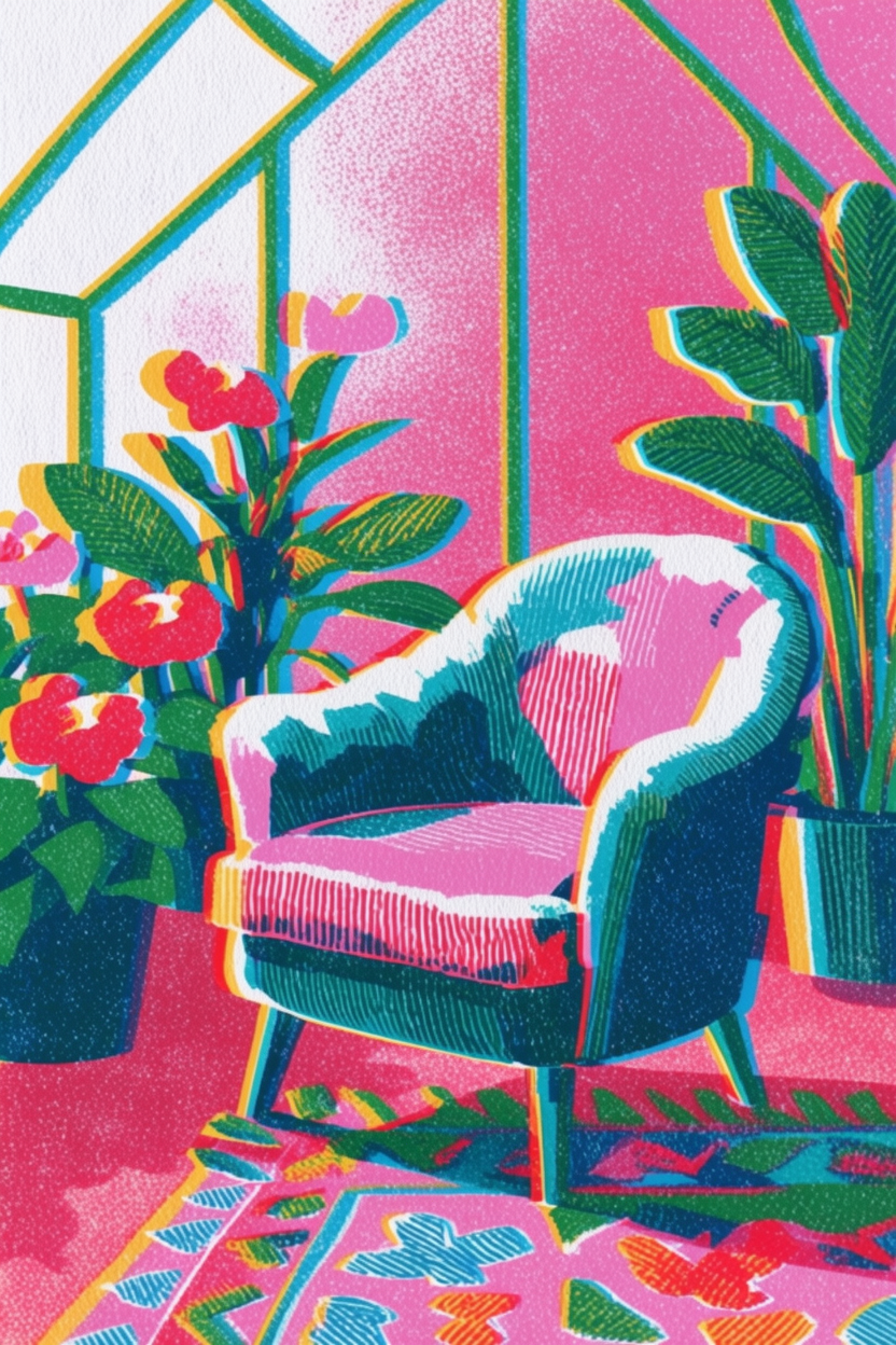
Introducing Krea 2
Krea 2 is our first foundation image model built completely from scratch, focused on aesthetics, style transfer, and creative control.
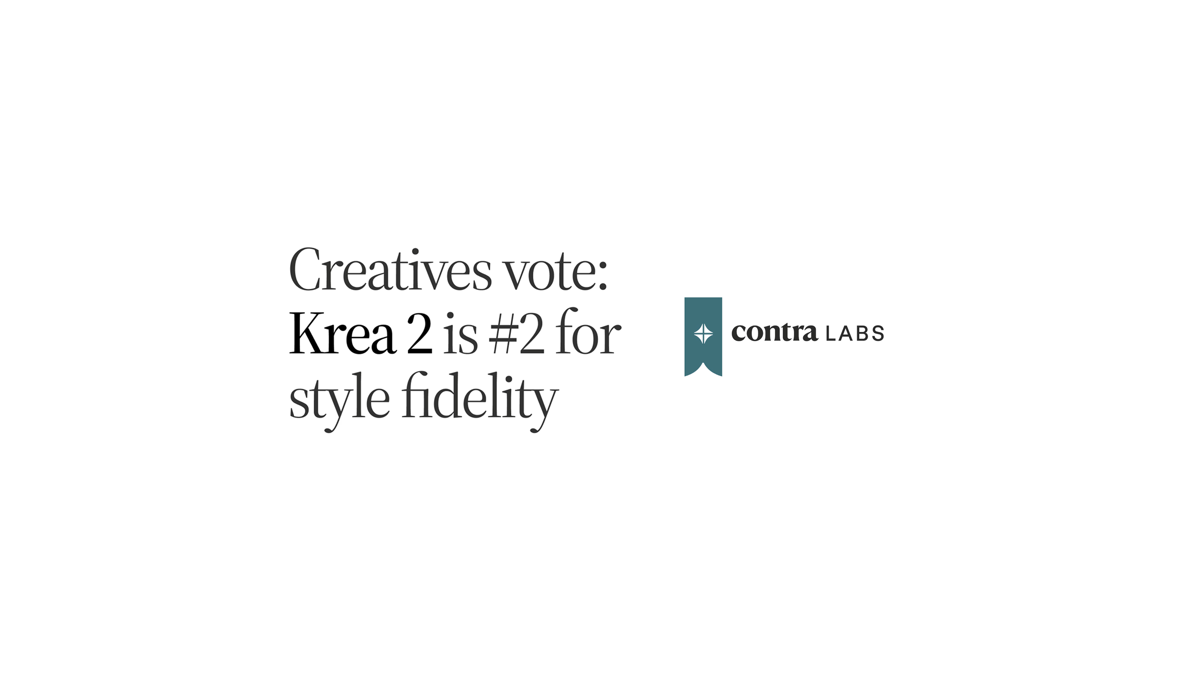
Krea 2 Large shines in style fidelity
Contra Labs found Krea 2 Large within 0.14 points of GPT Image 2 on Style Fidelity in a four-model style-transfer benchmark.
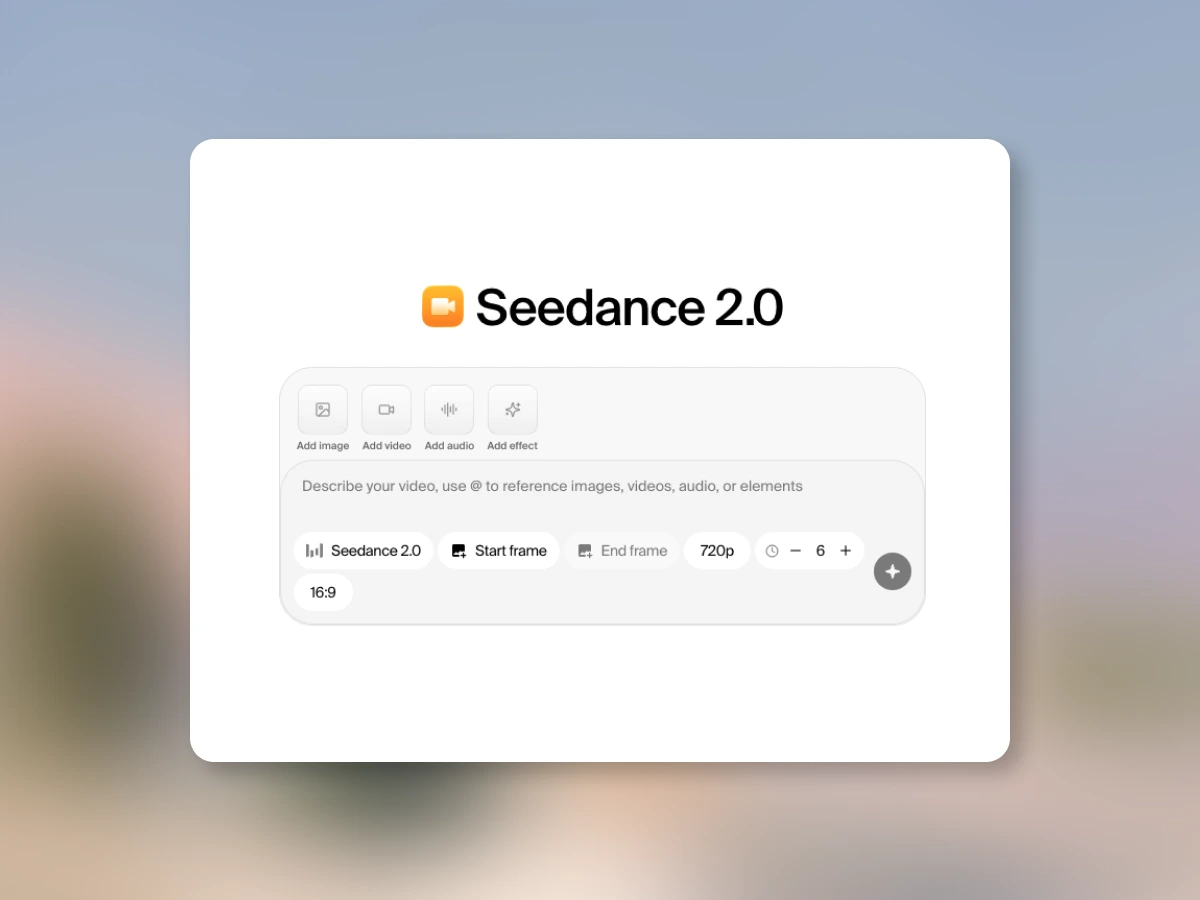
Seedance 2.0: now on Krea
Seedance 2.0 is available on Krea on all paid plans. Best-in-class motion coherence and cinematic camera control.
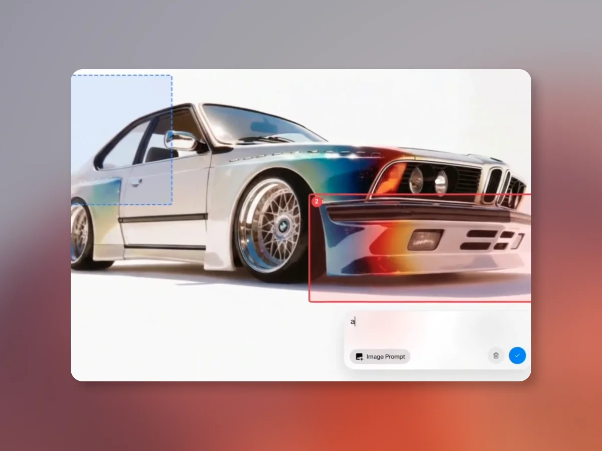
Annotations in Krea Edit
Mark up multiple regions, write a separate prompt for each one, and generate all the changes in a single pass.
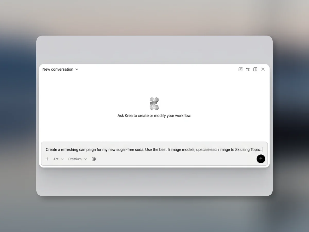
The Node Agent
Describe what you want, and watch our agent make it happen. Creative workflows, without the complexity.

A New, More Powerful Krea Edit
Change specific regions, render new perspectives, adjust lighting, apply color palettes, and more. A rebuilt editing tool with fine-grained AI control.
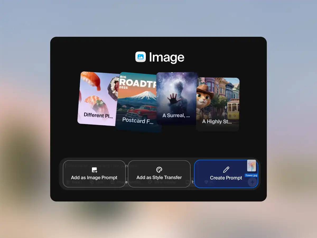
Turn Any Image Into a Prompt
Drop any image into Krea and get a detailed, generation-ready prompt in seconds. AI vision analyzes style, lighting, composition, and more.
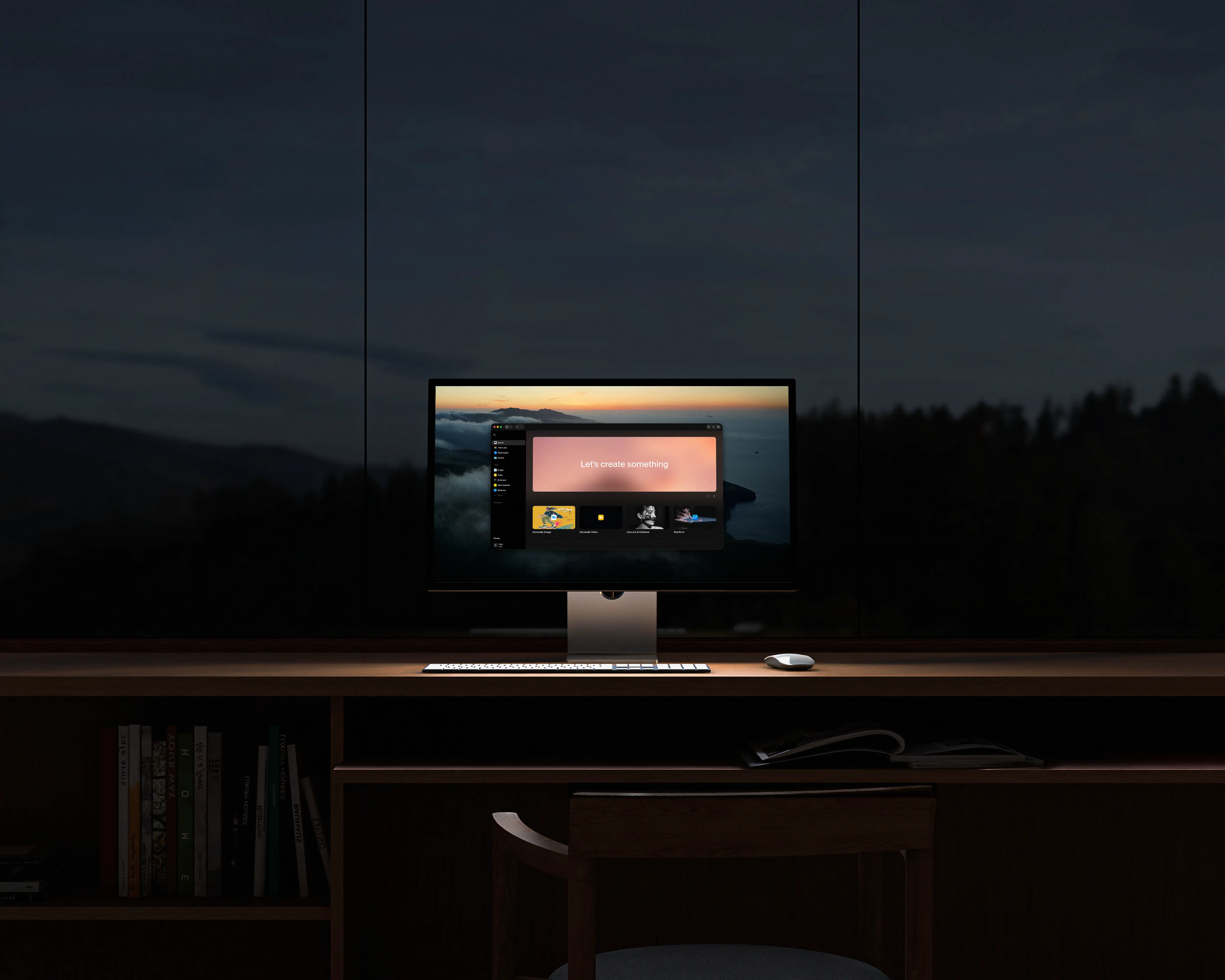
Krea Redesign
Krea's biggest interface redesign to date. Unified navigation, transparent model selection, drag-and-drop workflows, customizable workspace, and a rebuilt mobile experience.
Introducing Voice Mode
Introducing Voice Mode for Krea on iPad: speak while you draw and the canvas updates in real time for faster ideation and hands-free creative iteration.
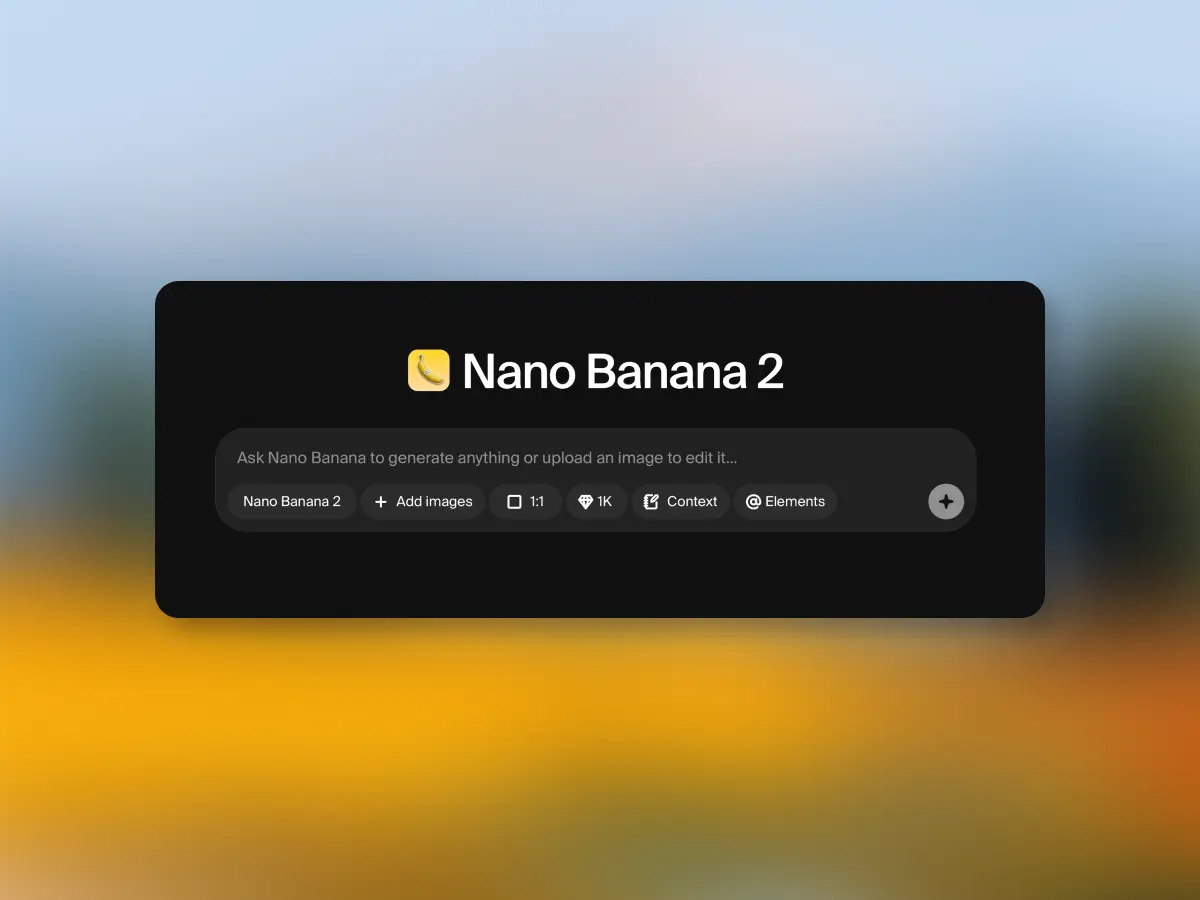
Meet Nano Banana 2, Google's Latest Image Model
Nano Banana 2 is faster, cheaper, and produces higher quality results. The next generation of Google Deepmind image model is available now.
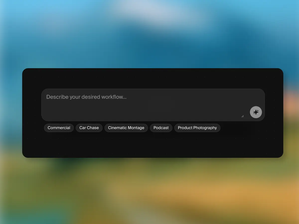
Prompt-to-Workflow
Create entire node workflows from text instructions. Describe what you want to build and Krea Nodes generates the workflow for you.
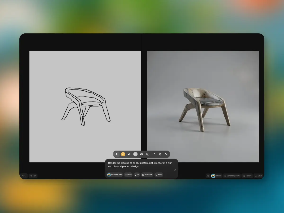
Realtime Edit
Paint on canvas, stream a webcam or your screen, and watch the AI edit in real time. Realtime Edit is available now in Krea.
Krea Realtime 14B: Real-Time, Long-Form AI Video Generation
We release Krea Realtime 14B, a 14-billion parameter model capable of real-time, long-form video generation.

Releasing Open Weights for FLUX.1 Krea
Krea announces the open release of FLUX.1 Krea, including model weights, training details, and resources to run and fine-tune the model.
A New Krea
Krea announces its Series B funding.
Krea Teams: Creative Collaboration Made Easy
Krea Teams lets your whole studio share styles, moodboards, and generated assets in one workspace — with shared billing and admin controls.
Announcing Krea Ship Week
Seven days, seven releases — Krea Ship Week brought new tools, models, and features every day.
Articles
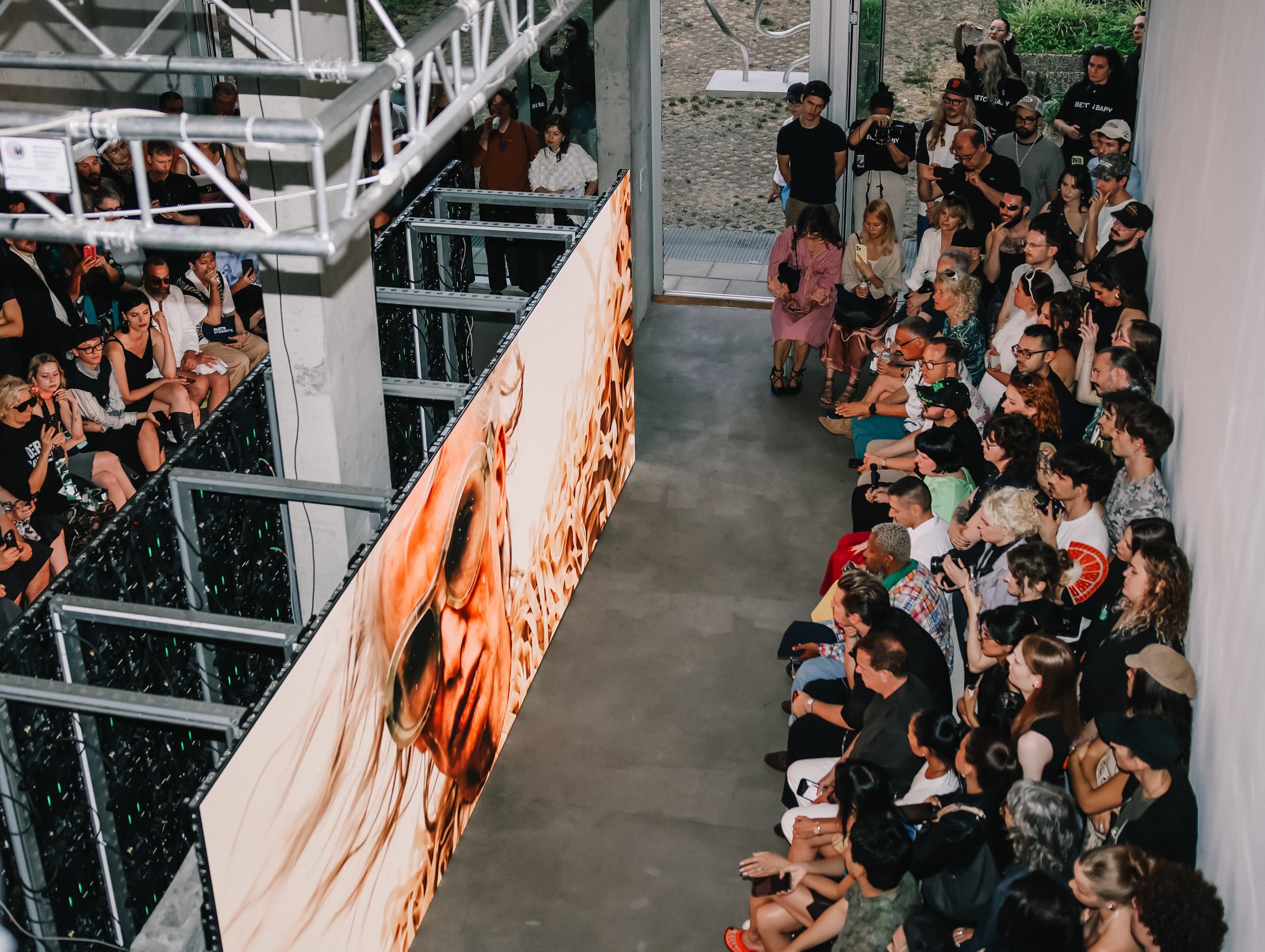
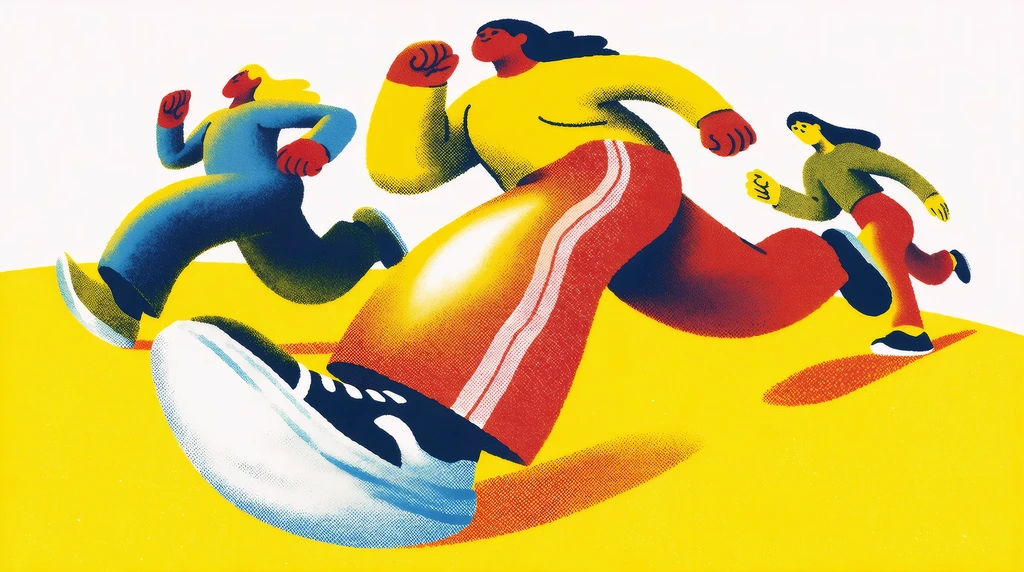
A runway show without a runway
How Taskin Goec brought an all-AI collection to Berlin Fashion Week with Krea.
7 Seedream 5 Pro Use Cases for Marketers: Ads, Product Images, and Campaign Creative (2026)
Seedream 5 Pro use cases for marketers: update approved ads, product images, and campaign creative with region edits that preserve layout and lighting.
The 5 Best AI Video Models for UGC Shorts in 2026
Discover the 5 Best AI video models for UGC shorts in 2026, optimized for reference control, native audio, vertical output, and fast iteration.
The 5 Best AI Video Models on Krea in 2026
Explore the best AI video models on Krea in 2026, ranked for quality, character continuity, motion, audio, and creative control.
15 Architectural Styles to Create With Seedream 5.0 Pro on Krea in 2026
Create 15 architectural styles with Seedream 5.0 Pro on Krea in 2026, using references, anchors, and layers for consistent, revision-ready renders.
15 Powerful Seedream 5.0 Pro Prompts for Photorealism, Product Shots, Portraits & More (Krea-Optimized)
Seedream 5.0 Pro prompts for photorealism, product shots, portraits, and more. Get Krea-ready prompt jobs for sharper renders.
8 Best AI Interior Design Tools in 2026, Compared
Discover the 8 best AI interior design tools in 2026, compared for layout control, material edits, and furniture scale with top pick Krea AI.
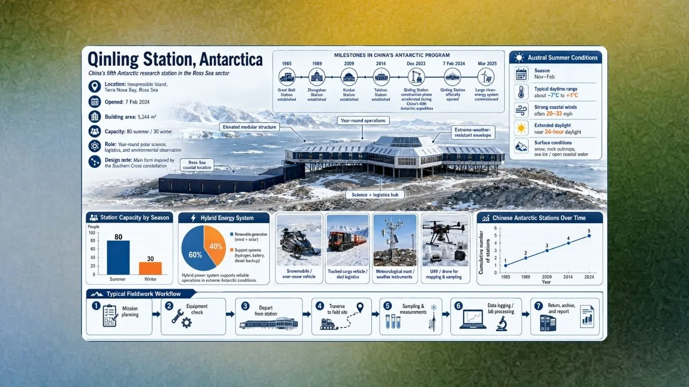
Seedream 5.0 Pro on Krea: 12 Complex Infographic Reasoning Examples (2026)
Seedream 5.0 Pro on Krea: 12 complex infographic reasoning examples (2026) showing how to plan hierarchy, label accuracy, and targeted edits.
Seedream 5.0 Pro on Krea for Product Photography: 15 Pro-Level Examples (2026)
Seedream 5.0 Pro on Krea for product photography: 15 pro-level examples showing precise material, color, and label edits for approval.
What Is Seedance 2.5 and What Can It Do
Everything new in Seedance 2.5: how it compares to Seedance 2.0, what changed with references and region editing, example prompts, and how to use it on Krea.
Seedream 5.0 Pro - Live on Krea
Seedream 5.0 Pro is an advanced image generation and editing model with web search and deep reasoning capabilities. Use it on Krea today.
10 Best Style Prompts For AI Image Generation In 2026
We spent a few weeks testing a wide range of prompts across different aesthetics and styles for image generation, and based on our experiences with them, these are the best.
30+ Best Nano Banana Prompts to Copy & Paste in 2026
Copy 30+ Nano Banana prompts for Gemini image generation. Free templates for portraits, product shots, ads, characters, styles, poses, and multi-image blends.
8 Best Creative AI Image Generators in 2026
We spent a few weeks testing all the AI image generator tools we could get our hands on, and based on our experiences with them, these are the best.
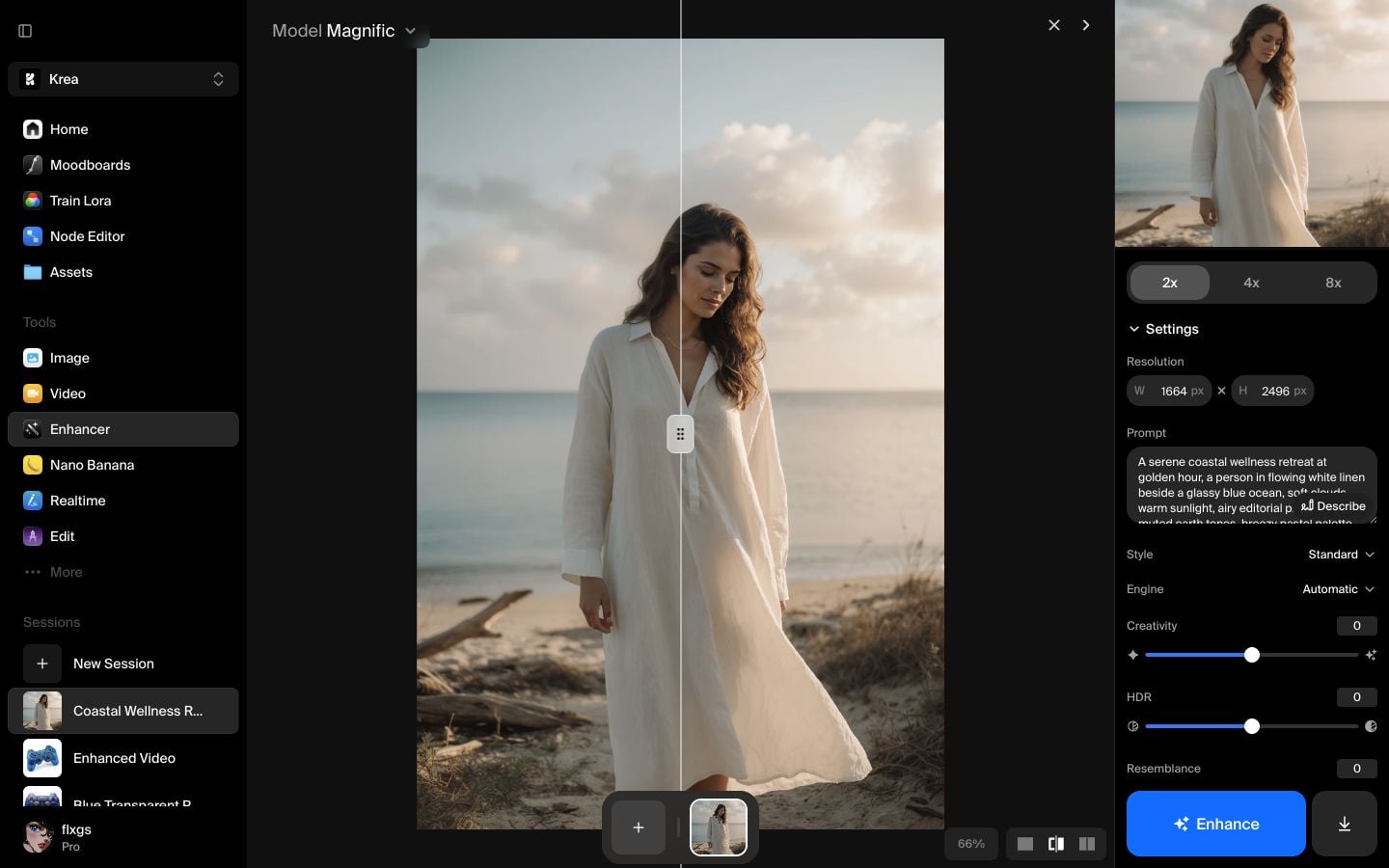
How to Enhance Images with Magnific in Krea
Magnific is useful when an image needs more resolution and more believable detail, not just a sharper resize.
How to Enhance Images with Magnific Precise in Krea
A simple guide to enhancing recent Assets images with Magnific Precise in Krea, including default settings and a real 2x result.
How to Enhance Images with Topaz Generative in Krea
A simple guide to enhancing images with Topaz Generative in Krea, using a recent Assets image and a real 2x result.
How to Generate Images With Style References in Krea
Learn how to use Style transfer presets with Krea 2 Large to generate images guided by a visual style reference.
How to Quickly Upscale Images in Krea
Learn how to use Quick Upscale from a Krea Image session.
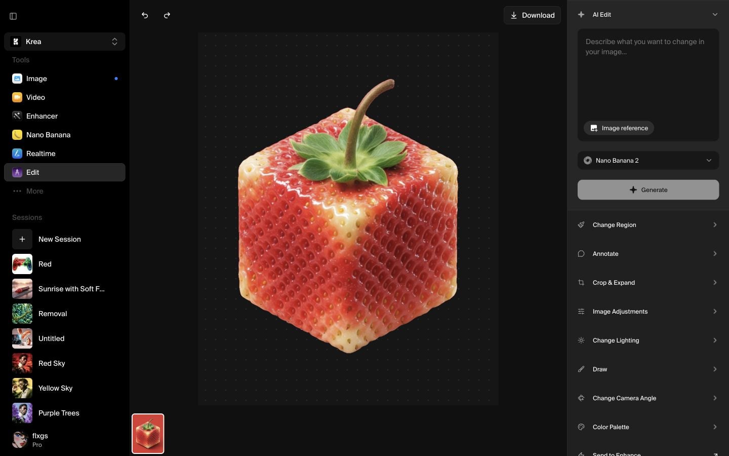
How to Remove an Image Background in Krea
Learn how to remove an image background in Krea Edit by selecting an asset, right-clicking it, and downloading a clean cutout.
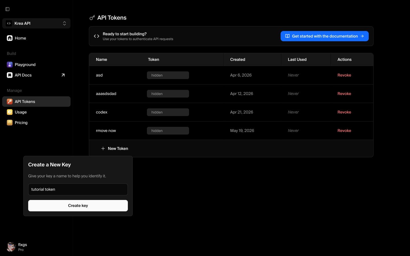
How to Create an API Token in Krea
Learn how to switch to Krea API mode, create an API token, name it, and store it safely after creation.
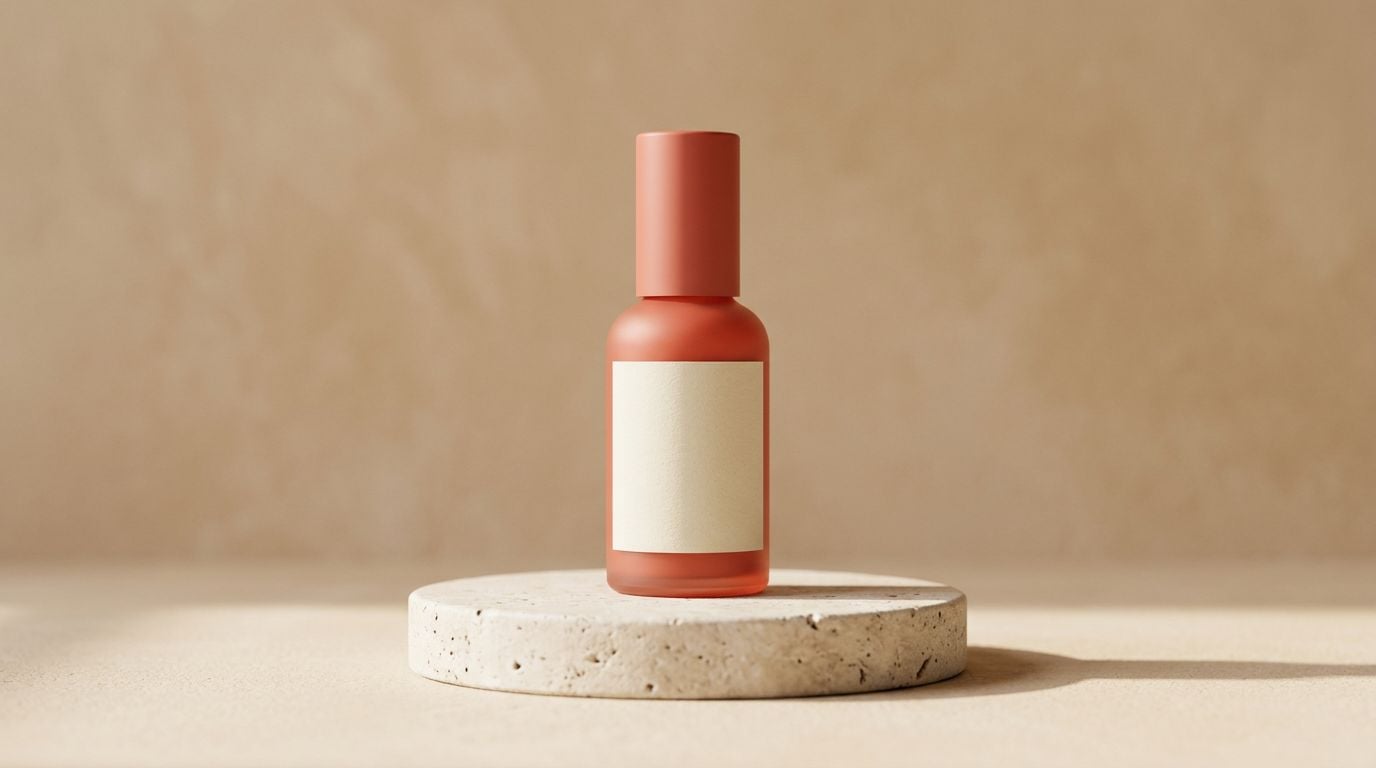
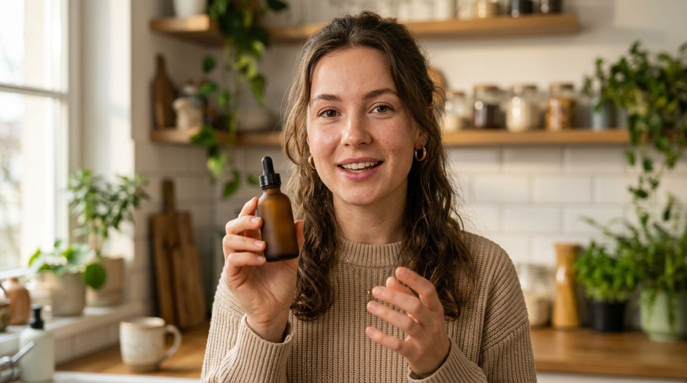
AI Tools for Generating Lifestyle Product Shots
If you are short on time: Krea 2 inside Krea is the best fit when you want flexible lifestyle product shots, campaign concepts, and editable product scenes in

AI Tools for Creating Product Mockups and Packaging Renders
If you are short on time: Krea 2 is the best fit when you want fast creative directions for product mockups, packaging concepts, and launch visuals. Use a
AI Tools That Generate Floor Plans and Building Concepts
Compare AI floor plan tools for layouts, building concepts, interiors, pricing, and sketch-to-plan workflows, with examples generated in Krea.
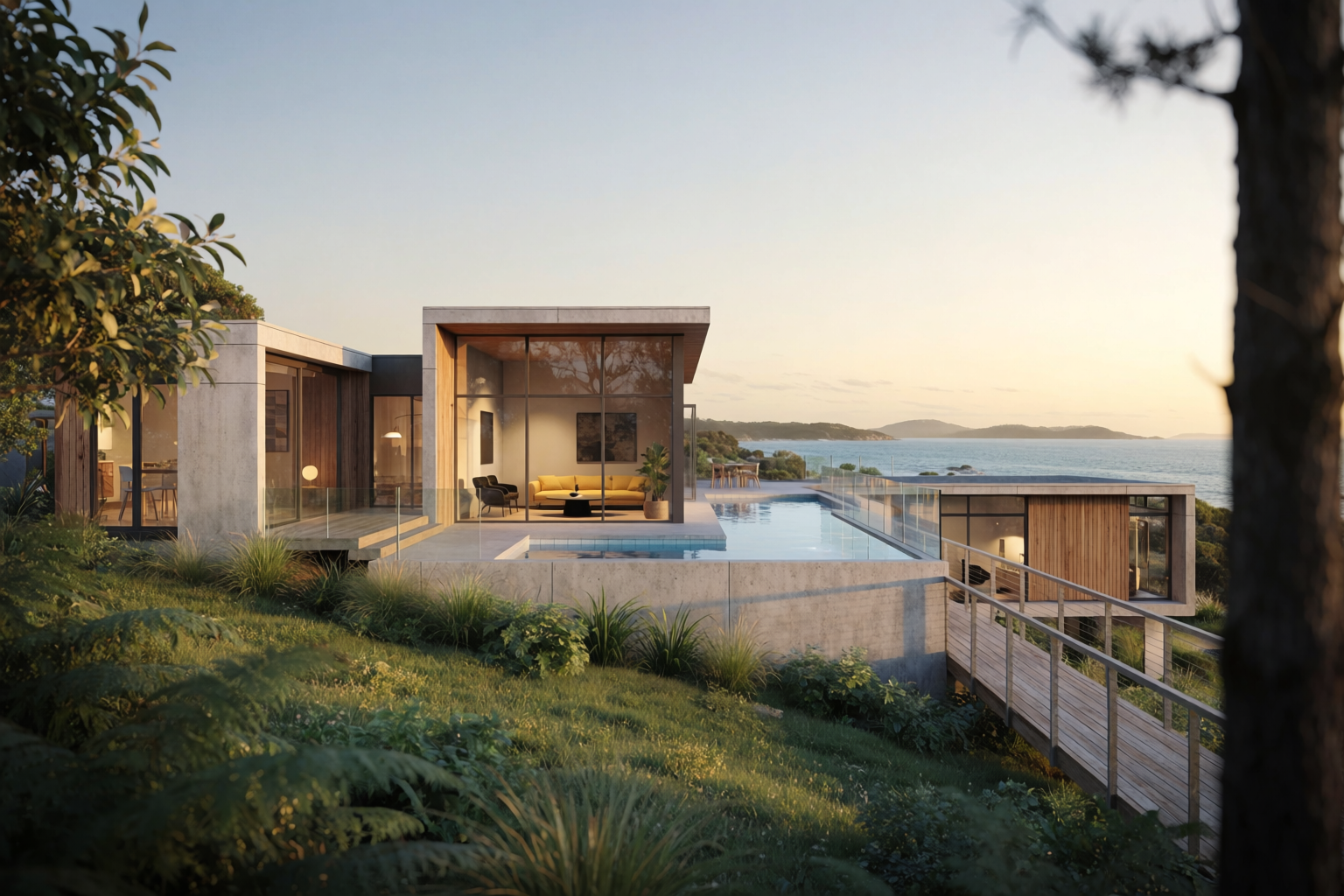
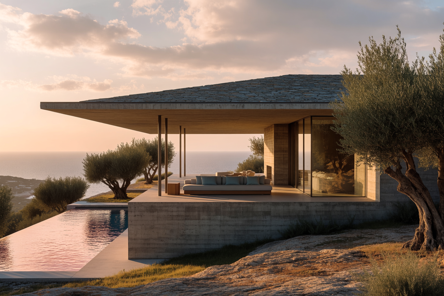
Best AI for Generating Photorealistic Architectural Renders
Photorealistic architectural rendering is one of the clearest places where AI can save time, but the phrase can mean a few different things. Sometimes you
Animate Krea 2 illustrations with Seedance 2.0
Turn Krea 2 stills into fluid animations with Seedance 2.0 — all inside a single Krea workflow.
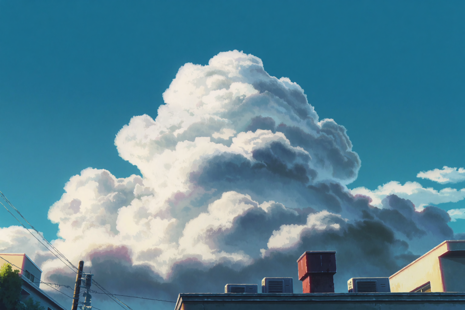
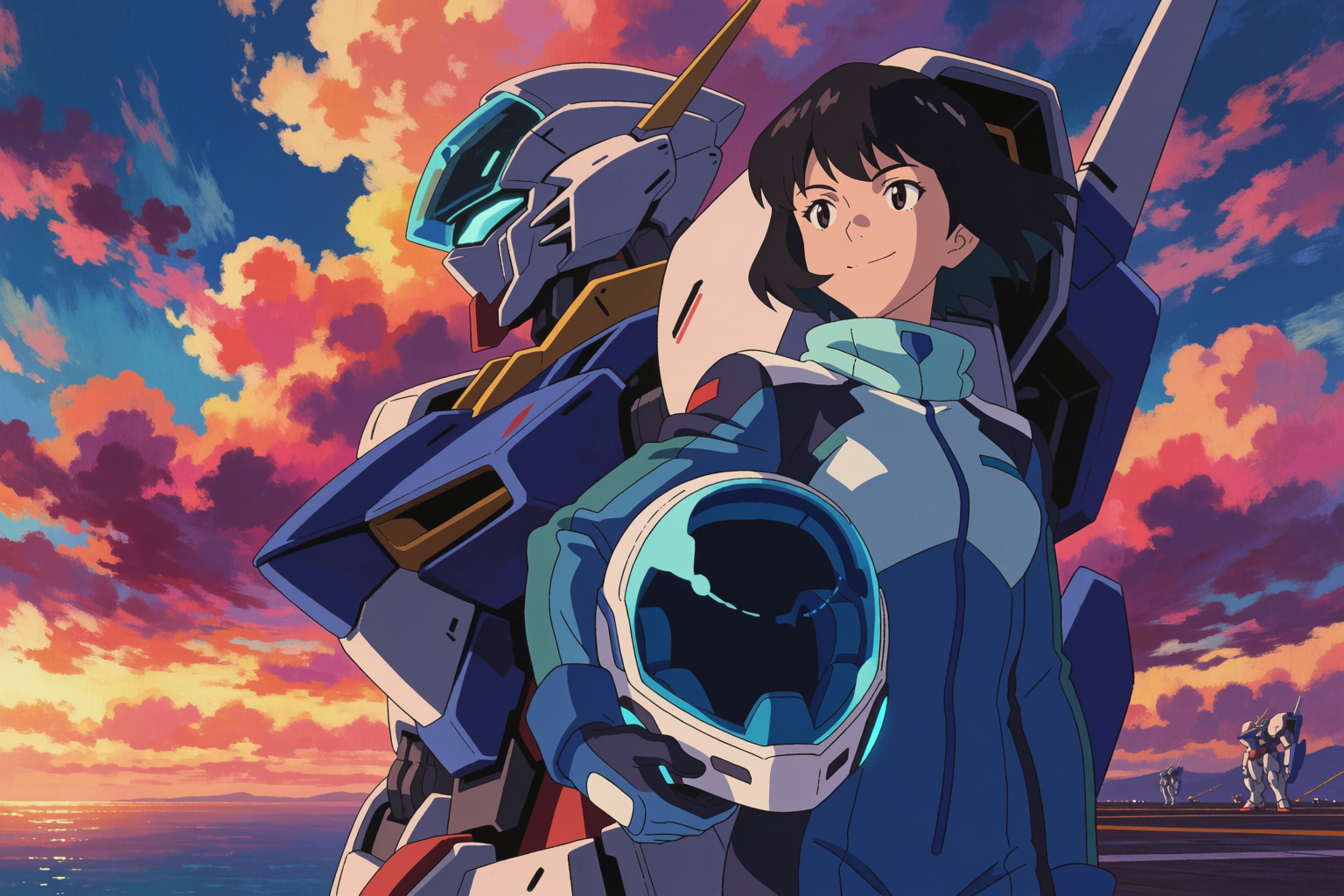
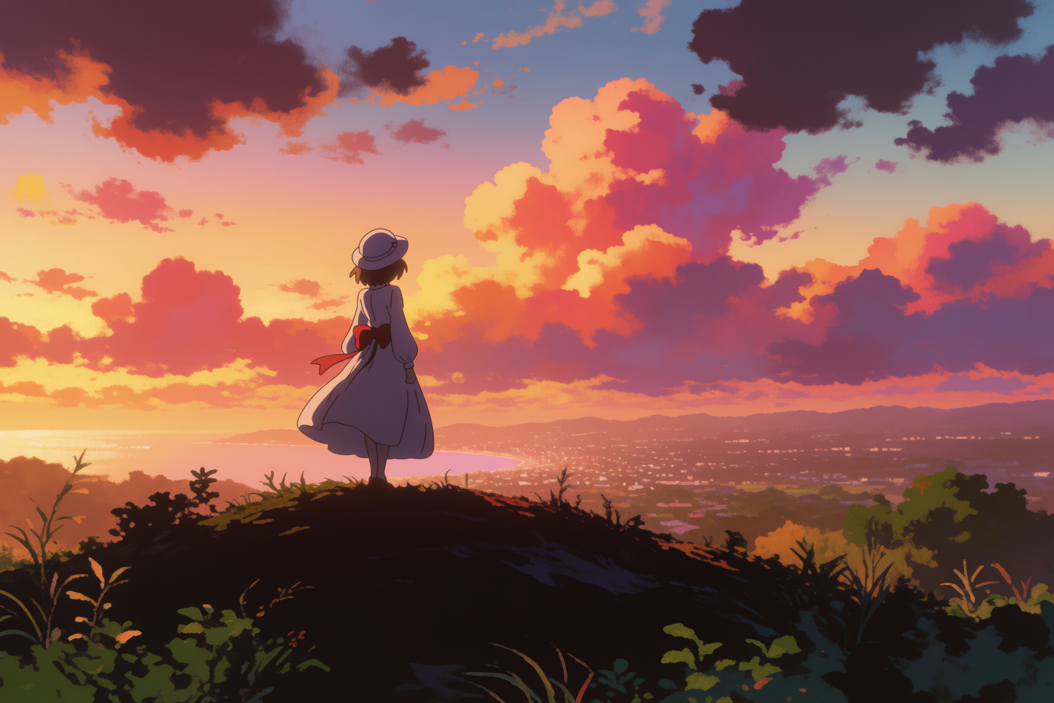
Anime backgrounds with Krea 2
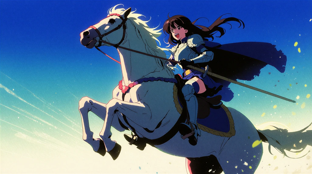
Make anime-style scenic backgrounds with Krea 2 — Shinkai skies, school hallways, train platforms, isekai landscapes for indie creators.
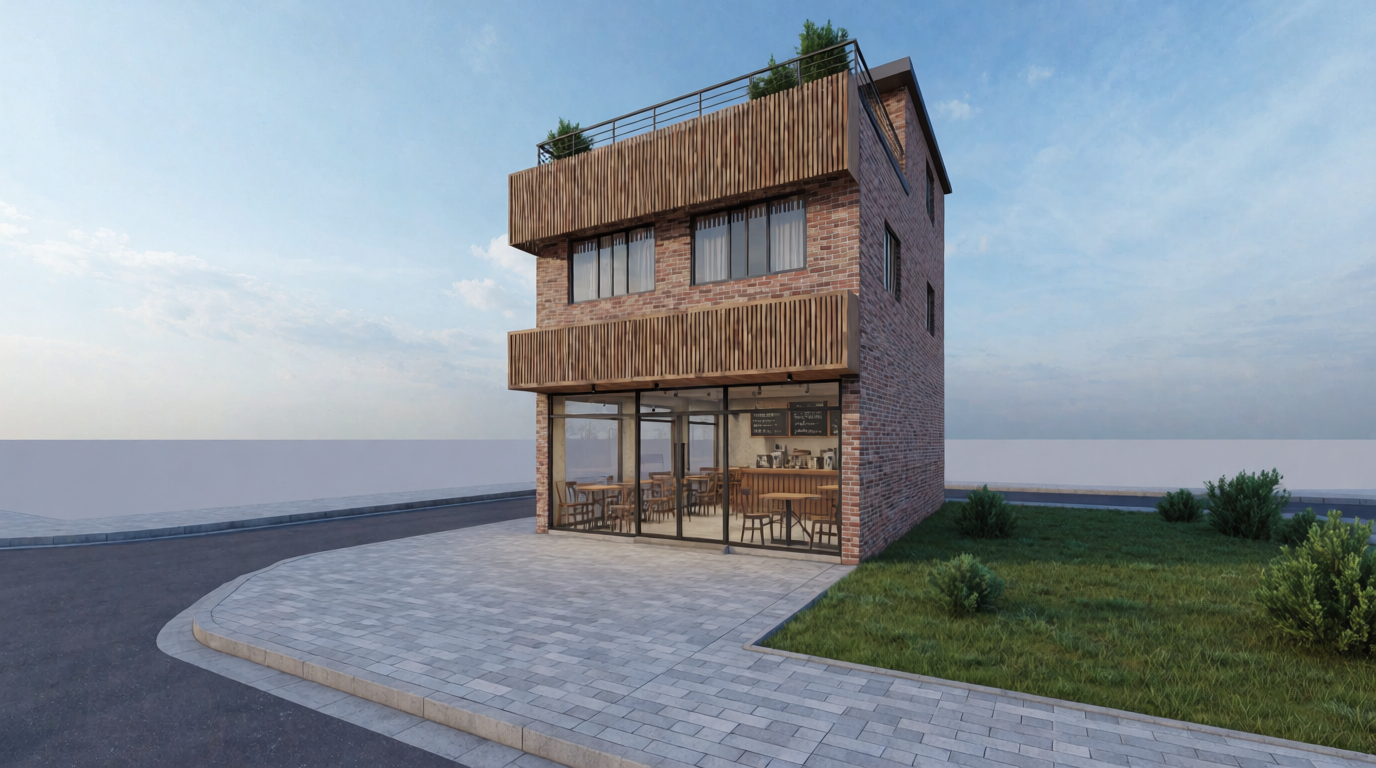
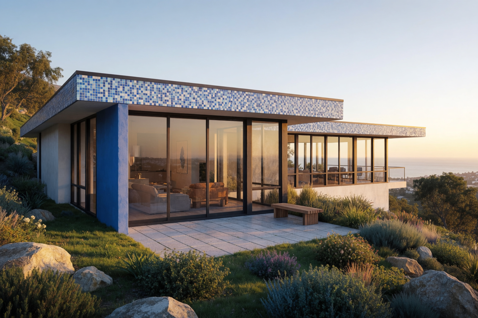
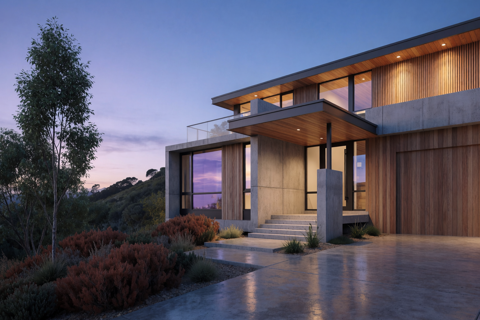
Architectural styles with Krea 2
Render any architectural style in Krea 2 — modernist, brutalist, Japandi, Mediterranean, mass timber, mid-century, postmodern.
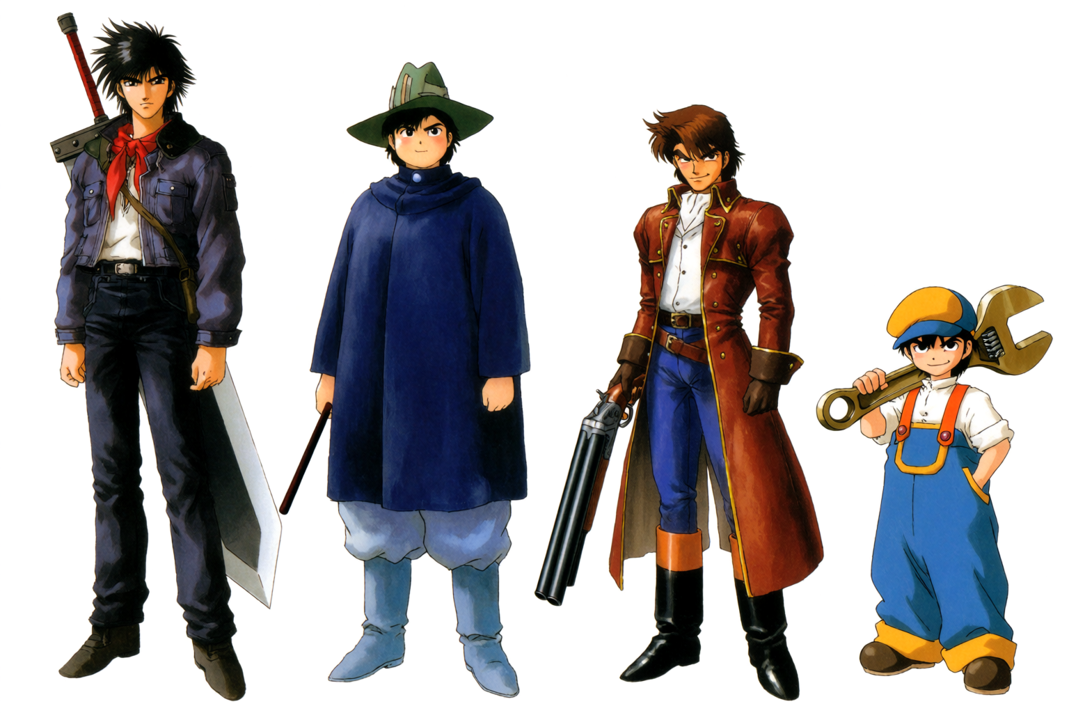
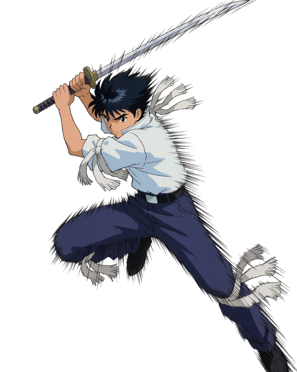
Character design with Krea 2
Character design is the foundation of every anime project. Krea 2 is built for this kind of pipeline work.
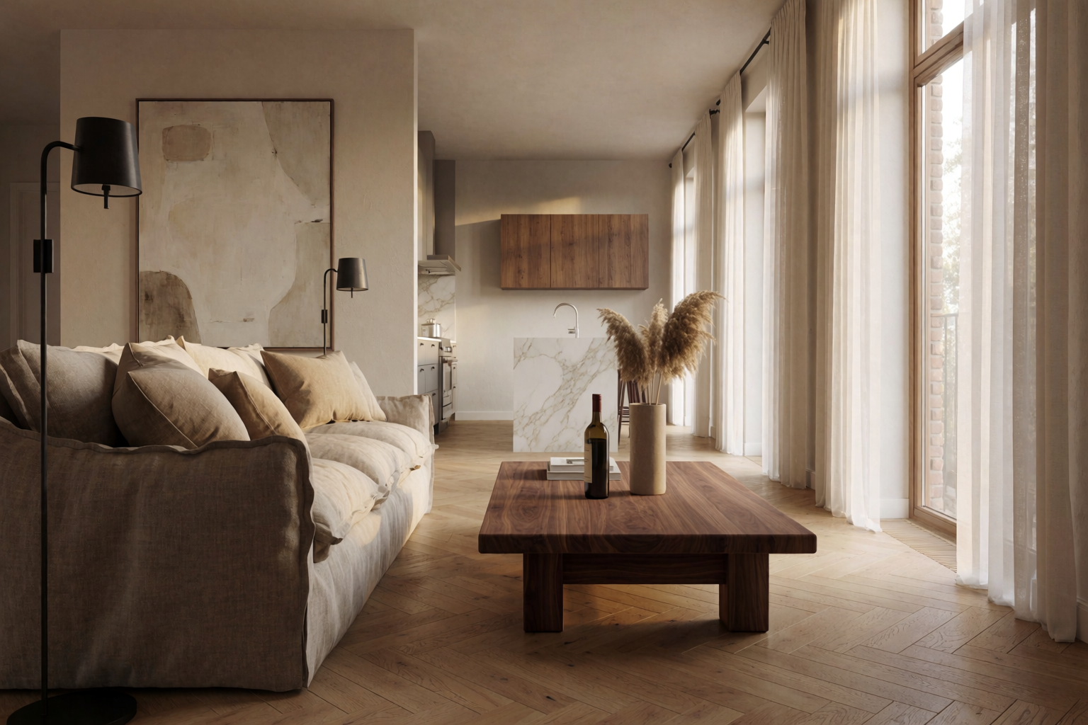
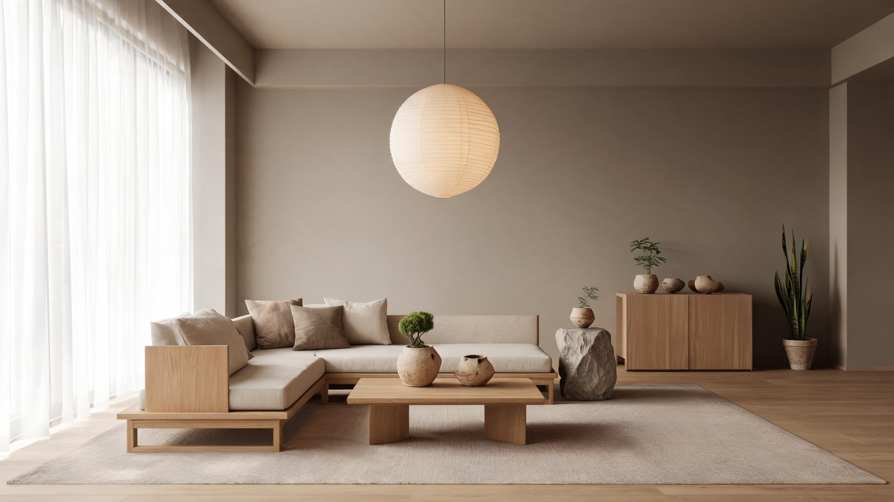
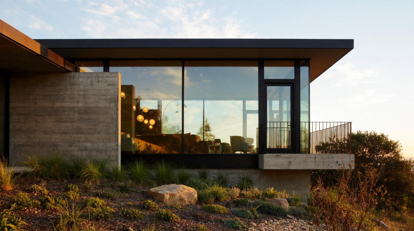
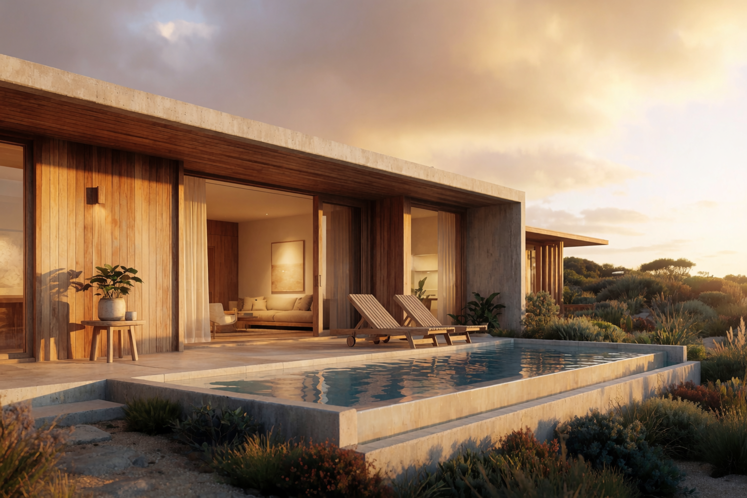
Interior design with Krea 2
Krea 2 renders interiors with material accuracy that holds up to design-publication scrutiny.
Krea 2 vs NijiJourney for anime
If you make anime art with AI, you are choosing between a handful of models. NijiJourney is the established name. Krea 2 is the new one. This article is an hone
Krea 2 and Nano Banana 2, side by side
In 2026, you can finally stop asking which image model is the best one . The interesting question is which two you should keep open at the same time. Inside Kre
Made with Krea 2 moodboards
A moodboard, in Krea 2, is a way to encode taste into the model. You drop in a curated set of and the system reads the whole set as a single creative direction.
Creators react to Krea 2 LoRAs
First reactions to the Krea 2 LoRA beta — from day-one experiments to a film-work take on consistency.
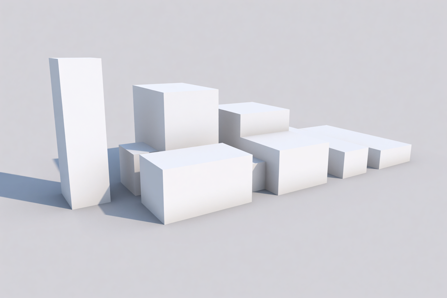
Concept and massing studies with Krea 2
Massing is the moment in a project when the only thing that matters is form. No materials. No windows. No landscape. Just volumes, in space, in relationship to
From sketch to anime panel with Krea 2
The bottleneck in indie manga and comic work is not the idea. It is not the storyboard. It is finishing — taking a rough panel sketch and turning it into a poli
Krea 2 sketch to render — architecture
The fastest distance between an architect's idea and a client's "yes" is a render. The slowest distance is the days of CAD, material assignment, lighting, and p
Krea 2 vs Lumion, Enscape, D5 Render
If you produce architectural renders, you have probably evaluated Lumion, Enscape, D5 Render, or Twinmotion at some point. These are excellent tools — built spe
Materials and lighting studies with Krea 2
How to use Krea 2 for rapid material and lighting studies — stone, concrete, timber, glass — without re-rendering your entire scene.
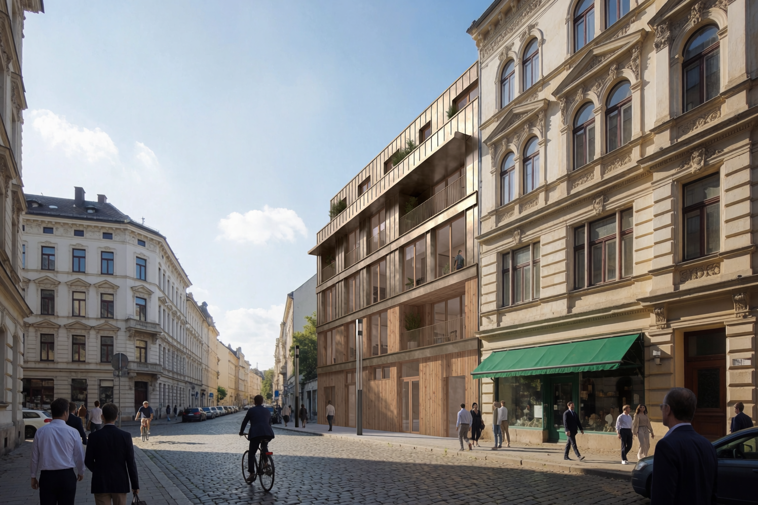
Site context renders with Krea 2
The hardest render in architecture is the one with neighbours. A standalone building on a clean lot is easy. The same building between two existing facades, wit
Studio anime aesthetics with Krea 2
Anime is not one look — each studio has its own palette, line weight, and emotional register. See how Krea 2 reproduces Ghibli, Trigger, MAPPA, and more.
Exploratory prompting in Krea 2
Krea 2 rewards curiosity — start vague, see what comes back, and follow the threads you like.
Krea 2 in the wild: community standouts
This week the Krea 2 community pushed the model in three directions — minimal prompts, mood-driven moodboards, and Krea 2 to Seedance 2.0 pipelines.
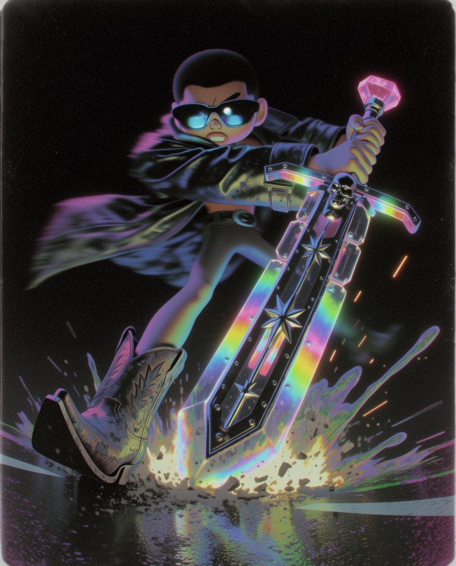
More early Krea 2 community work
Four more pieces from the Krea 2 community: cowboys via swapped srefs, a Kling 3.0 video loop, painterly portraits, and cinematic seaside frames.
Krea 2 community week 3
Tanzim benchmarks Krea 2, Lloyd Creates explores ethereal moods, and AIdriving pushes style transfer past 80%.
How Architecture Studios Use AI to Render Concepts in Minutes
See how architecture teams use Krea 2 for massing studies, material explorations, and client-ready renders — from sketch to presentation-quality visual in seconds, not hours.
Style references in Krea 2
How S-Refs work in Krea 2 — extracting style from a single image and applying it to any new prompt, with control over strength.
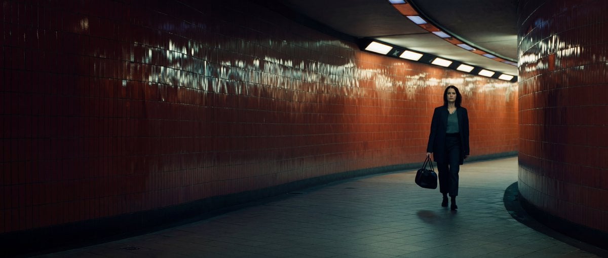
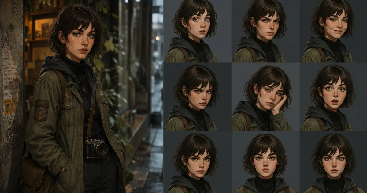
A London noir, shot in Krea 2
Filmmaker VictorInFocus pasted a Seedance video prompt into Krea 2 and got back a contact sheet of cinematic stills. Here's what happened, and the moodboard.
Krea 2 vs Midjourney: which AI image generator is right for you?
How Krea 2 compares to Midjourney in 2026: style control, workflow, feature scope, quality, and pricing.
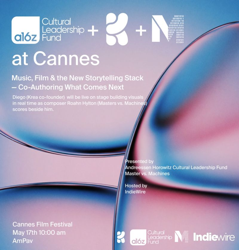
Krea at Cannes Film Festival
We're heading to Cannes. Our co-founder and CTO Diego Rodriguez will be live on stage at the American Pavilion, building visuals in real time as composer Roahn
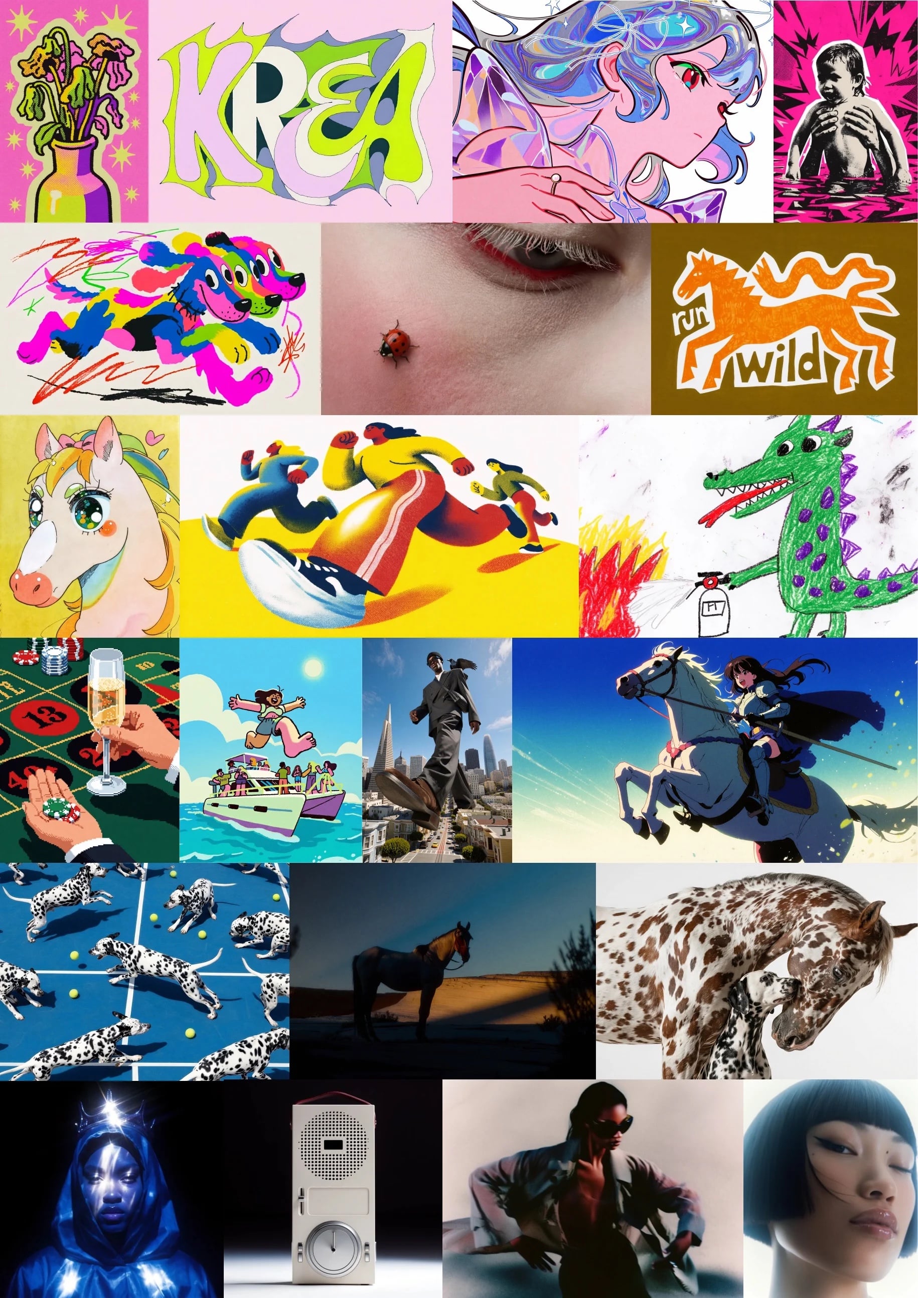
Krea 2: First Experiments from the Community
A collection of early creative experiments from the Krea 2 community.
On being the underdog
Our response to Fast Company's "underdog AI model" piece — why taste, not scale, is the moat behind Krea 2.