Moodboards are a quick way to turn a loose visual direction into a reusable style guide. Instead of trying to describe every lighting choice, color note, and texture in one prompt, you can collect a few reference images, let Krea analyze the pattern, and then generate with that moodboard attached.
This walkthrough uses images from the Favorites folder in Assets, then finishes by generating four images from the completed board.
Start from Moodboards
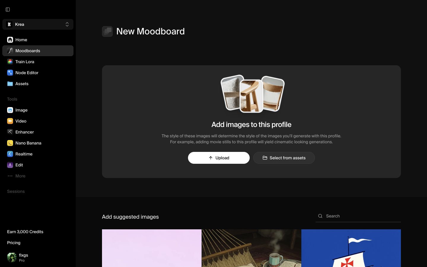
Open Moodboards from the app sidebar, then create a new moodboard. A new board starts empty so you can decide whether to upload images, select existing assets, or use suggested images.
Give the board a simple working name if you already know the direction. For this example, we left it blank at first and let Krea rename it after analysis.
Choose references from Assets
Click Select from assets. If you already save useful references, open Favorites in the asset picker. Favorites are a good place to start because they usually contain images you intentionally kept for their style, lighting, composition, or subject matter.
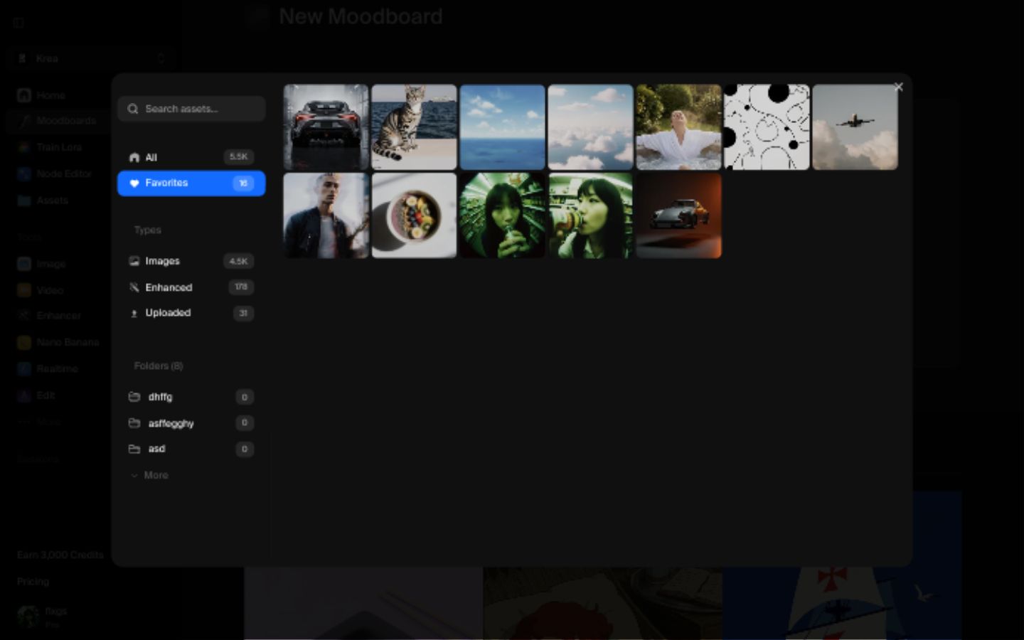
Pick images that share a clear visual language. In this example, the strongest references were coastal skies, soft clouds, warm light, white fabric, and open ocean. That is more useful than mixing unrelated subjects just because every image looks good on its own.
Add the images to the board
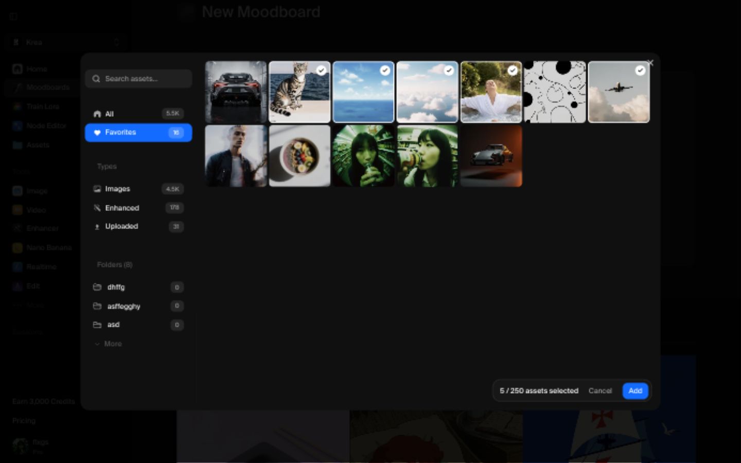
After selecting the references, click Add. Krea places them in the moodboard so you can review the set before analysis.
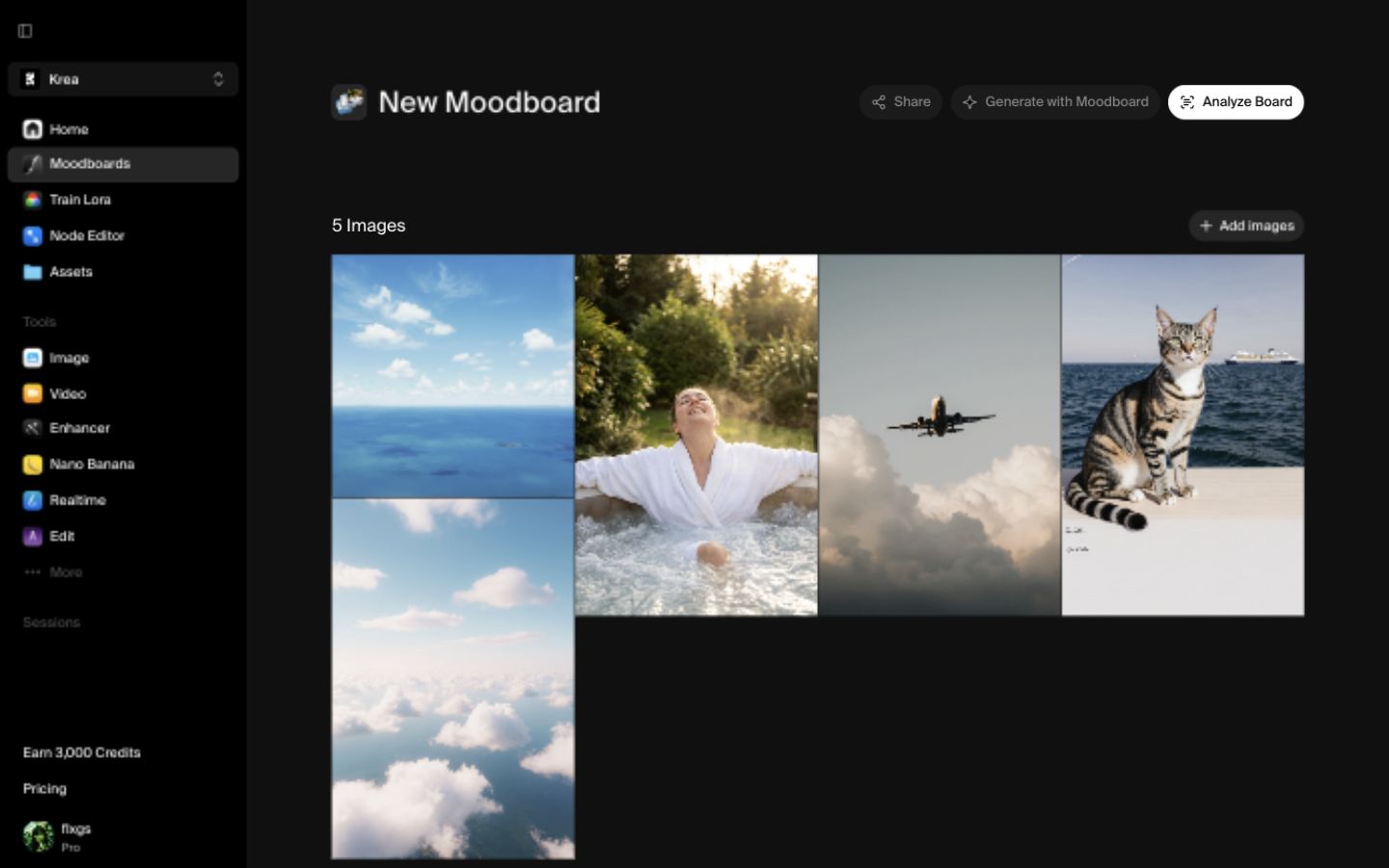
Before continuing, remove any image that pulls the board in the wrong direction. A single strong outlier can make the final style feel muddy. Aim for a shared palette, light quality, or composition habit.
Analyze the moodboard
Click Analyze Board. Krea reads the references and summarizes the taste profile, keywords, and generation direction. For this board, the analysis named the direction Luminous Coastal Serenity and surfaced keywords like golden hour lighting, expansive horizon, soft natural light, serene coastal atmosphere, muted earth tones, and breezy pastel palette.
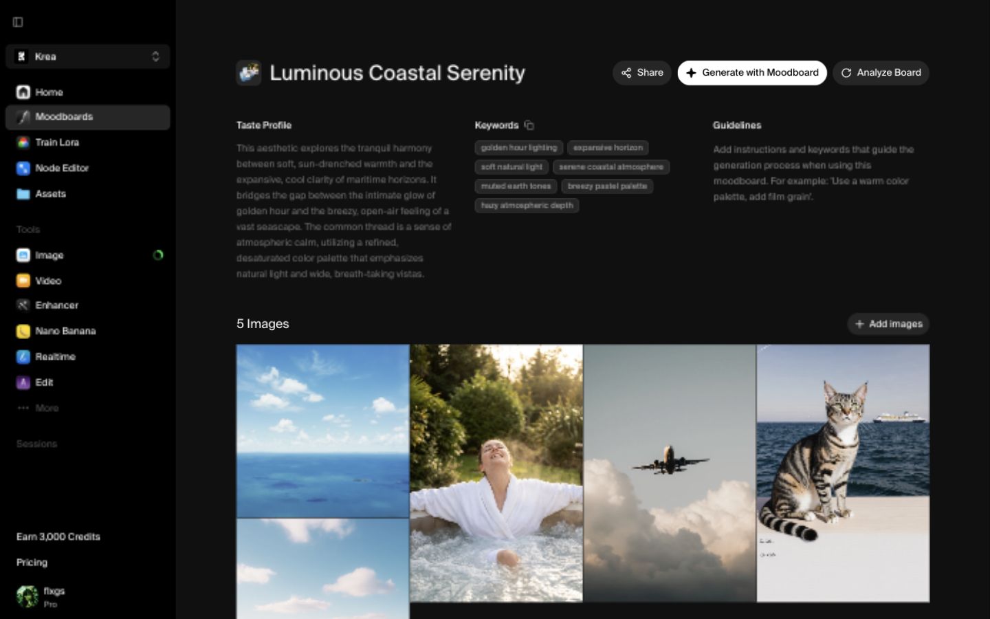
The analysis is useful because it turns your visual references into language you can reuse. You can also add guidelines if you want the board to emphasize or avoid something specific.
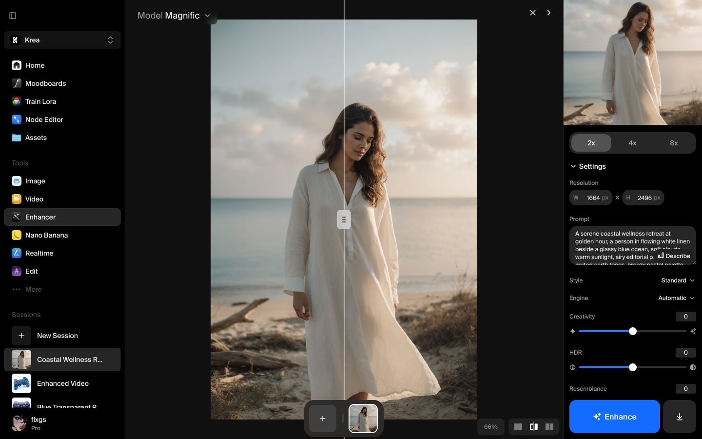
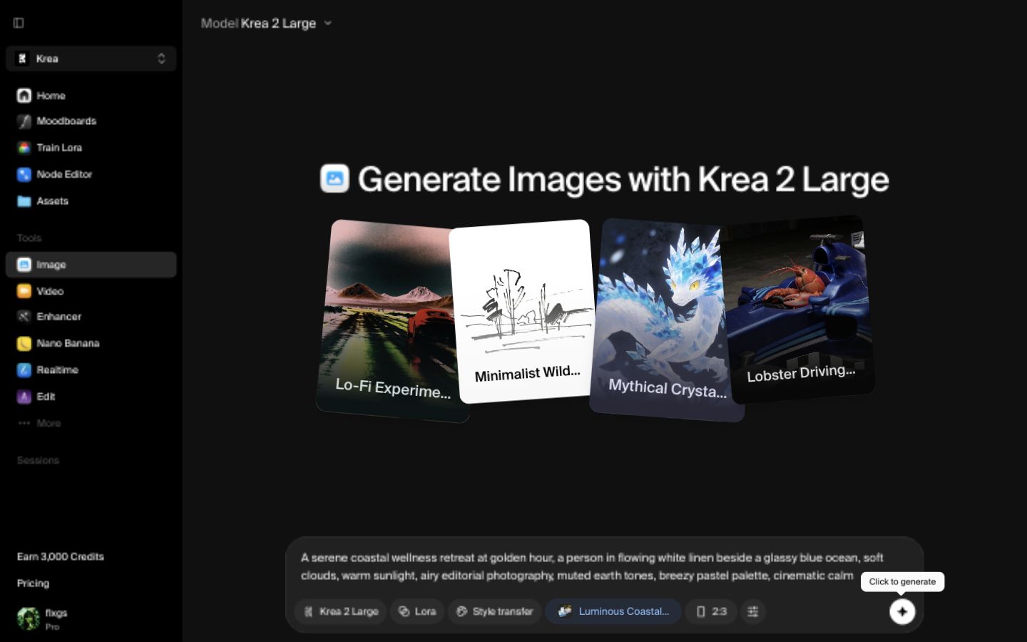
Generate with the moodboard
Click Generate with Moodboard to open the image tool with the board attached. The moodboard chip should appear beside the model and other prompt controls.
For this example, the prompt was:
A serene coastal wellness retreat at golden hour, a person in flowing white linen beside a glassy blue ocean, soft clouds, warm sunlight, airy editorial photography, muted earth tones, breezy pastel palette, cinematic calm
The prompt describes the scene. The moodboard carries the taste: soft maritime light, open horizons, white fabric, and calm pastel atmosphere.
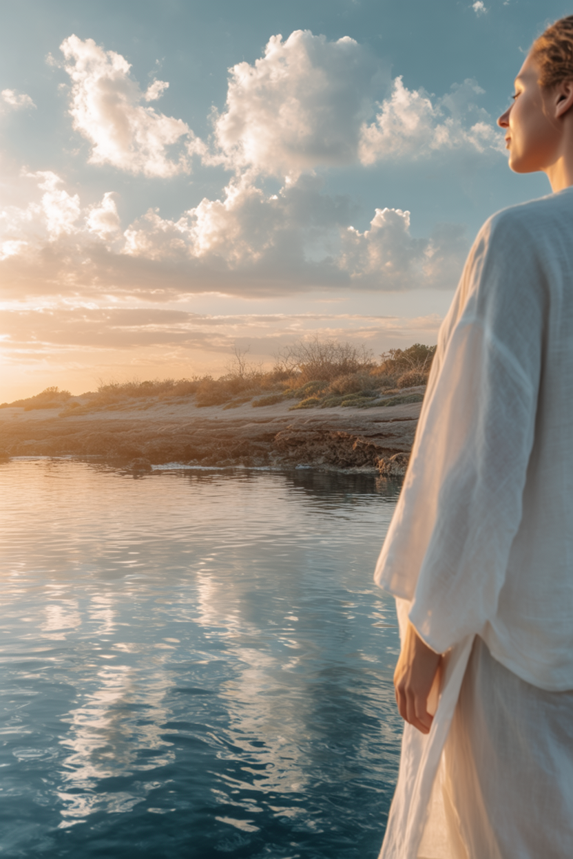
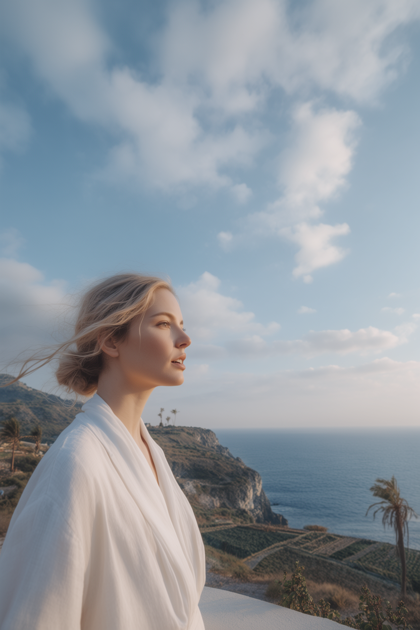
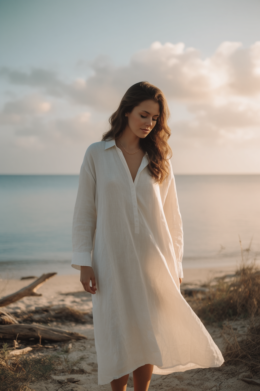
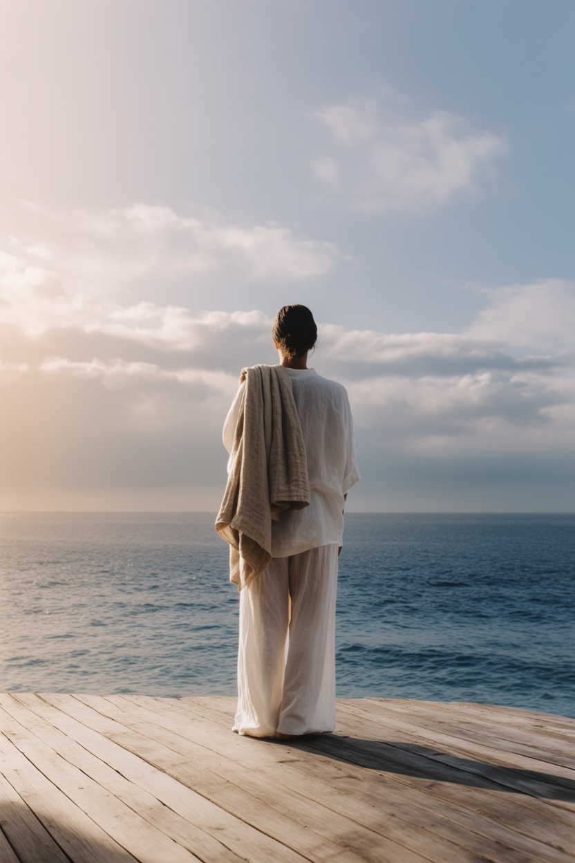
Review the outputs
Krea generated four images that follow the finished board much more closely than a prompt alone would. The set keeps the same coastal palette and soft editorial mood across multiple compositions.
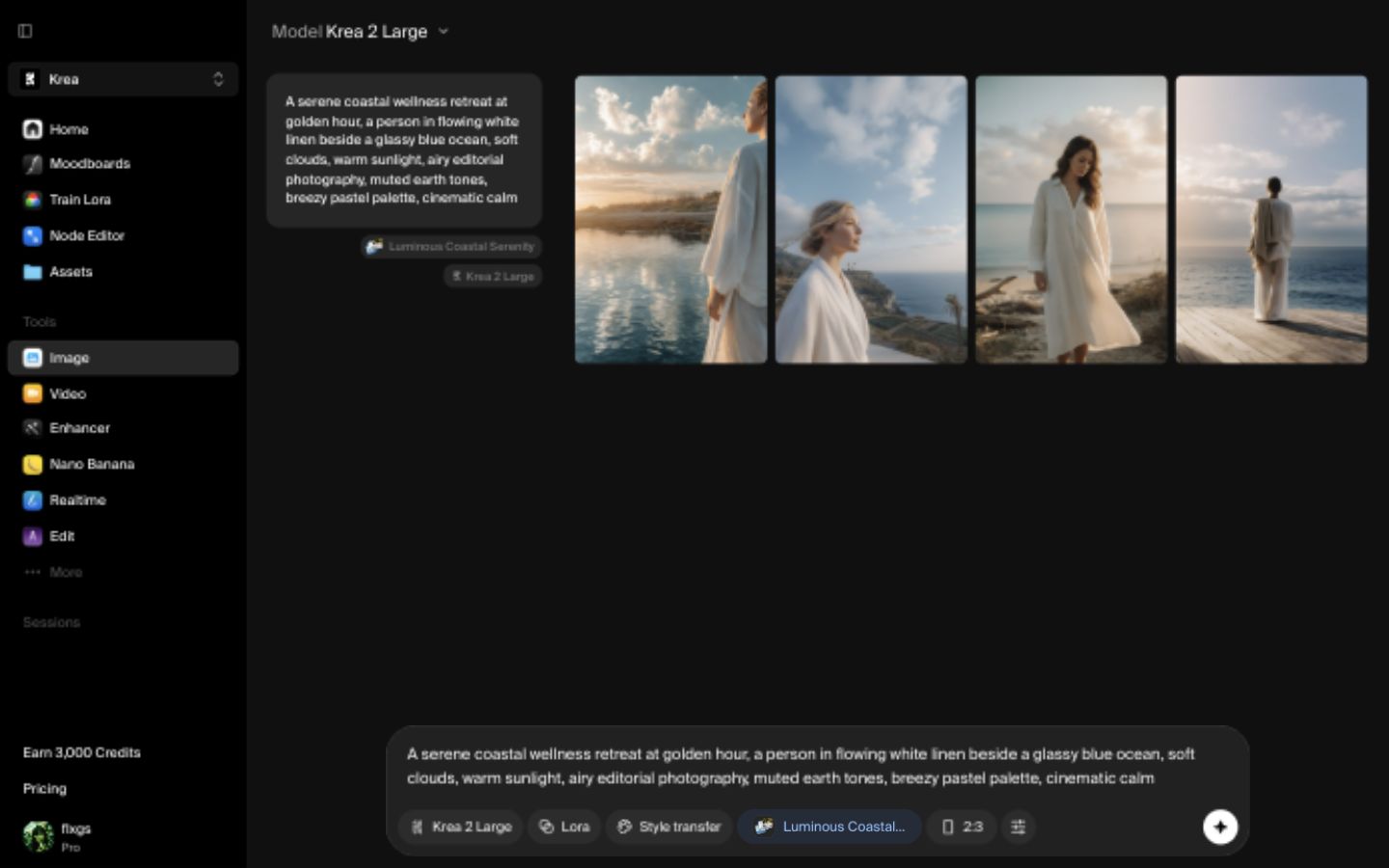
Generated with the finished moodboard
Krea Team
Four outputs generated from the Luminous Coastal Serenity moodboard.
Quick checklist
- Use 4-8 references with a shared visual direction.
- Prefer images that agree on lighting, color, texture, or composition.
- Remove references that are beautiful but off-theme.
- Analyze the board before generating so the keywords and taste profile are visible.
- Keep the prompt focused on the subject or scene, then let the moodboard guide the style.
Create your own moodboard
Build a reusable visual direction from references you already like, then generate with it in Krea.
Open Moodboards