In 2026, you can finally stop asking which image model is the best one. The interesting question is which two you should keep open at the same time.
Inside Krea, the pair we keep coming back to is Krea 2 — our own foundation model, built from scratch around aesthetics, style control, and taste — and Nano Banana 2, Google’s new general-purpose model with uncanny photorealism and very literal instruction following.
They are not the same kind of tool. Krea 2 is opinionated. It cares about how an image feels — composition, atmosphere, the difference between an art-directed frame and a generic AI render. It is also the model the rest of Krea is built around: style references, moodboards, and LoRA training all plug directly into it, which means you can teach it a house aesthetic and keep working from inside that aesthetic.
Nano Banana 2 sits on the other side of the spectrum. It defaults to truth on the page — a clean, photoreal interpretation of the prompt, without imposing a style. It’s also extraordinary at the small literal things: text on objects, plausible branding, photographic depth, the kinds of micro-details a real camera would catch.
Both live in Krea’s Image tool. You can switch between them on the same canvas, send a result from one into the editor, or feed it into video, upscaler, or restyle from there. This piece is a short tour of what each one does well — same prompt, no per-model tweaking, no cherry-picking — and why having both is more useful than picking a winner.
Five prompts, two models
We ran five prompts through both models. What you see below is unedited and in the same order for every scene: two Krea 2 variants on the left, two Nano Banana 2 on the right (the final scene is a single ultrawide frame from each).
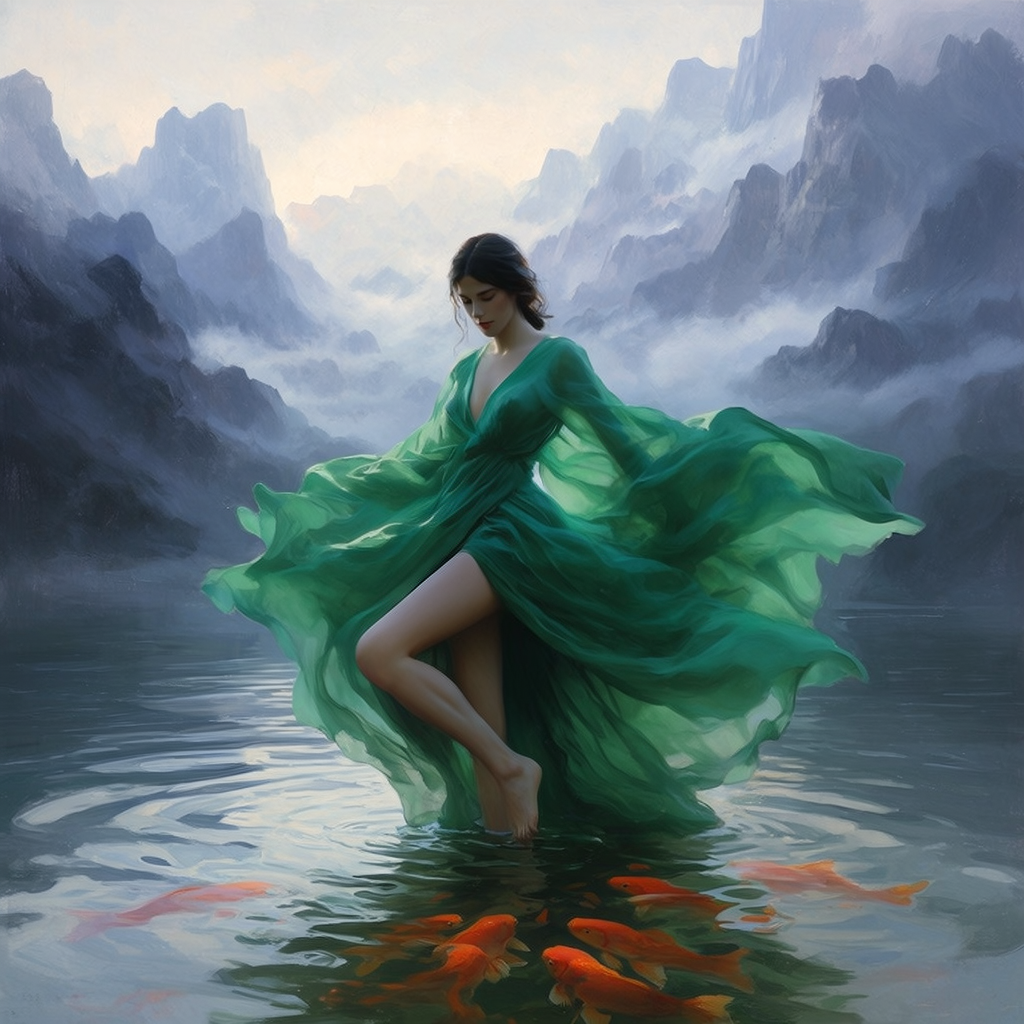
A figure in emerald silk, chest-deep in a misty lake
A figure in emerald silk, chest-deep in a misty lake
“A model in a flowing emerald silk gown standing chest-deep in a misty mountain lake at dawn, koi swimming below the surface. Krea 2 on the left, Nano Banana 2 on the right.”
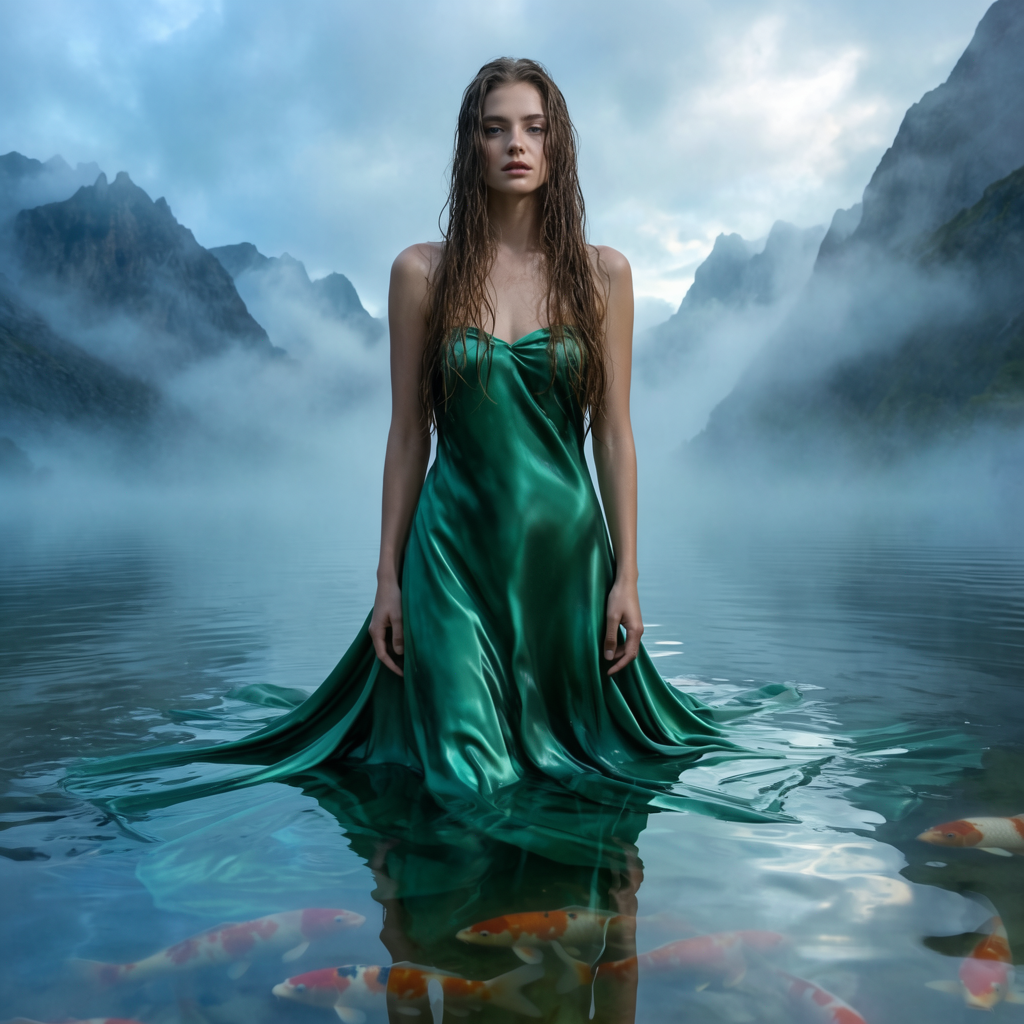
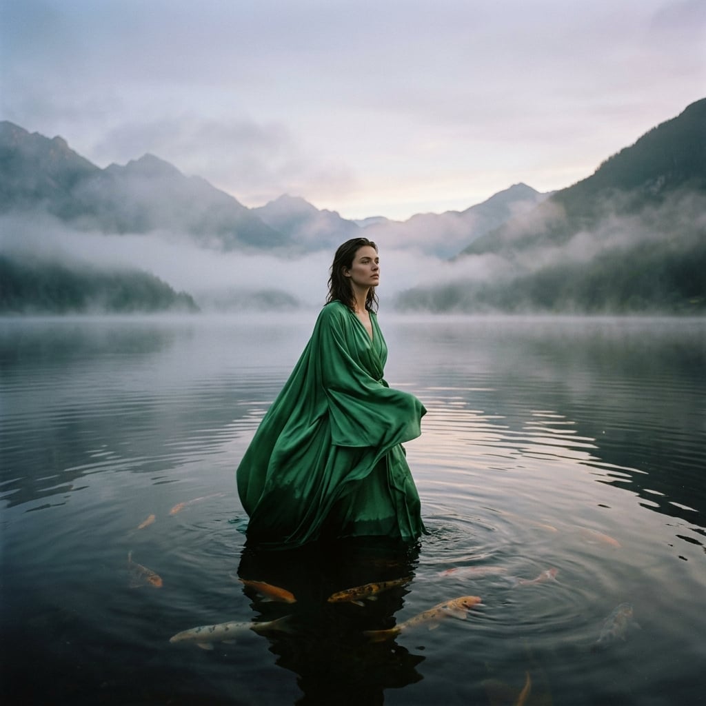
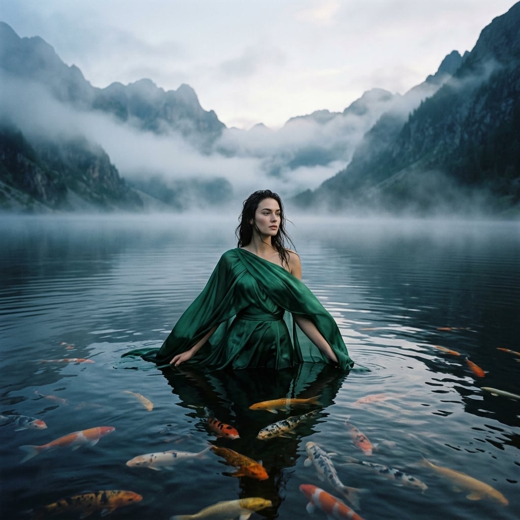
This prompt makes the difference obvious. Krea 2 treats it as art direction — its variants read like painterly stills from a fashion film, with deliberate fabric staging and a pictorial flatness that recalls oil portraiture. Nano Banana 2 treats it as production — believable water surface, plausible photographer framing, the kind of shot a real campaign would shoot at 5am with a soaked model and a patient art director.
Two looks at one brief. Neither is wrong; they are answering different questions about it.
A glass-floored living room over a foggy fjord
A glass-floored living room over a foggy fjord
“A glass-floored modernist living room cantilevered over a foggy fjord at sunrise, mid-century walnut furniture, a single bonsai catching the first light. Krea 2 on the left, Nano Banana 2 on the right.”
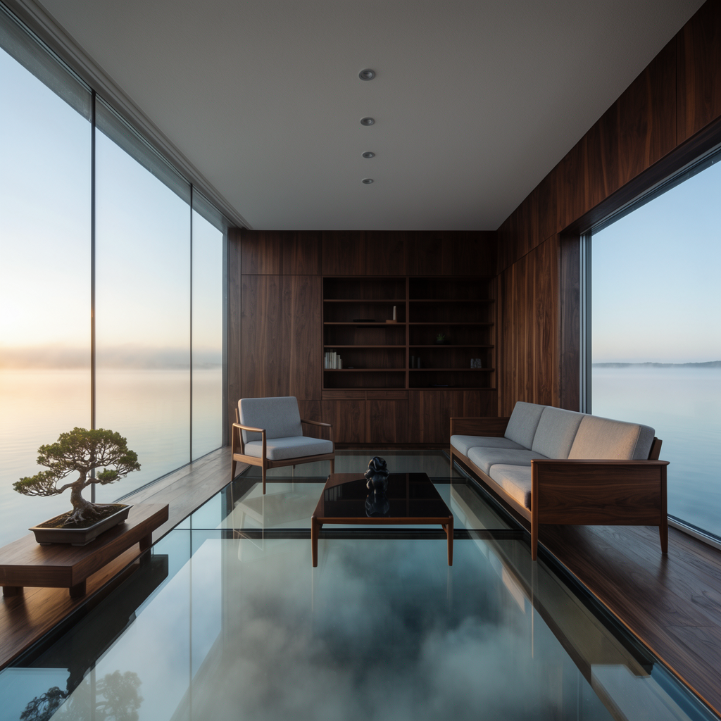
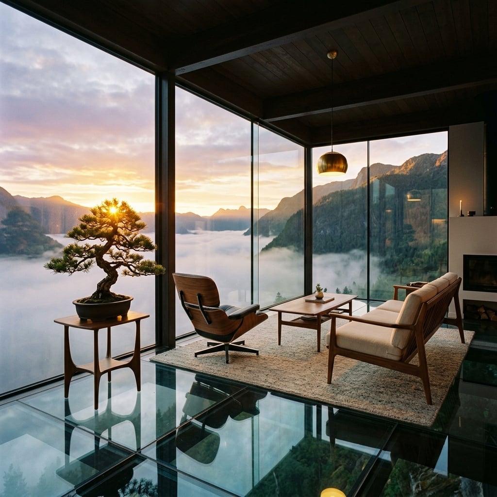
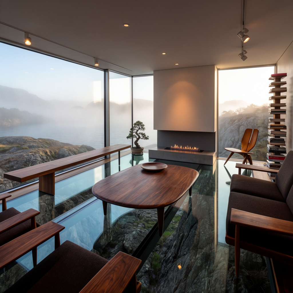
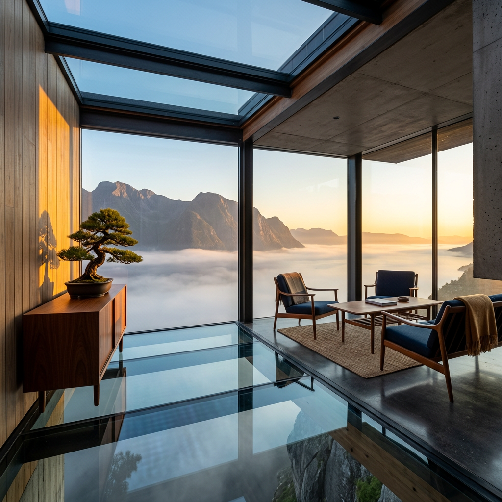
The architectural version of the same split. Krea 2 frames the room like an editorial spread — restrained, controlled, painterly horizon, every detail composed. Nano Banana 2 frames the room like the photographer just walked in — warm window light, lived-in objects, a sky that reads as that moment rather than that mood.
If you’re pitching a concept, the left column. If you’re listing it on Architectural Digest, the right.
A whisky pour, frozen mid-fall
A whisky pour, frozen mid-fall
“A crystal whisky glass mid-pour with three ice cubes frozen in mid-fall, amber liquid suspended in motion, smoke curling on a black marble counter, single warm rim light. Krea 2 on the left, Nano Banana 2 on the right.”
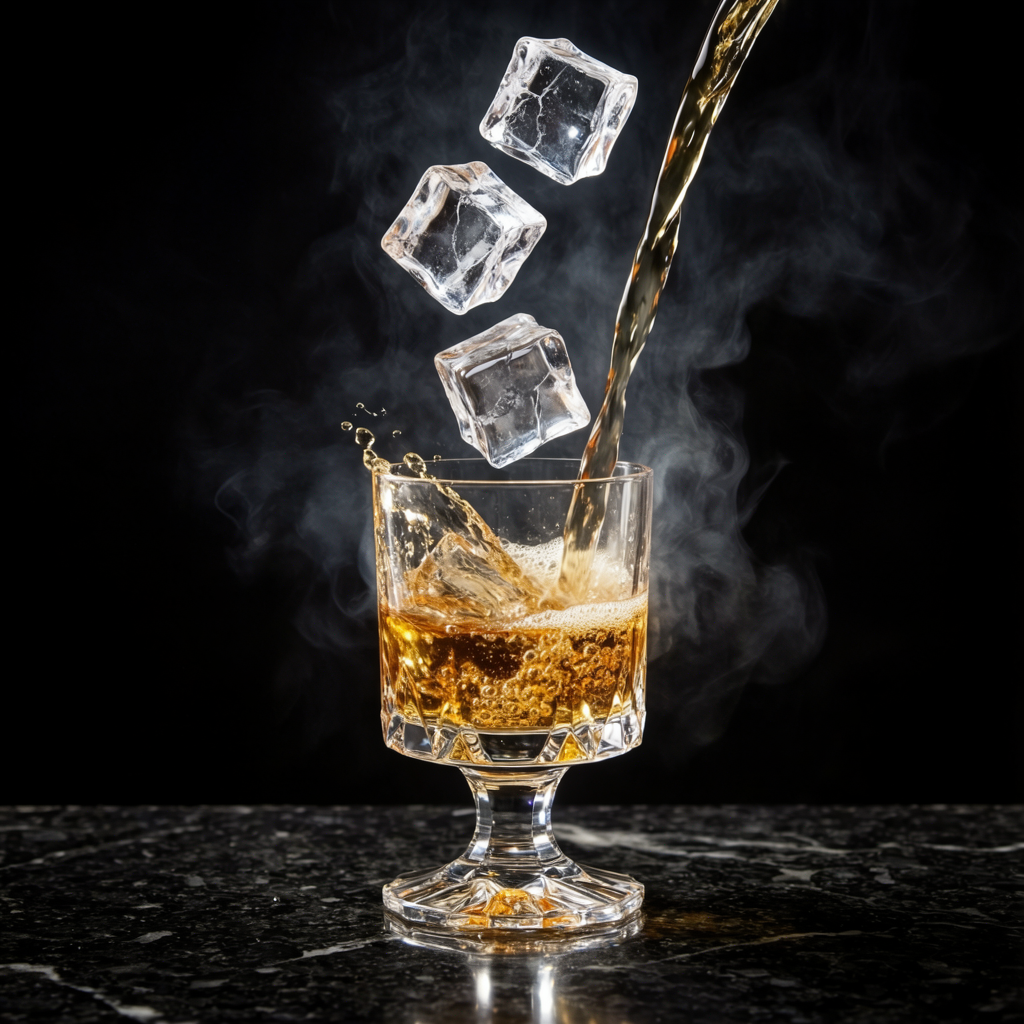
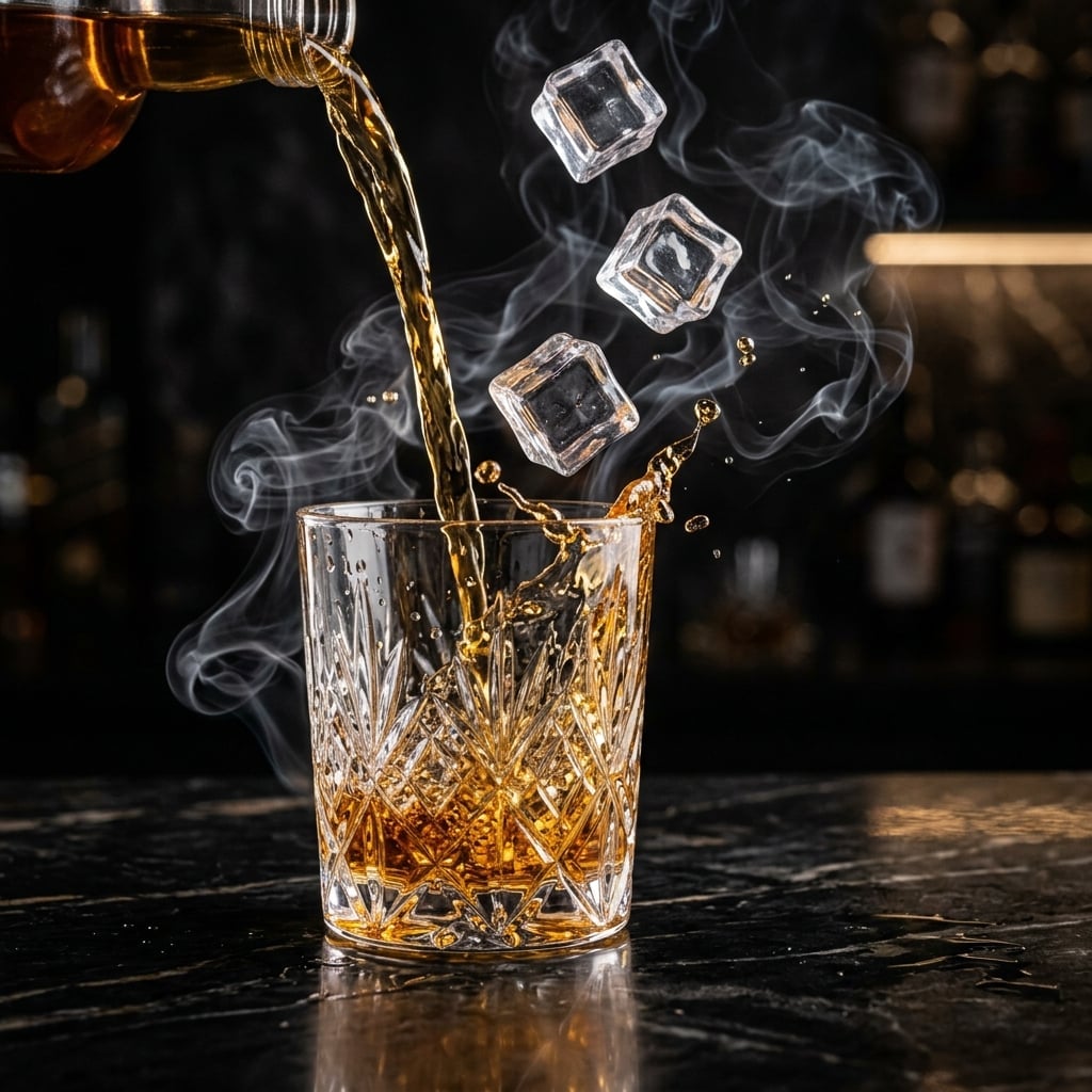
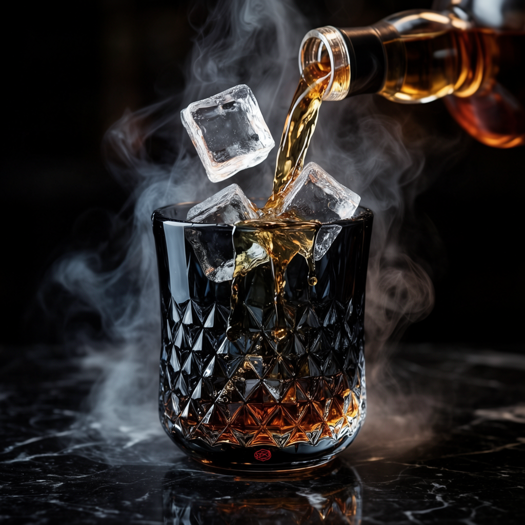
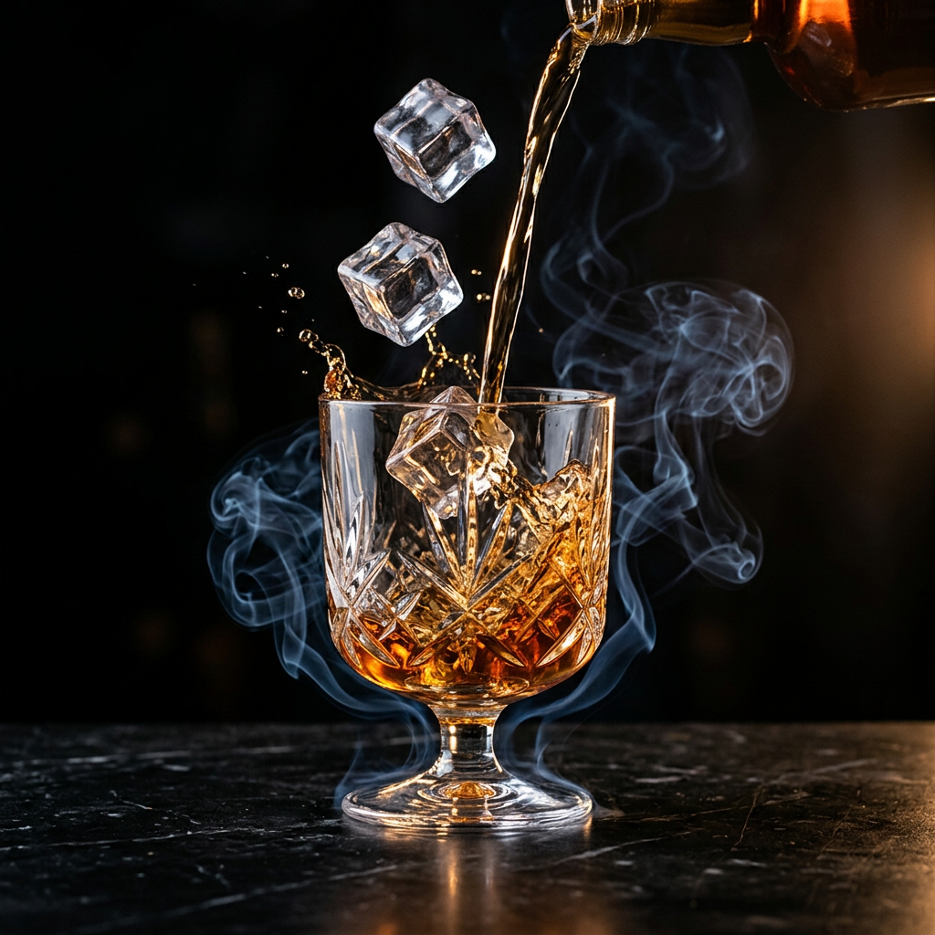
This is the prompt where Nano Banana 2 does its world-building thing. Krea 2 hands back a clean product hero — black background, the subject, a single rim light. Nano Banana 2 keeps wanting to put the glass somewhere: in a bar, behind a bottle, with shelves of liquor receding into the bokeh. The model can’t help filling in the context, and that context is exactly what makes its results read as commercial photography rather than packshots.
Krea 2 is the cleaner choice for a sleek campaign poster. Nano Banana 2 is the one you reach for when the brief includes the word “atmosphere.”
A hummingbird at dawn
A hummingbird at dawn
“An emerald hummingbird hovering inches from a backlit hibiscus, droplets of nectar suspended mid-fall, soft tropical bokeh, dawn light through palm leaves. Krea 2 on the left, Nano Banana 2 on the right.”
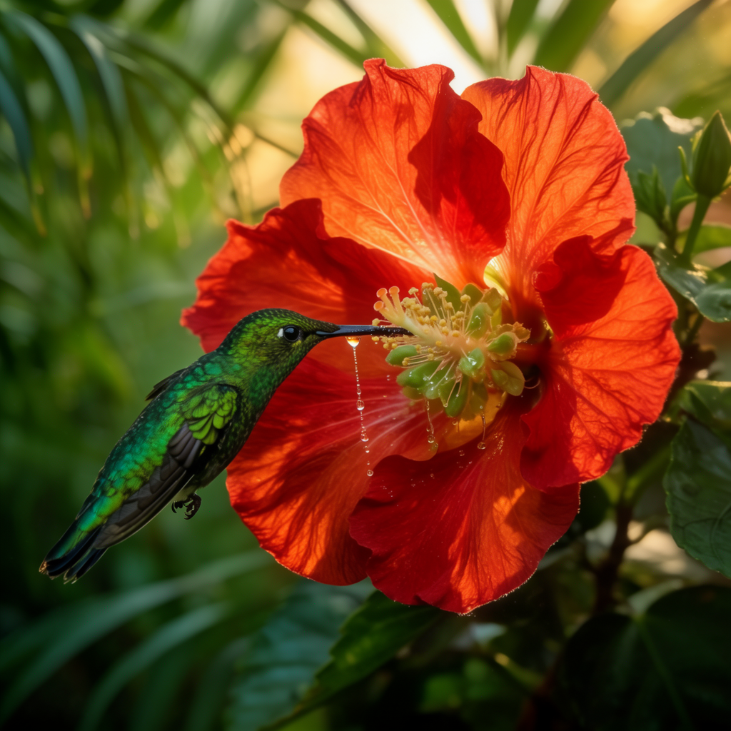
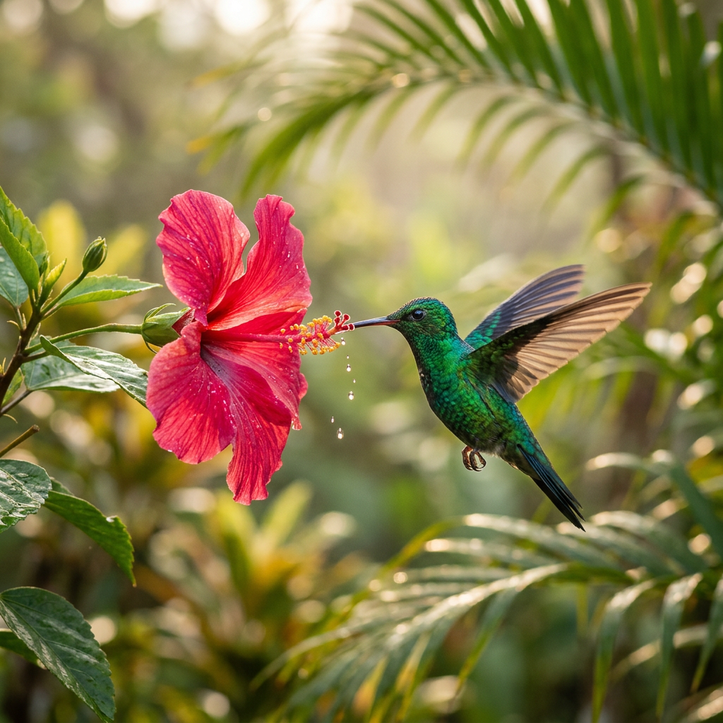
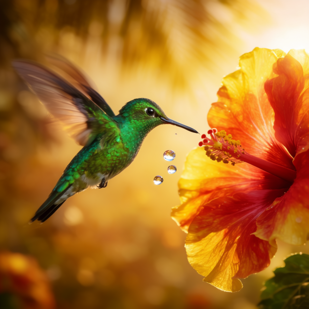
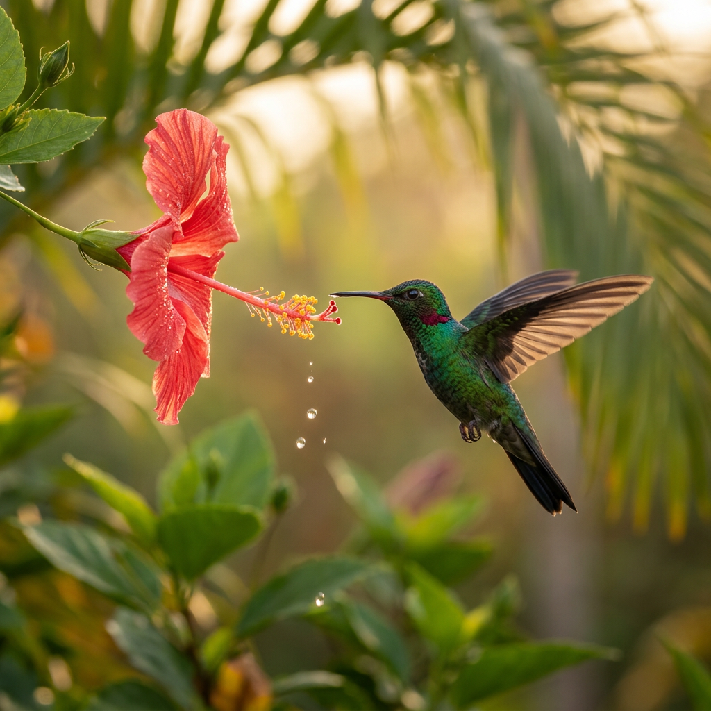
This is the scene where both models look gorgeous, but for different reasons. Krea 2’s frames feel composed — the bird is placed, the background blur is intentional, the color story is unified. Nano Banana 2’s frames feel photographed — there’s a sense of a long lens catching a moment, with the iridescent throat and individual droplets reading as captured rather than designed.
Both are the kind of image you’d ship as a hero. Pick by the verb: design an image, or photograph one.
An anamorphic portrait
An anamorphic portrait
“A cinematic anamorphic portrait of a woman in profile with iridescent gold face paint and intricately braided hair, lit by a single warm sodium streetlamp from the left, cold blue rim from the right, breath fogging in cold night air. Krea 2 on the left, Nano Banana 2 on the right.”
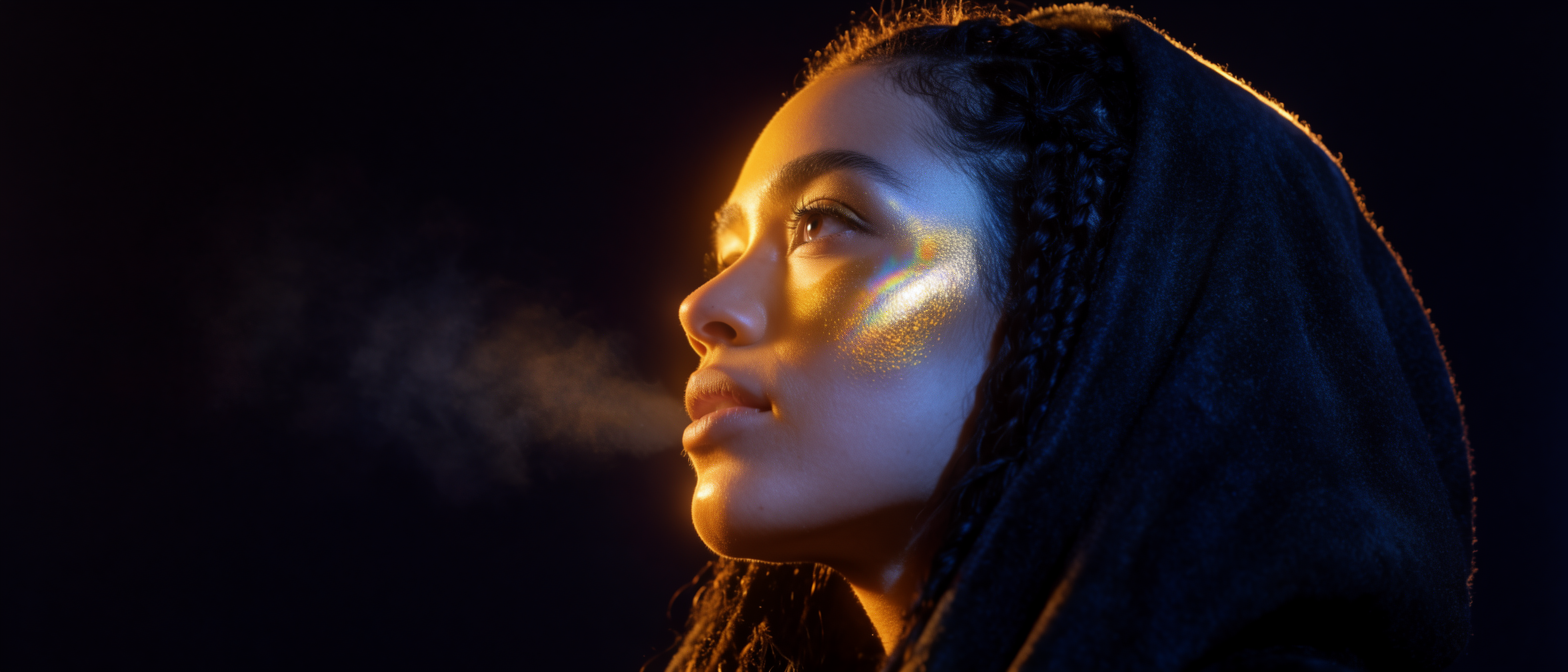
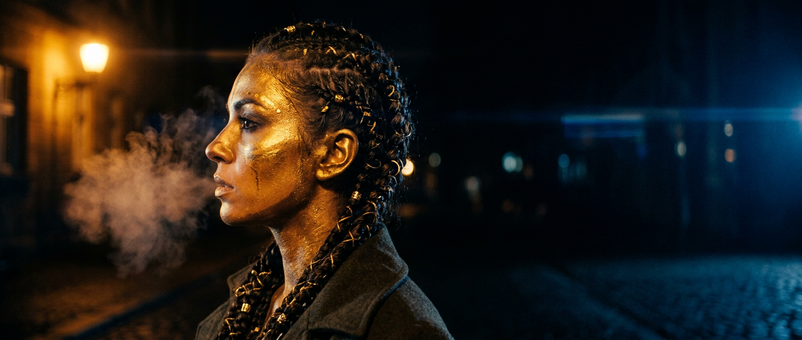
Same brief, two different locations. Krea 2 hears “cinematic portrait” and shoots it in a studio: one face, one cheekbone, one rim light, total control. Nano Banana 2 hears the same brief and shoots it on location: it found a cobblestone street, found a lamp post, found the night, and put her there. The story changes completely depending on which one you hand it to.
So when do you reach for which?
A working split, after a lot of side-by-side runs:
- Krea 2 is the instrument for direction. Reach for it when you care about composition, mood, restraint, taste — when “the image should feel a certain way” matters more than literal accuracy. It also unlocks the rest of the creative-control stack inside Krea: style references for one-shot guidance, moodboards for set-level taste, and LoRAs for a reusable house aesthetic.
- Nano Banana 2 is the instrument for truth on the page. Reach for it when you need a result that could be a real photograph — clean realism, faithful prompt following, surprisingly good text rendering, and that uncanny instinct for inventing the small contextual details (a bar around the whisky, a streetlamp behind the portrait, a real sky over the fjord).
That framing covers most of what we see day to day. The exceptions — like the painterly twist in the lake editorial above, or the studio-vs-street split in the final portrait — are exactly why having both open matters. The same prompt becomes two different briefs depending on which model you hand it to.
Two instruments, one canvas
The reason both live inside Krea is that real creative work bounces between those modes. A typical loop:
- Explore in Krea 2. Sketch the look. Try a few directions. Pull in style references or a moodboard to lock the aesthetic. This is where you decide what kind of image you want to make.
- Lock the hero in Nano Banana 2. Once the direction is clear, re-prompt the same brief in Nano Banana 2 to get the photoreal version. Often this is the final asset; sometimes it is the input for the next step.
- Stay in Krea for everything downstream. Open the result in the Editor to compose or tweak. Send it to the Enhancer for a 4K hero. Drop it into Video to animate the still. Everything stays in one place.
You don’t have to choose. You choose order.
Try both models on the same prompt
Open the Image tool and switch between Krea 2 and Nano Banana 2 in the model picker — same canvas, two instruments.
Open the Image tool