If you’ve ever typed a style name into an image model and gotten something vaguely related but not quite right, you already know the problem: aesthetics are easy to name and hard to direct. I’ve spent years designing assets and creating aesthetic images for brands both with non-AI and AI creative tools. After testing prompt styles across multiple generators, the difference between a weak image and a strong one usually comes down to concrete visual cues, not longer prompts.
In this guide, I’m breaking down 10 style prompts that reliably steer models toward distinct looks from retro web and coquette to film noir and vintage pop graphic. For each one, I’ll show when to use it, what makes it work, and the prompt details that actually help the model lock onto the style. By the end, you’ll have 10 aesthetics you can use immediately and the language to make them land.
Put these aesthetics to work
Paste any style prompt into the Krea image generator and watch the look land on your first pass.
Open Krea ImageHow I Tested These Style Prompts And What Makes Them Work
I tested these prompts the same way I usually test style steering in image tools: one subject, one prompt change at a time, and a close look at where the model drifts. For most of these, I kept the subject stable, then changed only the style language. A portrait, a product, or a still life is enough to see whether the style words are doing real work or just decorating the prompt.
The pattern was consistent. Short prompts with a clear subject and a few hard visual cues worked better than long style paragraphs. OpenAI’s current image guidance says the same thing: name the subject, setting, and style directly, then refine from there. In practice, the model responded best when I gave it texture, lighting, and layout details instead of relying on the style label alone.
A good example is the difference between retro web and retro web with specifics. “Retro web” often wanders. “GeoCities-era homepage composition, brushed chrome UI panels, neon gradients, tiny star GIF accents” usually lands somewhere usable on the first pass. The same thing showed up with film noir, cyanotype, and impasto, where the model needed a physical cue for light, paper, or paint before the style held together.
10 Style Prompts At A Glance
| Style | Best use case | Main visual cues |
|---|---|---|
| Retro web | Early internet nostalgia, album art, social graphics | Retro UI elements, glitch art, chrome buttons, neon gradients, low-res graphics, early internet aesthetic |
| Coquette | Romantic fashion, portraits, beauty editorials | Ribbons, lace, pearls, blush tones, soft light |
| Futurist glam | Editorial sci-fi, luxury fashion, cover art | Chrome and metallic finishes, liquid metal, iridescence, sleek reflections, hyper-glossy |
| Cyber zine | Posters, covers, experimental graphics | Collage, photocopy grain, glitch text, sticker layers, high-contrast monochrome |
| Lo-fi cyanotype | Botanical studies, print-inspired art | Prussian blue, paper texture, contact-print edges, soft focus, ethereal glow |
| Impasto expressionism | Painterly portraits, art prints | Thick paint, palette-knife marks, visible canvas weave, expressive brushstrokes, bold color contrast |
| Expressive marker | Sketchbook pages, character concepts, storyboards | Marker bleed, loose outlines, scribbled shading, hand-drawn feel, expressive cartoon |
| Thermal airbrush | Music art, retro-future posters, dreamy portraits | Soft gradients, heat-map colors, glow, haze, thermal imaging style, heavy film grain |
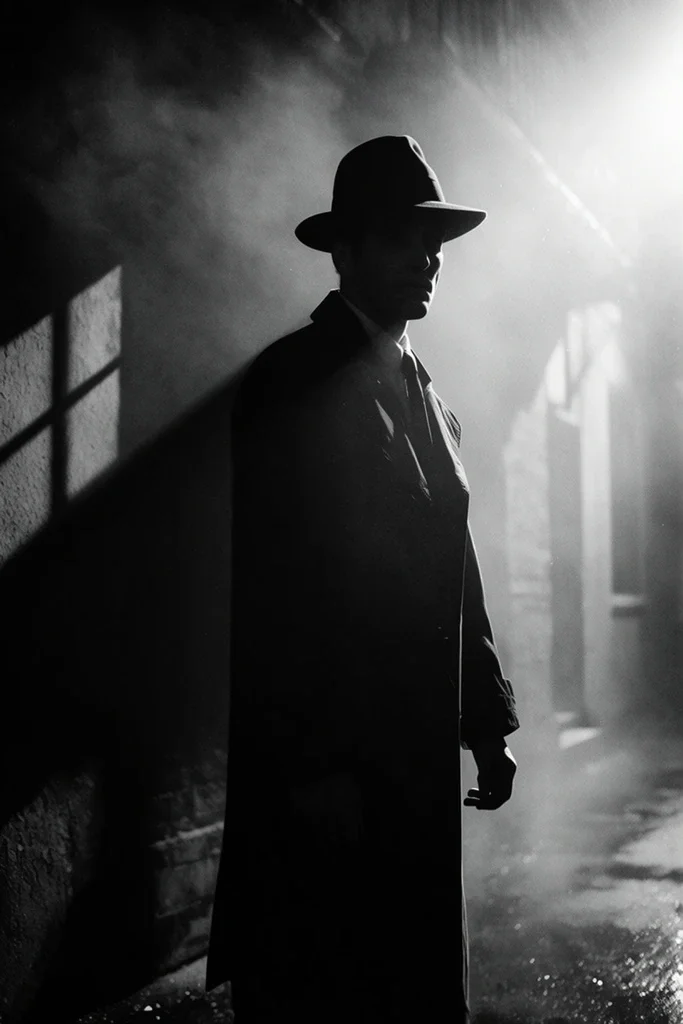
| Film noir | Suspense scenes, cinematic portraits | Black and white, hard shadows, smoke, wet streets, high contrast silhouette, moody atmospheric haze |
| Vintage pop graphic | Posters, tees, ads, editorial covers | Halftone dots, bold outlines, flat color blocks, 2D graphic cartoon, saturated colors |
Retro Web
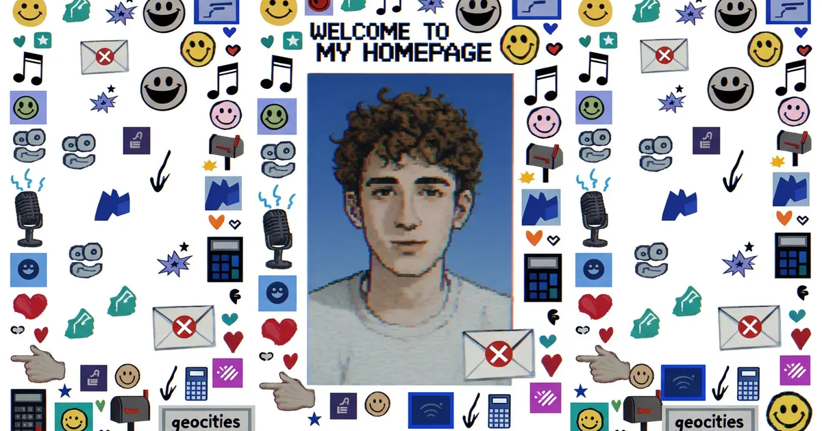
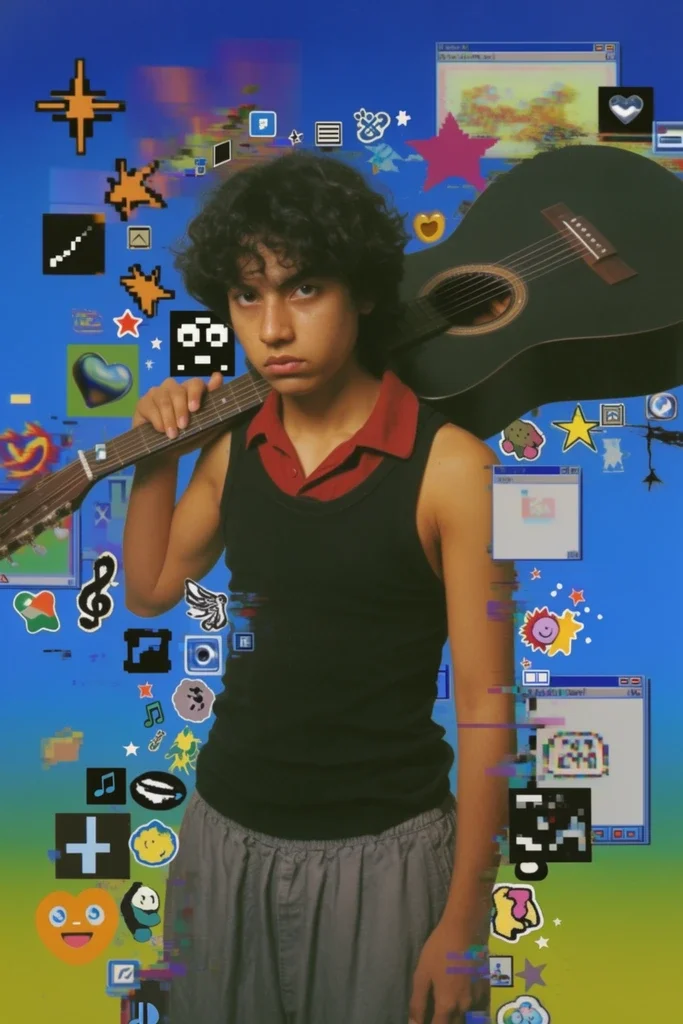
Retro web works when the image should feel like a late-1990s or early-2000s browser page. It is useful for thumbnails, zines, album art, and mock homepage graphics. The prompt needs dated web markers, or the model usually slides into generic digital style.
The cues that held up best in testing were browser chrome, tiny iconography, and awkward layout details. “GeoCities-era homepage composition,” “brushed chrome buttons,” and “tiny star GIF accents” did more than simply saying retro web. I also had better results when I asked for low-resolution graphics and early-2000s internet nostalgia instead of leaving the era vague. A test image with a browser-window frame around a portrait usually tells the story fast. If the chrome bars look slightly clunky and the layout feels handmade, the prompt is doing the work.
Portrait of a musician in a GeoCities-era homepage composition, brushed chrome UI panels, neon gradients, tiny star GIF accents, low-res web graphics, early-2000s internet nostalgia, clean subject separation.
Coquette
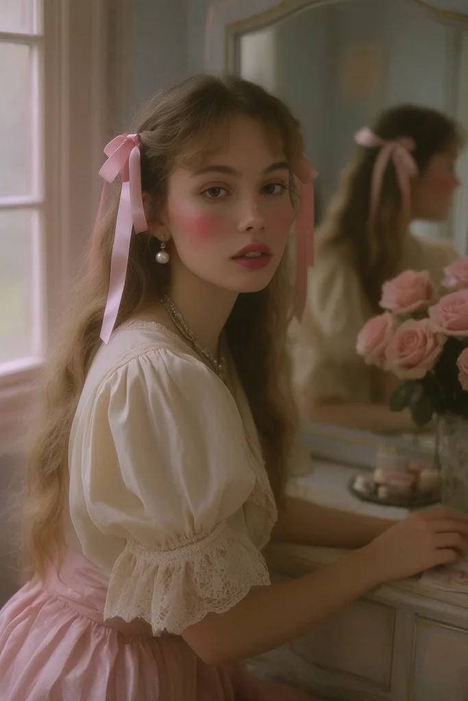
Coquette is one of the easier styles to steer because it depends on concrete objects: ribbons, lace, pearls, bows, blush tones, and soft fabric. The prompt works best when it describes materials instead of just mood. A model can fake pretty, but it needs help with trim, color, and surface detail.
In practice, this style is useful for beauty shots, portraits, vanity scenes, and fashion layouts. It gets weaker when the subject is too plain. A white shirt and a neutral background are not enough. Satin ribbons, lace trim, and pearl jewelry give the model something specific to build around. In one test pass, the image snapped into place once I added “vintage vanity” and “soft window light.” Without those, the result stayed too broad.
A young woman at a vanity, coquette aesthetic, satin ribbons in her hair, lace-trim blouse, pearl jewelry, blush pink and cream palette, soft window light, delicate romantic styling, editorial composition.
Futurist Glam
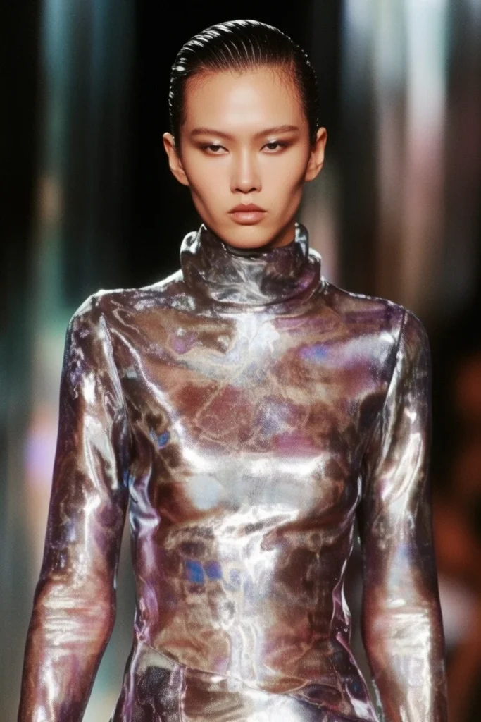
Futurist glam is useful when the image needs polish without drifting into full cyberpunk. The prompt blends luxury cues and futuristic surfaces. Think chrome, liquid metal fabric, iridescent highlights, and sharp tailoring. The image should feel styled, not just sci-fi.
This works well for editorial portraits and fashion concepts because it gives the model two anchors at once: a runway-like figure and reflective surfaces. In testing, the strongest outputs came from specifying the kind of reflection, not just asking for shine. “Ultra-clean reflections” and “sleek futuristic skyline” make the direction more concrete. A runway model in liquid-metal couture against chrome architecture gave cleaner results than a loose “futuristic fashion” prompt, which tended to drift toward generic space imagery.
Futurist glam portrait, runway model in liquid-metal couture, chrome architecture, iridescent highlights, sleek hair, high-contrast studio lighting, luxury editorial mood, ultra-clean reflections.
Cyber Zine
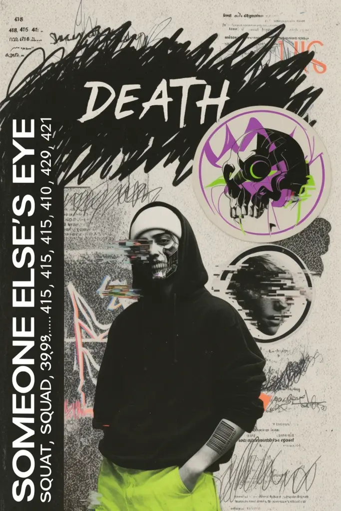
Cyber zine is built for collage, photocopy texture, and rough editorial layouts. It is the right prompt when the image should look assembled by hand, not rendered smoothly. I use it for poster concepts, cover art, and social assets that need a cut-and-paste feel.
The most reliable cues were photocopy grain, glitch typography, sticker overlays, and scribbled notes — the same display-lettering territory our free font guide covers. Those terms push the model toward layered surfaces and away from clean digital polish. If the result looks too neat, add “photocopy grain” or “cut-and-paste collage” before you add more style words. A test cover with one cyborg figure and a messy border treatment usually makes the point quickly.
Cyber zine cover, cut-and-paste collage of a streetwear cyborg, photocopy grain, glitch typography, sticker overlays, scribbled notes, neon purple and acid green accents, gritty DIY magazine layout.
Lo-Fi Cyanotype
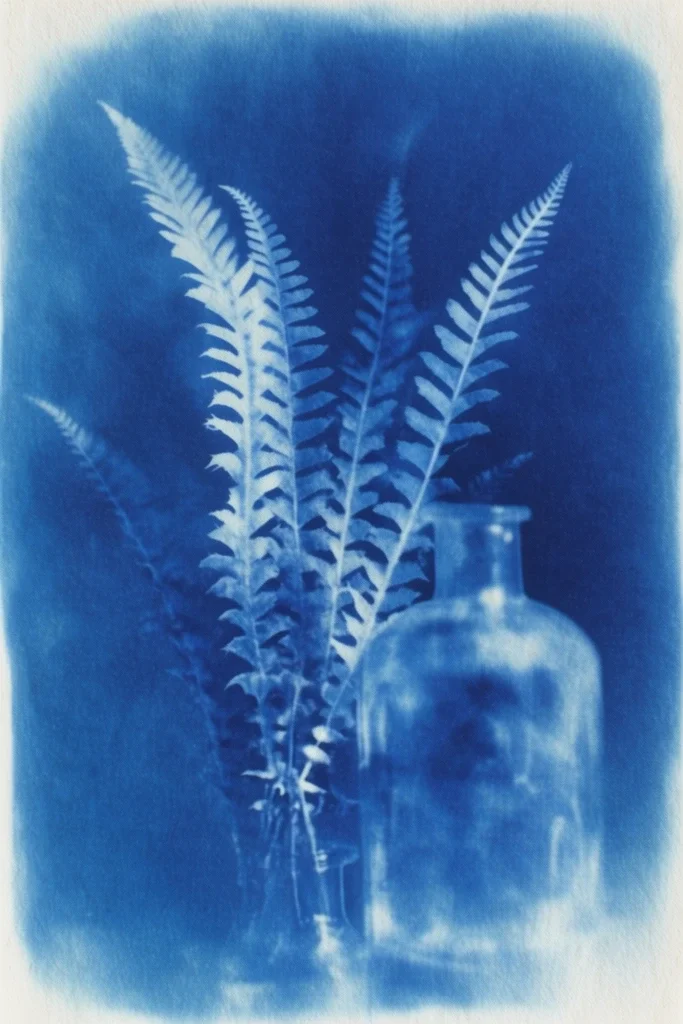
Lo-fi cyanotype is one of the most specific styles on this list, and that specificity helps. Cyanotype is a historic blue-toned photographic process, so the prompt benefits from process language. Paper texture, chemical staining, and soft silhouette edges matter more than decorative detail.
This style is useful for botanical studies, still lifes, and quiet objects. It works less well if the subject is crowded or overly colorful. The image usually improves when you ask for one or two subjects with a clear shape, then give the model the print process to imitate. In testing, a fern and glass bottle held the look better than a full table scene, which started to lose the handmade edge.
Lo-fi cyanotype of fern fronds and a glass bottle, Prussian blue monochrome, paper fiber texture, contact-print look, uneven exposure, handmade sun-print aesthetic, soft vignette.
Impasto Expressionism
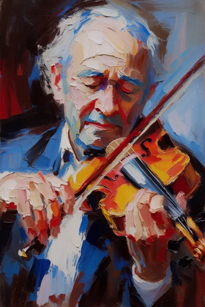
Impasto expressionism works when you want the surface of the image to matter as much as the subject. Impasto means paint laid on thick enough to show brush or knife marks, and in image prompts that translates to visible texture, thick paint ridges, and a composition that still reads clearly after the model starts piling on pigment.
I found this prompt most reliable with portraits and simple scenes. If you add too many objects, the texture can swallow the whole frame. Keep the subject clear, then tell the model to build the image with thick paint and obvious brushwork. A violinist, a face, or a single figure under angled light usually gives the brushwork room to show without losing the subject.
Impasto expressionist portrait of an elderly violinist, thick oil paint, palette-knife ridges, visible canvas texture, dramatic color contrasts, emotionally charged brushwork, painterly realism.
Expressive Marker
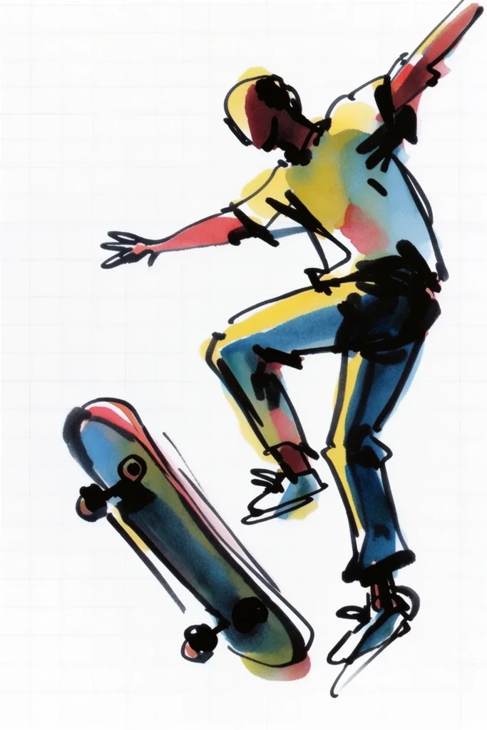
Expressive marker is easy to control because marker lines have obvious traits: bleed, uneven fills, and sketchy movement. It works well for storyboard frames, character concepts, and illustrated notes. I usually reach for it when I want the output to feel fast and hand-drawn.
The prompt needs line language. Without “bold black outlines” or “visible sketch lines,” the model may smooth everything into a cleaner digital illustration. Notebook paper, scribbled shading, and hand-lettered labels help keep it grounded in the right visual register. In testing, a skateboarder mid-jump made a better marker sample than a still portrait because the motion gave the lines something to do.
Expressive marker illustration of a skateboarder mid-jump, bold black outlines, colored marker fills, slight bleed at edges, energetic sketch lines, notebook-paper background, spontaneous hand-drawn look.
Thermal Airbrush
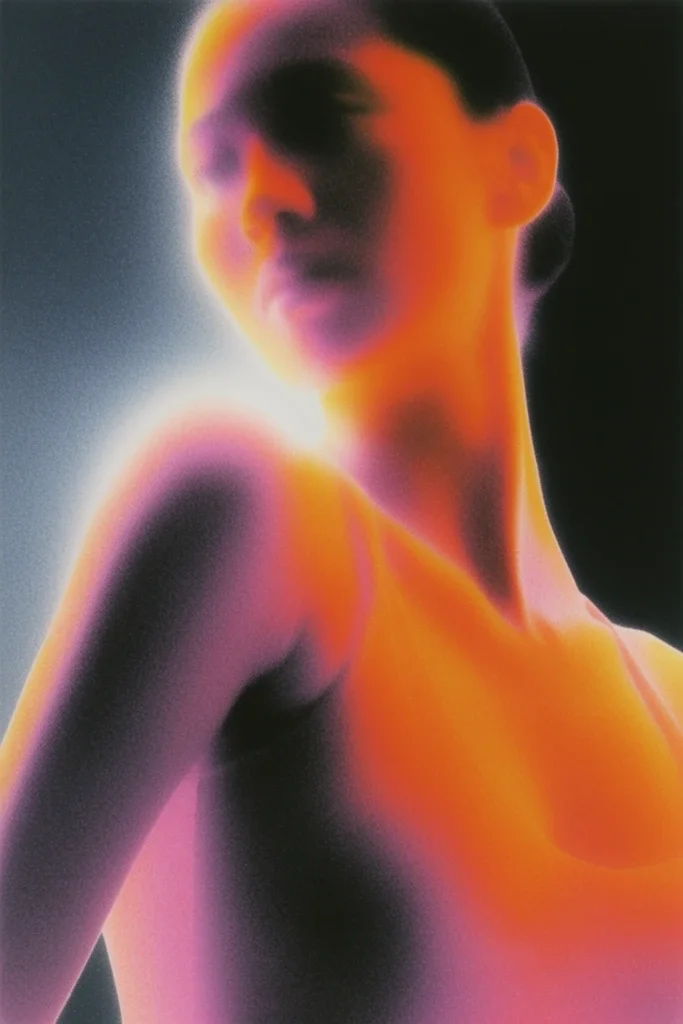
Thermal airbrush is useful when you want glow, softness, and heat-map color without losing form. It sits somewhere between retro poster art and dreamlike portraiture. The prompt works best with gradients and color temperature language rather than vague words like atmospheric.
The strongest results came from pairing a subject with one or two color-shift cues. “Infrared-inspired magenta and orange glow” gives the model a direction it can actually use. “Feathered edges” also helps keep the image from turning hard-edged or metallic. A dancer under stage lights is a good test subject because the color bloom can wrap around the body without collapsing the silhouette.
Thermal airbrush portrait of a dancer under stage lights, smooth gradient shading, infrared-inspired magenta and orange glow, soft atmospheric haze, glossy poster finish, high contrast but feathered edges.
Film Noir
Film noir is one of the most dependable prompts if the goal is mood through lighting. The style depends on black-and-white contrast, hard shadows, smoke, and wet streets. It gives the model a clear cinematic structure, which is why it often behaves better than vague dark cinematic prompts.
This style improves when the lighting is described as a physical setup. Venetian blinds, rim light, and rain-slick pavement matter because they tell the model where the shadows come from. That makes the image feel directed rather than simply desaturated. A lone detective in an alley is the straightforward test here. If the shadows fall in the right places and the highlights stay narrow, the prompt is working.
Film noir detective in a smoke-filled alley, high-contrast black and white, venetian blind shadows, rain-slick pavement, hard rim light, tense cinematic framing.
Vintage Pop Graphic
Vintage pop graphic is the prompt I use for poster work that needs to read fast, the same territory our poster design guide covers in more depth. It relies on bold outlines, flat colors, halftone dots, and screen-print texture. The style gives the model a specific production method to imitate, which usually helps more than asking for generic pop art.
The best prompts keep the composition simple. One subject, a limited palette, and a few print cues are enough. If the image gets too complex, the halftone texture starts to break down. A soda bottle, a face, or a single product shot usually works better than a crowded scene. In testing, a centered figure on a flat background gave the cleanest print feel.
Vintage pop graphic of a woman holding a soda bottle, flat red-blue-yellow palette, bold black outlines, halftone dots, screen-print texture, mid-century poster composition, energetic and iconic.

How To Tighten Any Style Prompt In Krea
The cleanest workflow is simple: write the style prompt, generate a first pass, then use a reference image or edit tool to correct what drifted. That is usually enough for the styles above.
For styles like film noir, lo-fi cyanotype, or impasto expressionism, I would keep the prompt short and let the reference do the heavy lifting. For looser looks like futurist glam or thermal airbrush, a reference can lock the palette and finish faster than another paragraph of adjectives — the same reference-image trick behind turning a real QR code into branded, on-brand artwork.
If the output keeps missing the style, reduce the prompt to the few visual details that matter most, then use a reference image to carry the rest.
Krea also provides moodboards with these styles directly baked in so you can immediately start generating images with these aesthetics. The moodboard presets guide the generation to recreate the look, feel, and aesthetic you want. Under each moodboard is also a presentation of previous generations, providing a huge, actually useful inspiration bank for all your creative explorations.
FAQ
Frequently asked questions
What makes a style prompt work better than just naming an aesthetic?
Should style prompts be long?
Can I combine two style prompts in one image?
How do I keep a model from drifting away from the style?
Which of these styles is easiest for beginners?
Can Krea help with style prompts?
Explore style prompts in Krea
Use style references, moodboards, and generative sliders to lock any aesthetic and iterate fast.
Try Krea Image