A palette prompt loses control when color words arrive as a late detail instead of governing the frame. Models can treat colors buried at the end as attributes of one object, while a third named hue often muddies a composition by dividing its color budget three ways. Starting with two color names gives the image a clear constraint before the subject adds detail.
Choose a two-color relationship according to the visual job the image must perform. Image type determines the useful color relationship: a forest river calls for the calm continuity of neighboring hues; a poster-like botanical calls for contrast that survives a small crop; a product still life calls for a designed pastel opposition. Choosing the relationship for that job makes the palette actionable.
The mood of an AI image comes from the kind of relationship between its two named colors, so keeping that relationship intact while swapping the subject makes each palette reusable. These five combinations move from analogous calm and near-complementary graphic contrast to soft botanical light and two distinct forms of complementary color.
How These Palettes Were Selected
A useful prompt palette needs a defined color relationship, a specific aesthetic outcome, and a formula that preserves both when its subject changes. Each pairing was generated in Krea with Krea 2 (Medium), which returns a set of variations per prompt, alongside a prompt that puts the palette before the subject and names the light or compositional treatment it requires. That gives you a way to choose by mood, inspect the pairing’s range, and reproduce its central constraint without treating the collection as a color-theory ranking.
Test these palettes in Krea
Open the Krea image generator, paste a palette prompt, and get a set of variations back.
Open Krea ImageAt a Glance
| # | Palette | Best for | Control that matters |
|---|---|---|---|
| 1 | Lake Blue + Forest Green | Calm aquatic nature scenes | Dappled light through water and leaves |
| 2 | Goose Yellow + Klein Blue | Graphic editorial and poster compositions | Name Klein blue specifically |
| 3 | Willow Green + Peach Pink | Airy spring botanical scenes | Soft directional backlight |
| 4 | Violet Purple + Sunset Orange | Deep, cinematic dusk scenes | A glowing horizon or low-sun direction |
| 5 | Mint Green + Coral Pink | Product, still-life, and surface work | Clean studio light and crisp shadows |
From Harmony to Graphic Contrast
1. Lake Blue + Forest Green - Best for calm aquatic nature
Lake blue and forest green make a forgiving nature palette because analogous hues create calm without an opposing color competing for attention. The pairing runs from blue into green and produces a biophilic, ethereal nature aesthetic with an aquatic-dreamscape feel.
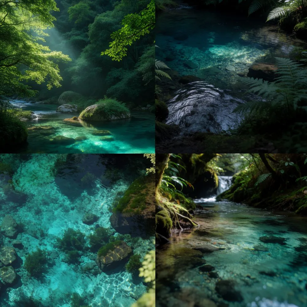
Water-filtered light gives this relationship enough variation to hold several natural scenes together. Across a sunlit forest river, dark fern pool, and overhead turquoise shallow bed, water-filtered light maintains the shared luminous palette. If the model drifts, it usually lands on a neighboring green or blue, so the composition remains coherent. Organic subjects develop tonal range through crystalline water and light filtered through vegetation.
Prompt:
Photorealistic cinematic photograph of a secluded deep turquoise pool hidden inside a lush temperate forest, viewed slightly downward from the shaded riverbank, transparent blue-green water revealing stones and subtle underwater texture, ferns and dense leafy plants framing the foreground, dark mossy banks surrounding the water, soft patches of sunlight illuminating the center of the pool, peaceful mysterious atmosphere, saturated emerald greens and cool cyan water, natural shadows, highly detailed botanical textures, premium landscape photography, no people, square compositionVariation tips: River subject. Fern-filled pool. Overhead shallow water.
2. Goose Yellow + Klein Blue - Best for graphic editorial impact
For a subject that must separate instantly from its background, goose yellow and Klein blue create the strongest contrast in this collection. The pair creates bold graphic contrast: Bauhaus color studies, modernist blocks of color, and pop-art magazine layouts use similarly saturated opposition. Reach for this pairing when immediate readability matters more than naturalistic color.
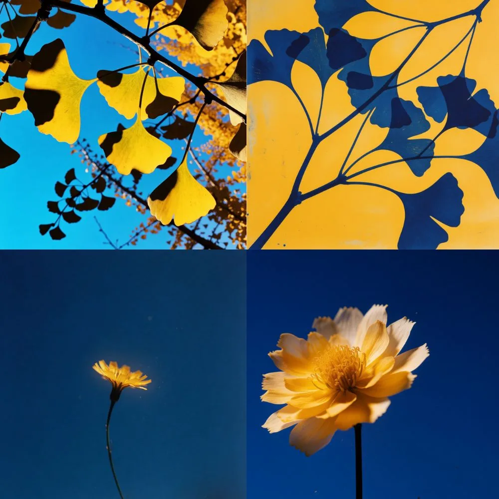
Flatness is the intended treatment here. The generations include backlit ginkgo leaves against a bright sky, an inverted blue-on-yellow botanical print, and flowers isolated on deep blue; the contrast remains legible in thumbnails, compressed files, and small crops. Klein blue names a specific deep ultramarine, while sky blue produces a different aesthetic. Preserve the precise color name and color-blocking language when you want an editorial poster rather than a photograph.
Prompt:
Experimental botanical art composition of branching stems and overlapping ginkgo leaves rendered in deep saturated Klein blue over a flat luminous golden-yellow background, intricate organic branch silhouettes crossing diagonally through the frame, translucent leaf textures layered over solid graphic shapes, bold complementary color blocking, modernist printmaking aesthetic, subtle screenprint texture and imperfect ink grain, sophisticated editorial poster design, only Klein blue and vivid yellow with tiny tonal variations, no text, square compositionVariation tips: Ginkgo leaves. Inverted botanical print. Single flower on blue.
From Soft Spring Light to Complementary Energy
3. Willow Green + Peach Pink - Best for airy pastoral scenes
Willow green and peach pink create pastoral romance by keeping two light, desaturated botanical colors at low contrast. Both sit in the top third of the value range, which gives flowers, grass, and garden details a spring-romantic, cottagecore feel.
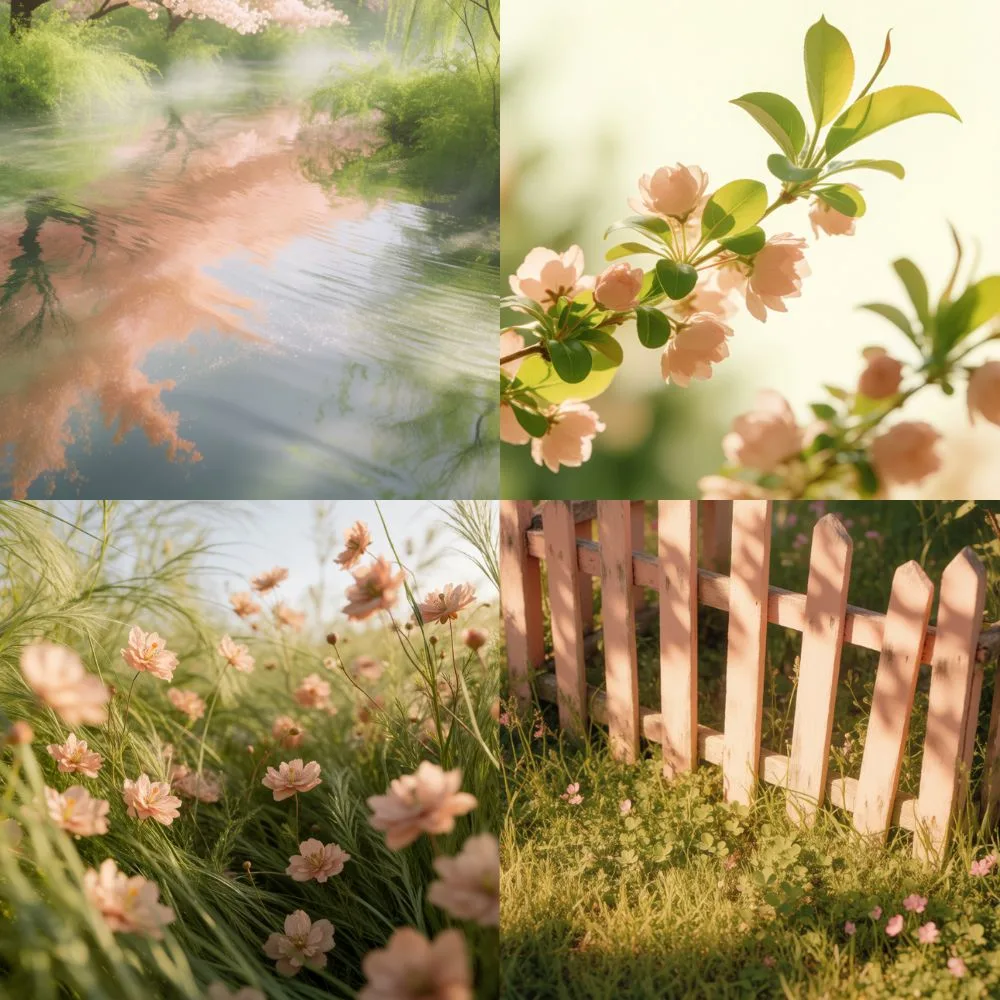
Light protects the distinction between these pale hues. Soft directional light appears across the generations: blossom reflected in still water, a backlit peach-blossom branch, and a sunlit peach fence. Hard light or night can collapse the pairing to grey because neither color has enough contrast to carry the frame alone. Ask for hazy backlight and gentle depth of field to keep the elevated value range delicate rather than washed out.
Prompt:
Photorealistic low-angle photograph of a lush willow-green meadow scattered densely with soft peach-pink wildflowers, blossoms at different heights creating layers through the foreground and background, warm afternoon sunlight passing through delicate petals and fresh leaves, slight natural breeze, dreamy shallow depth of field, vibrant but soft spring colors, pastoral romantic atmosphere, luminous greens and blush-peach highlights, premium countryside editorial photography, no people, no buildings, square compositionVariation tips: Blossom reflection. Cosmos meadow. Peach-painted garden detail.
4. Violet Purple + Sunset Orange - Best for cinematic dusk depth
Violet purple and sunset orange create depth quickly because their warm-cool complementary relationship makes orange read as the light source. The colors split across the value range, producing a psychedelic, retro-futurist, surreal-dusk mood.
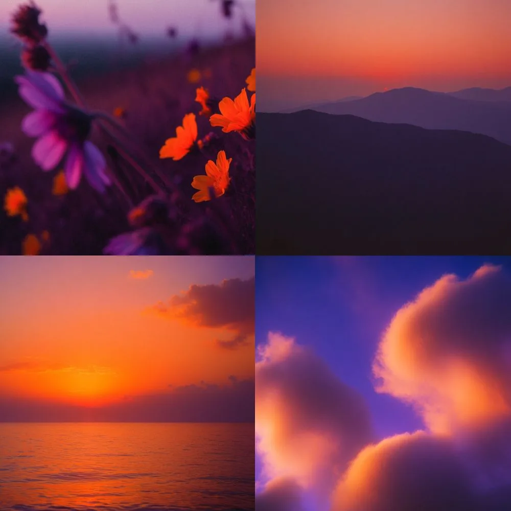
A low sun solves the depth problem before you add a separate instruction for recession. The setting light keeps foreground, middle distance, and horizon distinct. Orange supplies an implied direction of light, which gives the scene spatial structure instead of a flat field of saturated color. Keep glowing-horizon and atmospheric-haze language when the subject needs a cinematic sense of distance.
Prompt:
Cinematic landscape photograph of distant mountain ridges layered in deep violet and indigo silhouettes beneath a glowing sunset-orange sky, warm coral haze settling between the mountain layers, soft atmospheric perspective, tiny orange sun disappearing behind the horizon, bold complementary violet-and-orange palette, slightly surreal color grading, subtle film grain, dreamy retro travel photography, peaceful expansive composition, no people, no buildings, square compositionVariation tips: Wildflowers at last light. Layered mountains. Waterline sunset.
5. Mint Green + Coral Pink - Best for designed still life and surfaces
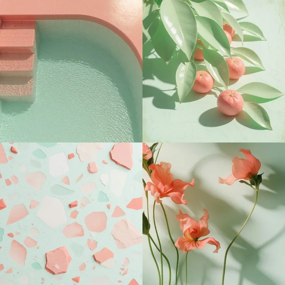
Mint green and coral pink soften complementary opposition into a candy-colored treatment for objects and materials. The pairing uses the same basic opposition as violet purple and sunset orange, then lifts and desaturates it into retro pastel, Y2K, kawaii color. Use it for controlled still lifes and surfaces rather than subjects that need a natural landscape mood.
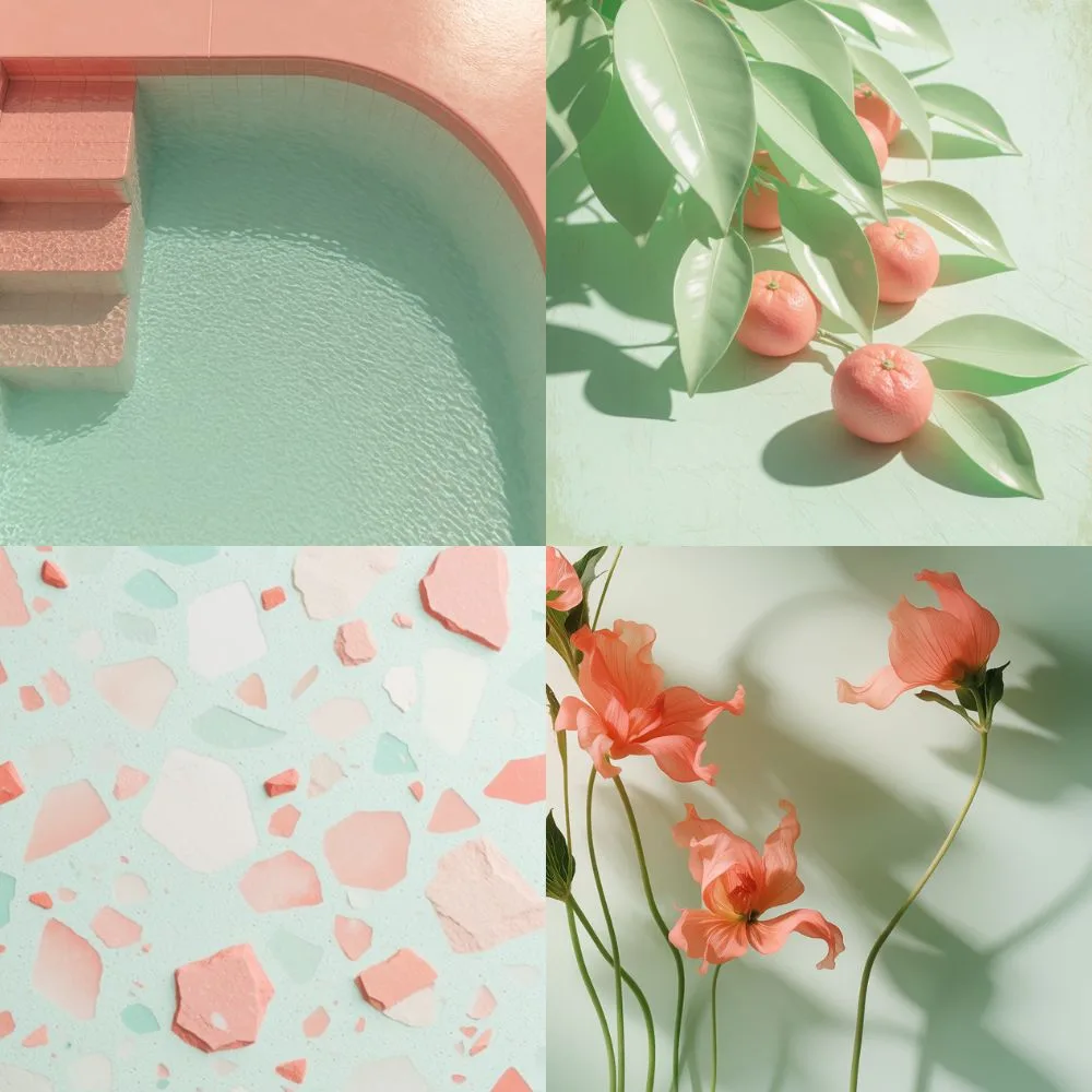
Studio-like subjects give this palette its designed quality. The generations stage the palette in three studio setups: a coral pool edge against mint water, coral fruit on mint leaves, and terrazzo surfaces with coral poppies casting shadows on mint. Terrazzo, tile, and studio shadow suit the relationship because clean planes let the pastel opposition remain intentional. Treat clean light and crisp shadows as part of the palette instruction, especially for a product or material.
Prompt:
Stylized editorial still-life photograph of glossy mint-green leaves surrounding several small coral-pink citrus fruits, arranged organically across a pale mint surface, warm sunlight casting crisp overlapping leaf shadows, juicy translucent fruit texture, playful unexpected color treatment while retaining realistic photographic detail, fresh tropical mood, pastel mint and coral-pink palette, subtle vintage print quality, no people, no text, square compositionVariation tips: Terrazzo surface. Coral fruit. Tile-and-shadow still life.
How to Reuse These Prompts
Keep the palette phrase fixed and change only the subject when testing these formulas. Put the palette first and the subject second, so color steers the whole frame. Keep each light treatment fixed during subject tests: use backlight for willow and peach, low sun for violet and orange, and flat studio light for mint and coral. Changing the subject tests whether the palette relationship carries the mood across a flower, garment, or room.
Try These Palettes in Krea
Every image on this page came out of Krea 2, and each prompt returns a set of variations rather than a single frame, so one palette gives you several compositions to choose between.
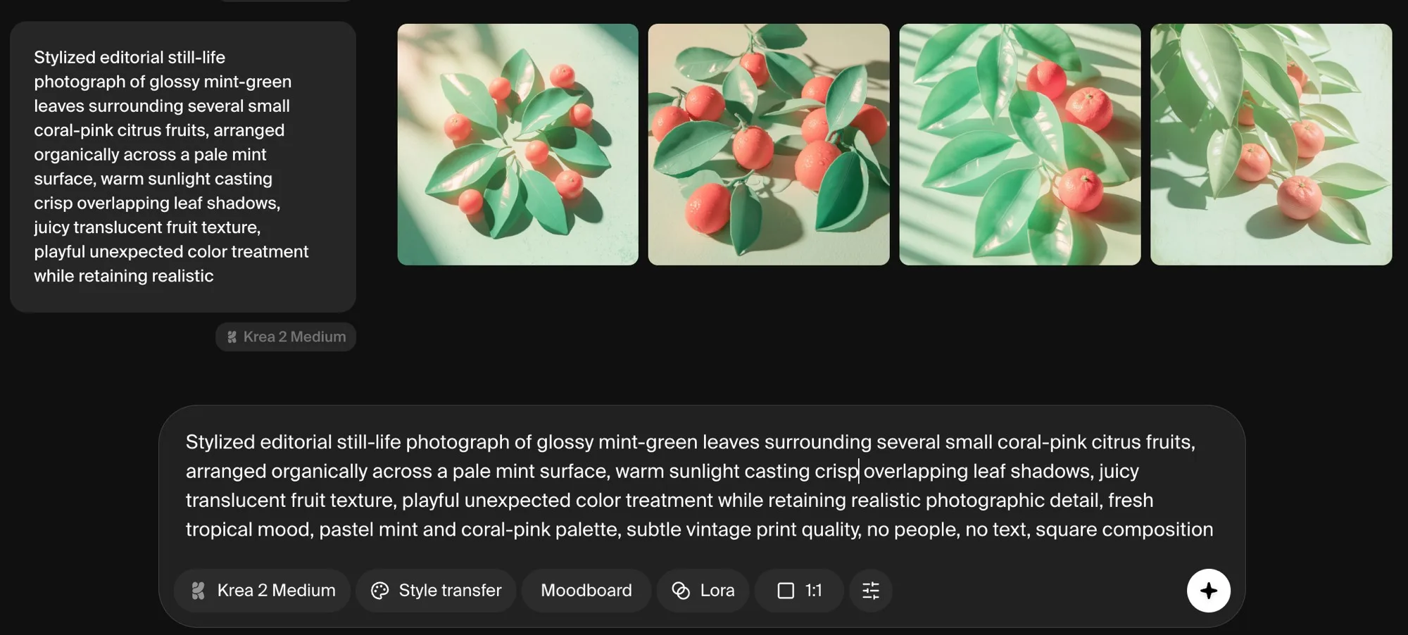
Open Krea Image, pick Krea 2 Medium, paste one of the prompts above, and change only the subject. Keeping the color words and the light description intact is what carries a palette from a meadow to a perfume bottle.
Make a palette your own
Swap one subject into any prompt above and generate it now with Krea 2.
Generate images