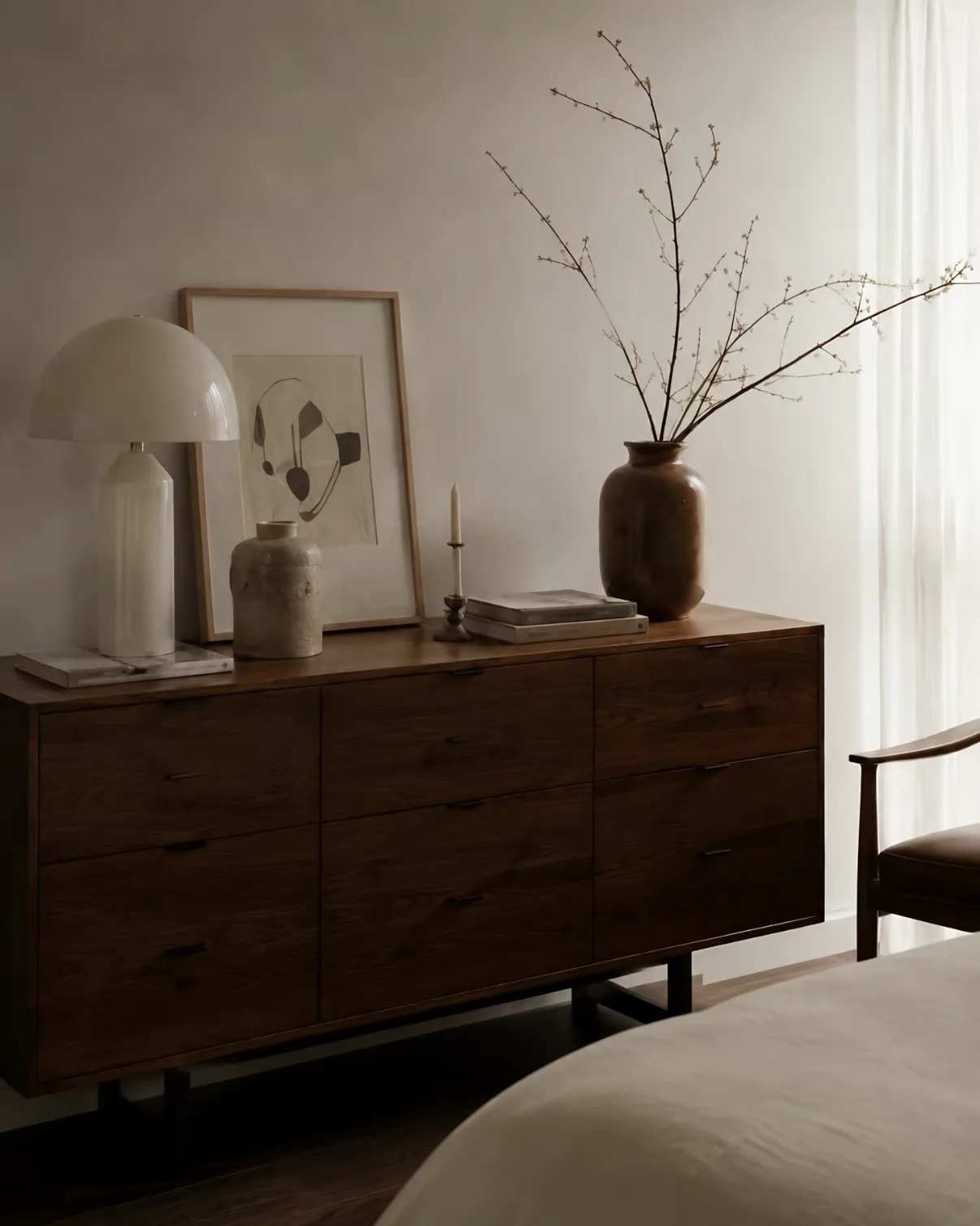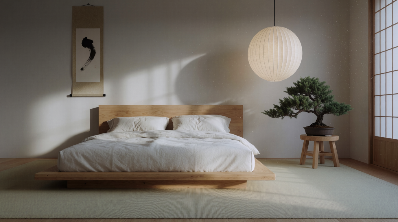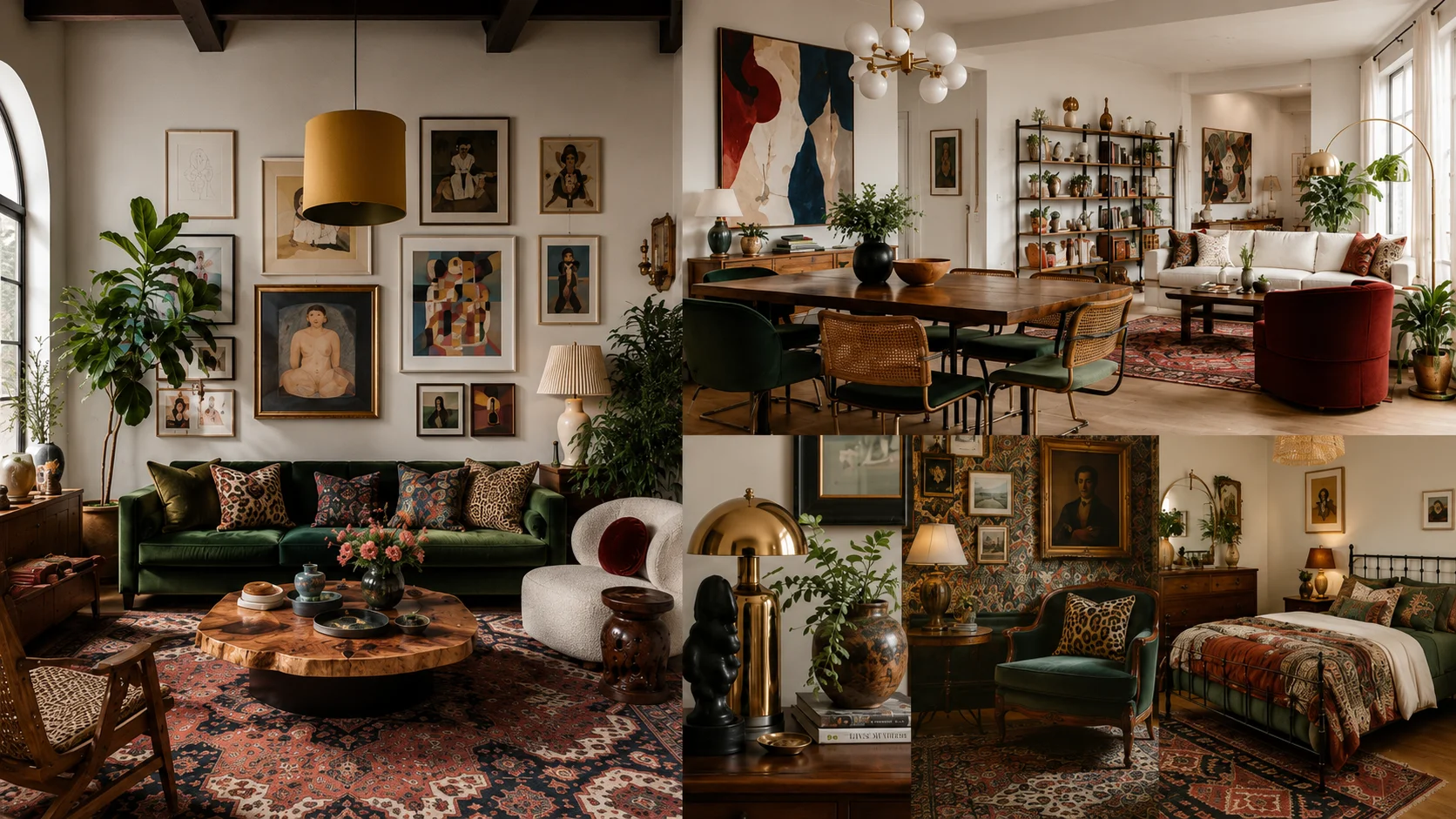
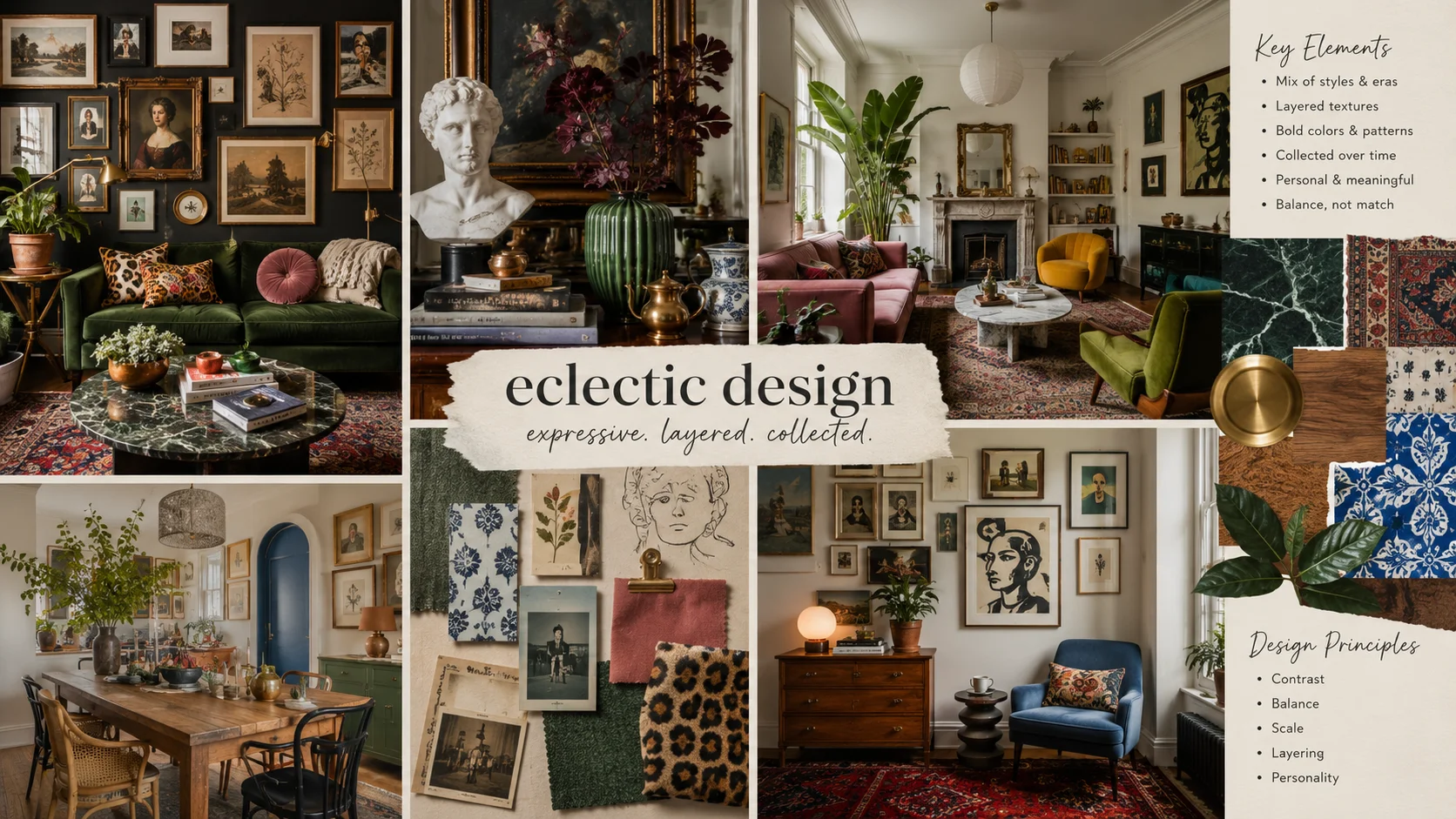
Eclectic design is a melting pot that turns contrast from different periods, materials, and colors into a curated character. The style rewards confidence and mastery over design themes and motifs. Ensuring the various components come together into one theme is crucial to making a good design.
In this article, we show how we can use generative AI, and especially generative models on Krea to experiment with AI for eclectic interior design.
1. A Dominant Color Anchor
Give mixed furniture and decor one dominant color field before asking them to share a room. Use 60% dominant color on walls and major furniture, 30% secondary color in rugs and curtains, and 10% in accents. A terracotta wall and cream sofa can establish the baseline before you introduce walnut, brass, or a patterned vintage chair.
That baseline makes differences easier to read. The chair no longer looks like an isolated find because its warm wood relates to the wall, while deep-green cushions can pull brass accents and foliage into the same color family.
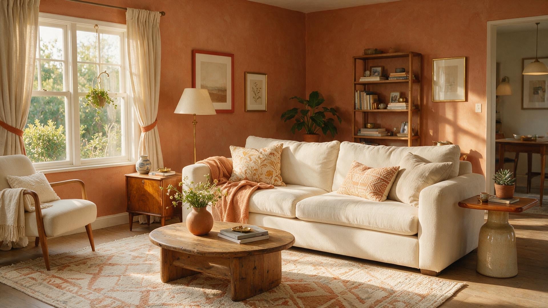
Write that relationship into an AI prompt rather than expecting the word “eclectic” to invent it. Color unifies the furniture: prompt for “a Brooklyn brownstone with wide-plank floors, varied seating, and a terracotta palette,” so the palette reads as one composition. You are telling the generator which visual decision has authority.
Visualize your color anchor now
Prompt a terracotta-anchored room in Krea and see the palette before you commit.
Generate a room2. A Conversation Between Two Design Periods
Once color has made the room legible, limit the stylistic contrast to two recognizable periods. Architectural eclecticism used that method at a grand scale: Charles Garnier combined historical references in the Palais Garnier foyer, built between 1860 and 1875. At home, pair mid-century walnut forms with Art Deco metalwork, then let both remain distinct.
Restrained plaster walls and a limited terracotta-and-deep-green palette keep the walnut chair and brass pendant legible as separate forms. A streamlined walnut dining chair beside a geometric brass pendant creates a clear exchange between silhouettes, while the warm palette from the first idea keeps the pairing from feeling arbitrary.
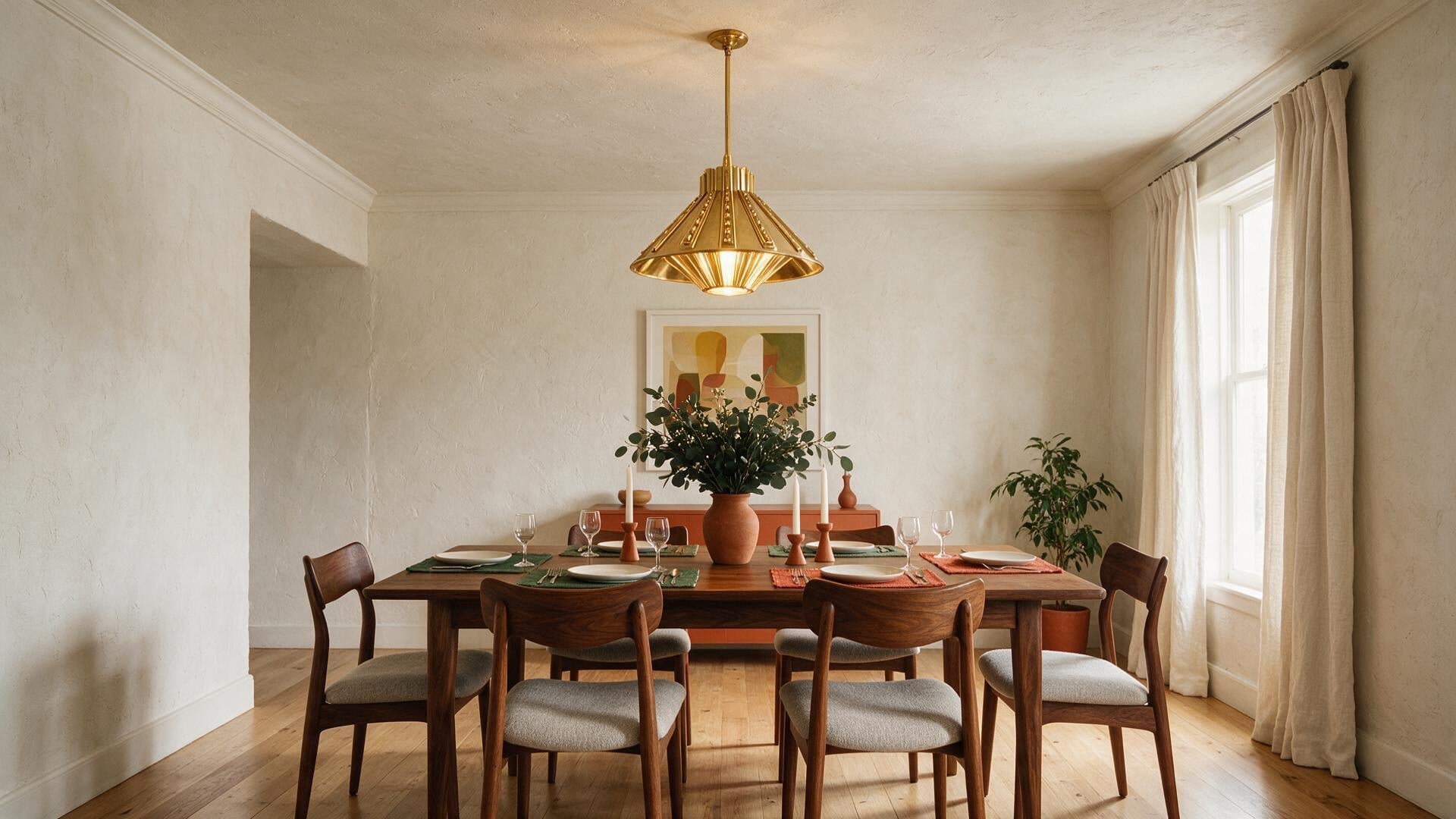
Name both periods and the materials in your prompt. A reliable hybrid prompt combines the room, two named influences, and visual constraints: materials; lighting with a shared color or texture; and “photorealistic, architectural photography.” “Dining room, mid-century walnut furniture paired with Art Deco brass accents, warm terracotta-and-deep-green layered lighting, photorealistic architectural photography.” The prompt requests a relationship between elements instead of an undefined mixture.
3. Materials That Repeat Across Different Objects
Material can connect objects whose dates and styles do not match. Woodgrain identifies mixed wood tones and Modern Heritage among its 2026 interior movements, which gives you permission to place a dark vintage cabinet near lighter oak seating. Repeat aged brass in the lamp and hardware, or natural linen in upholstery and curtains, so the woods feel chosen rather than mismatched.
Repeated walnut, brass, or linen gives unlike pieces a visible connection. Walnut grain on a side table, a brass reading lamp, and linen on a contemporary chair create a sequence your eye can follow across the room.
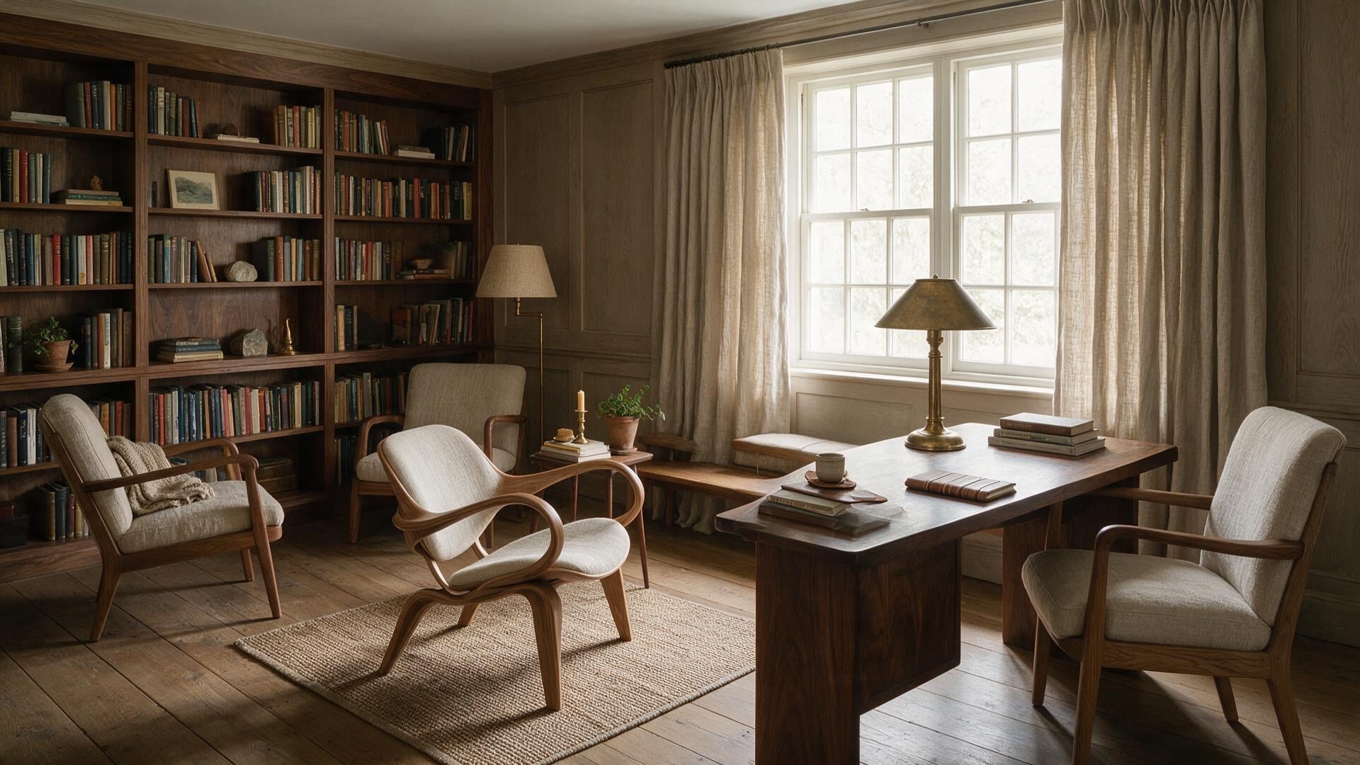
Krea mood boards can carry this logic across room types. Krea’s mood-board workflow builds a persistent taste profile from 6 to 12 reference images, preserving a consistent direction as rooms change through color, lighting, and texture. Load a board that repeatedly shows walnut, aged brass, and natural linen, then change the text from living room to bedroom without abandoning the material language.
4. Pattern and Texture at Different Scales
The largest motif should draw the eye on a rug or curtain, while smaller prints on pillows or art remain secondary. Planning Pretty recommends grounding a dominant pattern with calm solids and echoing texture at different scales, so the room’s most active surface reads clearly. The room reads as one focal pattern, one supporting print, and a calm field.
Texture supplies variation without asking every object to compete through pattern. Texture gives neutral rooms depth because carved wood, velvet, and plaster each catch light differently.
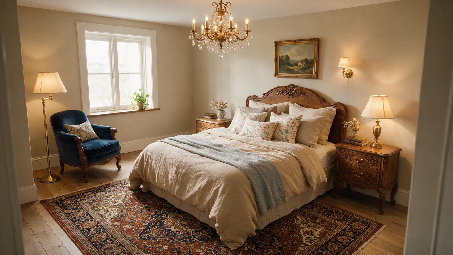
Use lighting language when you visualize this mix. Anne Marie Ostmeyer and Kristine Perry of Slifer Designs forecast layered rugs and throws in varied textures as part of a move toward maximalist comfort. Warm layered lighting reveals texture through shadows across velvet, wood, and woven textiles, giving the room atmospheric depth.
5. Furniture Heights and Intentional Breathing Room
Vary furniture heights, then protect empty space around the contrast. Cohere recommends changes in scale and silhouette alongside negative space, because a low contemporary sofa makes a tall antique cabinet more expressive only when both pieces have visible floor and wall around them. Crowding them with extra tables, art, and baskets erases the effect.
Pause before adding the next object. Clear circulation and a sparse wall arrangement let the cabinet’s vertical line become part of the composition instead of another claim on attention.
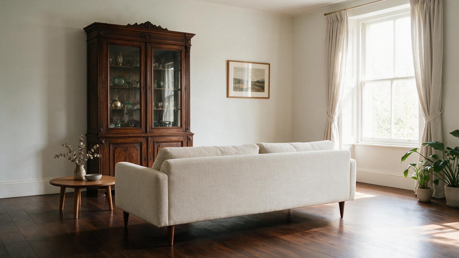
Treat clutter as a prompt-control issue too. Krea lets you adjust mood-board style strength between a more prompt-dominant and more aesthetic-dominant result. Although a reference board may hold an appealing layered look, reduce its influence while testing a sparse layout so the requested circulation and negative space remain visible.
6. Personal Pieces With a Shared Story
Choose personal objects that reinforce the room’s palette, material language, or mood. Bradley Odom of Studio Dixon Rye describes 2026 rooms shaped by “patina, provenance and a quiet sense of permanence” that feel “masterfully mixed and effortlessly lived-in.” A travel textile, inherited lamp, or flea-market painting earns its place when it repeats the room’s palette, material, or mood.
That test gives sentiment a practical role. An inherited brass lamp can echo the dining pendant; a framed textile can carry the deep green used in the cushions. Keep the objects that advance the story a visitor encounters, and let the rest stay stored or rotate over time.
Let the architecture inform that story without turning the room into a replica. Furnishings can contrast with a home’s architecture while respecting its scale and existing features, Design historian Alessandra Wood writes; Victorian homes and mid-century ranches can carry strong stylistic tendencies. Preserve original millwork or clean ranch lines, then choose contrasting furnishings that respect their scale and your common thread.
7. A Mood Board and Prompt That State the Common Thread
Turn the finished design logic into a mood board and a precise prompt before exploring alternatives with AI. Krea recommends mood boards for architecture and interior-design presentations because the extracted style profile can carry across generations. Build the board around a shared palette, lighting, and texture, then carry its common thread into a prompt through three details: the room, two design influences, and key materials.
Prompt: “Mid-century walnut and Art Deco brass; terracotta, cream, and deep green linen and patterned wool; warm layered architectural daylight.” Each phrase has a job, so you can revise one decision without losing the rest.
Iterate composition before escalating detail or style intensity. The Business Research Company projects AI in interior design to grow from $1.39 billion in 2025 to $1.76 billion in 2026, a 27.1% increase, driven in part by demand for personalized visualization. Generate several controlled directions, choose the one with the clearest shared thread, then refine furniture and decor choices. Market growth expands access to visualization, The Business Research Company reports, while a repeated palette or material thread determines whether a generated concept feels coherent.
Where to Start
An existing piece gives the room visual logic when its wood tone, metal finish, or color family guides later furniture and decor selections. Roman Alonso describes personal eclectic layering as collecting and layering into a style entirely your own. Set the first prompt with three inputs: photograph the anchor, collect references in a rust, cream, and charcoal palette, and name two design influences. Together, they establish a specific direction for the room.
A walnut heirloom table, brass lamp, and terracotta palette are enough to form the first coherent version of a room. The rest can arrive through the same act of choosing.
FAQ
Frequently asked questions
What’s the biggest reason an eclectic room looks messy instead of intentional?
How do I start an eclectic design so everything actually feels connected?
What AI prompt formula works best for creating an eclectic-but-cohesive room?
Can I mix different design eras in one room without it looking random?
How many patterns and textures should I use in an eclectic room?
Build your eclectic room in Krea
Set a palette anchor with a mood board, name two influences, and test one contrast at a time.
Try Krea Image