
Unmistakably Doodles.
A whole world.
One visual language.
At first sight, the Doodles style looks effortless: smooth shapes, candy colors, a single eye floating off the side of a head. However, pulling that off is the achievement. Under the clean, playful surface is a strict visual language where the proportions, colors, and lines are all deliberate decisions.
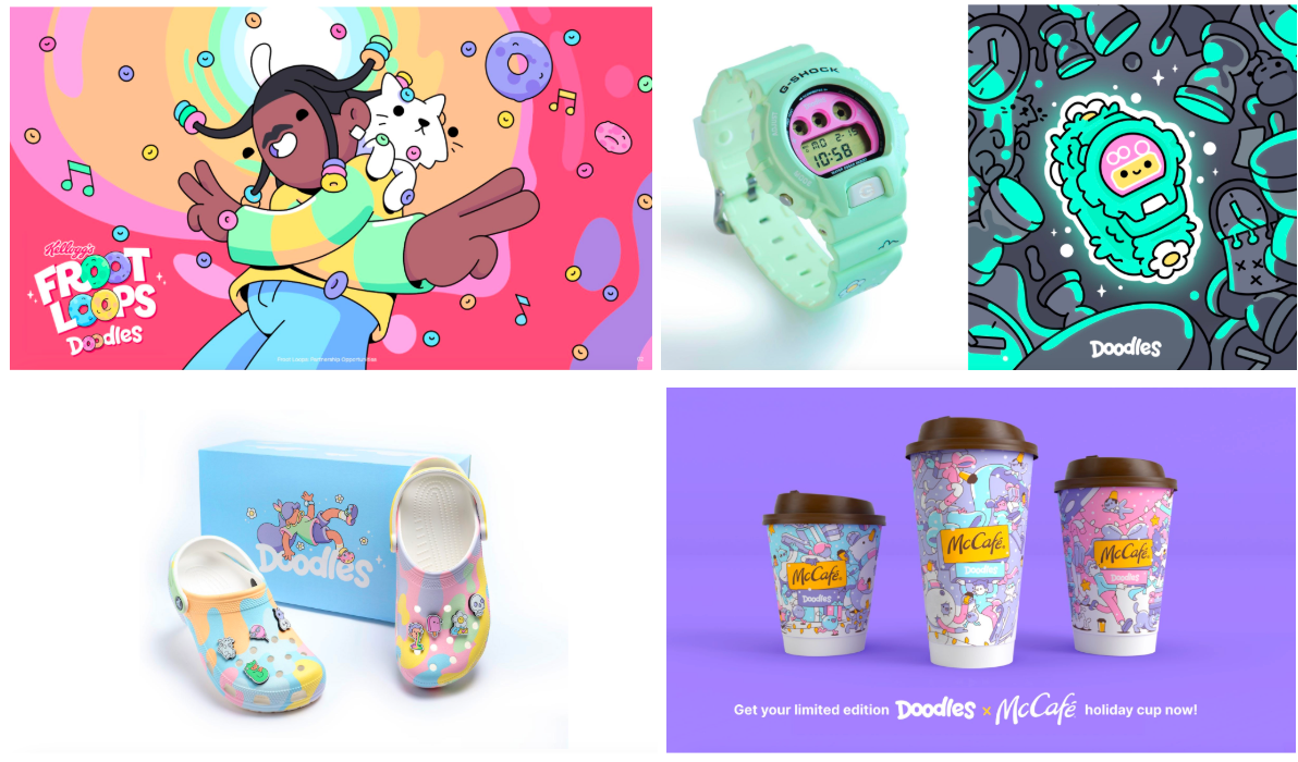
These decisions make up Doodles, one of the internet’s most recognizable visual identities, with millions of fans and billions of views across social shorts, music videos with well-known artists, and a short film that premiered at TIFF. The look has shown up on cereal boxes, on Crocs, and on McDonald’s holiday cups. And throughout all of those different formats, the style has to be exactly right, because the style is the brand.
But the style is also the hard part
Here’s the catch the team names plainly:
"Our style, although seemingly simple, is quite formulaic, and if something is off, it is unusable."
Doodles’ style is not loose, it runs on rules; to name a few:
- The far eye floats off the head in three-quarter profile: their trademark, the way the Simpsons have an overbite and Disney has white gloves.
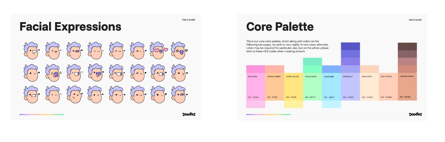
- Faces follow a fixed grammar of expressions outlined in a handbook called the FieldGuide, which Doodles created as an internal resource and later made available as a limited edition hardback collectible.
- The core palette is locked to specific hex values (Petal Pink, Touch Grass, Grape Jelly, Clear Skies) and shadows obey their own theory: shifting the saturation across, never dragging the color down.
Miss any one of the above, and the piece doesn’t read as Doodles. It reads as almost-Doodles, which is worse than nothing.
Almost Doodles, never Doodles
To make work at the volume and speed an internet-native brand needs and without watering the style down, Doodles turned to AI. The brief was simple to say but brutal to satisfy:
"We need to make as much art as we can, at speed, without compromising quality."
So they tested the whole market.
"We've tested with every model on the market searching for results that are undeniably on brand. They all struggle."
The result was always the same - something close but not quite there: the eye drifts off its mark, the fills pick up gradients the style never uses, the palette wanders or the shadows go muddy. The output looks almost Doodles: close in spirit but ultimately wrong. It wasn’t that one model nailed it while the rest lagged; the entire market was stuck at the same almost.
The reason is structural: most image models pull toward a single safe, polished default and quietly flatten the expressive, illustrated looks that don’t fit it. A style this precise doesn’t survive that pull; Doodles’ style doesn’t survive that pull. What Doodles needed wasn’t a better prompt, it was a model that could read their style and every one of its specificities, and recreate it.
"We needed a model that was visually literate."
Want to bring your brand's visual language into Krea?
Talk to our enterprise team about building a custom creative workflow for your brand.
Contact SalesTeaching Krea their style
Krea 2 was built for exactly this gap anchored in the visual literacy of models. Where most models optimize for one polished look, Krea 2 is designed around style itself - putting as much work into how it reads and reproduces a visual language as into how it reads a prompt, with particular strength in the expressive, illustrated directions other models smooth away.
Then Doodles took full advantage of this aesthetic potential, as they trained a custom Krea 2 LoRA on their own aforementioned Field Guide. A LoRA is a lightweight model trained on a tight, consistent dataset. Instead of rebuilding the visual direction prompt by prompt, you teach the look once and reuse it as a layer on top of Krea 2, with control over how strongly it applies and the option to stack it with others. It’s persistent memory for the things a prompt can’t easily describe. So Doodles did it. They trained a LoRA with a focused set of their characters and rules, turning their style from something that had to be re-described every single time into a reusable model that simply knows it.
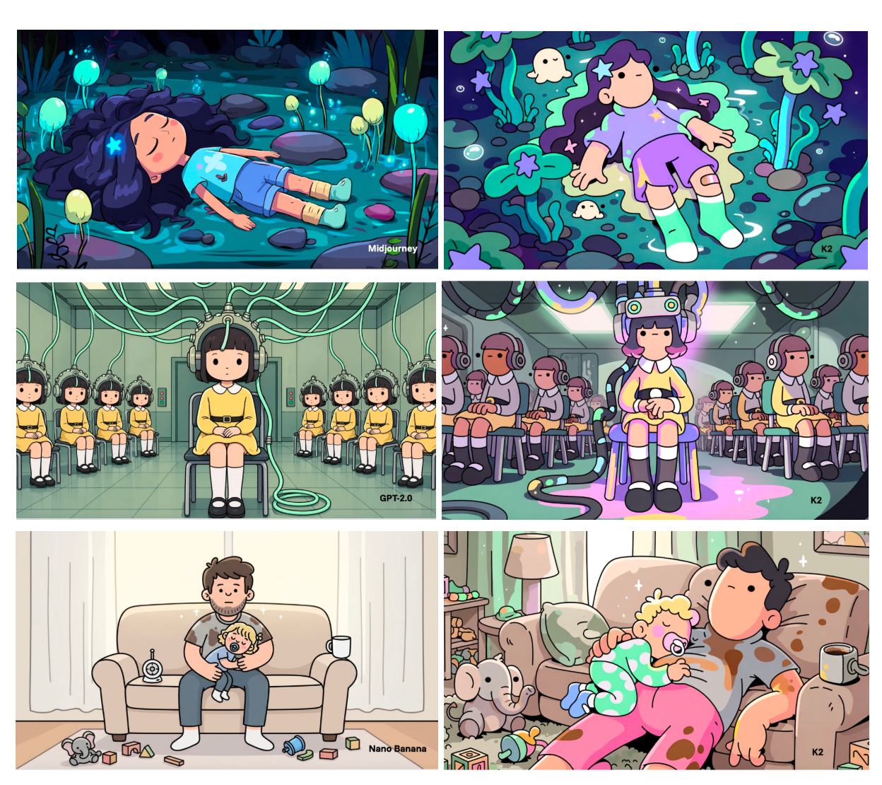
After training their LoRA, Doodles ran the same brief through other top image models and they got impressively close; polished, clearly Doodles-inspired, but they stalled at almost: the eye drifts, gradients creep into the fills, the palette wanders. Krea 2 and the Doodles LoRA is what closes the gap: the eye placed right, the fills flat, the palette exact, the shadows shifted rather than darkened. Now it comes back unmistakably Doodles.
Almost. And unmistakably.
The same brief. Two interpretations.
Choose a scene to compare.
Look at the eyes, the flat fills, and the palette.
View the full comparisonFrom almost to always
The shift is less about any single image and more about what becomes possible once the style is finally reliable. Topical work can ship while a cultural moment is still happening, because perfecting the style is no longer bottlenecked. The style doesn’t get diluted as volume climbs.
The look that other LoRAs could almost reproduce, but could never actually perfect, is now simply and reliably repeatable with Krea 2.
Your brand’s world. Built into Krea.
Work with our enterprise team to build a creative workflow around your brand’s visual language.
Contact sales