A mood board is a visual collage used to judge one creative direction. Making one comes down to a fixed method: pick the surface, list the samples, limit the palette, choose the composition, set the light, and cull to 12 to 18 elements until the direction reads in ten seconds. This article walks that method, then shows it applied eight times, one board per brief across interiors, branding, fashion, and campaigns, each generated on Krea in a single unretouched pass on August 26, 2026 from a prompt that describes the physical board rather than the project. You get the exact prompts, the control to preserve on each board, and one variation to try.
The boards are ordered by domain. They move from physical materials in interiors to tone and type in branding, fabric in fashion, and energy in campaigns.
Key takeaways
- Mood boards distil a direction into 12 to 18 elements across five ingredient types (photography, colour chips, material samples, type references, one or two anchors); the eight boards here were each generated in a single pass on Krea from a prompt describing the physical board.
- Keep 12 to 18 elements so the mood, domain, and anchor remain readable within ten seconds.
- Balance visual references, material cues, and one or two anchors so the direction reads clearly within ten seconds.
- Describe the physical board and its lighting so Krea renders a focused collage rather than a broad project concept.
How to make a mood board in one pass
Eleven steps, in the order the eight boards below were made:
- Name the domain and format. Name the creative domain and choose a board format.
- Specify the surface. Name the physical base, such as a white board.
- List the samples. Request imagery, palette chips, and material or graphic references; add one or two anchor images where useful.
- Limit the palette. Use a neutral base with one or two accent colors rather than several unrelated color families.
- Choose the composition. Tight grids separate references, while airy layouts allow more visual interaction.
- Set the light. Natural daylight reveals materials, diffuse light softens branding references, and hard light creates campaign or resort energy.
- Request the view. Ask for a flat, photorealistic view that presents every sample on one inspectable plane.
- Exclude readable text. Add
no readable textwhenever wording is not carrying the concept. - Cull crowded results. Collect broadly before generation, then reduce the requested collage to 12 to 18 elements.
- Run the ten-second test. Identify the mood, domain, and anchor without inspecting every sample.
- Change one variable. Change one variable per run while preserving the board’s defining control.
How we chose these mood board examples
A mood board earns its place here when it communicates one decision. Reference count alone tells us little. A board with 30 competing ideas is less useful than a board whose 14 elements all support the same material, tone, or energy.
Standard studio practice is to collect dozens of references, then cull the board to 12 to 18 elements while balancing imagery with color and tactile or typographic references. We checked whether the imagery and palette supported one or two anchors.
The domain provides a second test. Interior boards depend on physical samples. Brand boards communicate through tone and type. Visible fabric distinguishes the fashion boards; contact sheets and motion blur give the campaign boards their sense of pace.
Build a mood board in Krea
Generate the board tiles from one prompt, then swap a single material or color and regenerate.
Open Krea ImageEight mood board examples at a glance
| # | Mood board | Best for | Control to preserve |
|---|---|---|---|
| 1 | Coastal restaurant | Calm hospitality interiors | Sea-glass green against weathered materials |
| 2 | Dark wellness spa | Enclosed, quiet wellness spaces | Basalt-led dark material grid |
| 3 | Specialty coffee roaster | Tactile food and beverage branding | Letterpress texture among roast tones |
| 4 | Minimalist skincare | Soft clinical-lifestyle branding | Airy spacing around water and frosted glass |
| 5 | Autumn-winter knitwear | Material-led cold-season collections | Moorland anchor with visible yarn |
| 6 | Summer resort collection | Sunlit warm-weather fashion | Hard light over citrus and azure |
| 7 | Tech product launch | Fast, high-contrast launch campaigns | Electric accent color on black |
| 8 | Holiday retail campaign | Warm seasonal merchandising | Kraft texture beneath red and gold |
Interior mood board prompts
1. The coastal restaurant - Best for relaxed hospitality interiors
Prompt:
A designer mood board for a coastal restaurant interior, pinned collage on white board: weathered oak sample, rope texture, off-white plaster chip, sea-glass green paint swatch, photos of woven pendant lights and linen banquettes, a hand-written label card, natural daylight, flat view, photorealistic, no readable text
Variation tips: Rattan can replace rope without disturbing the sea-glass color anchor.
Five physical samples tie the coastal direction to surfaces that could exist in a restaurant. These surface samples provide more practical evidence than beach photographs.
The pinned arrangement lets each material retain its edge and scale. Natural daylight reveals the relationship between the off-white plaster and sea-glass green without turning the presentation into a polished specification sheet.
2. The dark wellness spa - Best for quiet, enclosed spaces
Prompt:
A designer mood board for a dark wellness spa interior, grid collage: slate and basalt stone samples, eucalyptus sprig, deep green and charcoal paint chips, photos of candlelit stone bath and arched corridors, folded waffle towel swatch, moody soft light, flat view, photorealistic, no readable text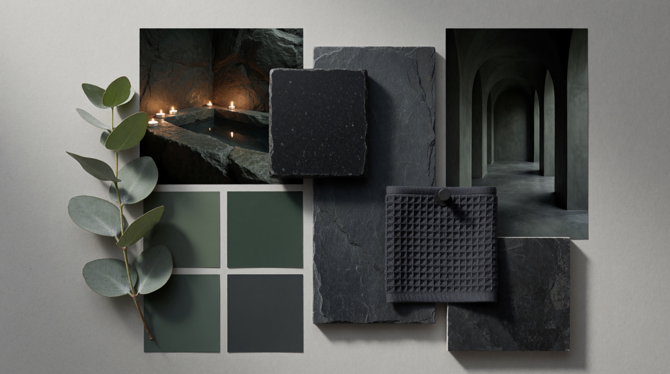
Variation tips: The botanical note can shift to cedar while basalt remains the dominant material.
The grid keeps the organic references under control. Without that structure, eucalyptus, candlelight, and arched corridors could pull the board toward a looser botanical theme.
Basalt and slate provide weight, while the waffle towel and eucalyptus introduce softness. Deep green and charcoal allow those hard and soft materials to share one enclosed palette.
Brand identity mood board prompts
3. The specialty coffee roaster - Best for tactile packaging systems
Prompt:
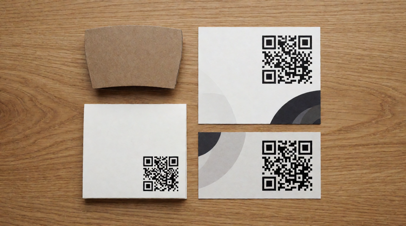
A brand identity mood board for a specialty coffee roaster, tight grid collage: kraft and burnt-orange color chips, coffee bean macro photo, letterpress texture card, minimal cup mockup photo, roasted-tone gradient strip, torn paper textures, flat lay on pale desk, photorealistic, no readable text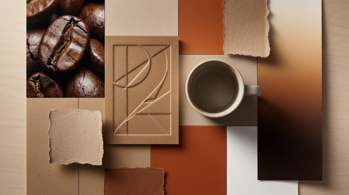
Variation tips: Oxblood creates a darker accent, while letterpress preserves the tactile identity.
Letterpress and torn paper establish a tactile identity before a logo or readable wording appears. They suggest ink pressure, absorbent stock, and packaging that rewards close inspection.
The roasted-tone gradient connects the kraft base, coffee macro, and burnt-orange accent. It fills the tonal gap between those references without adding a second mood.
4. The minimalist skincare line - Best for soft premium branding
Prompt:
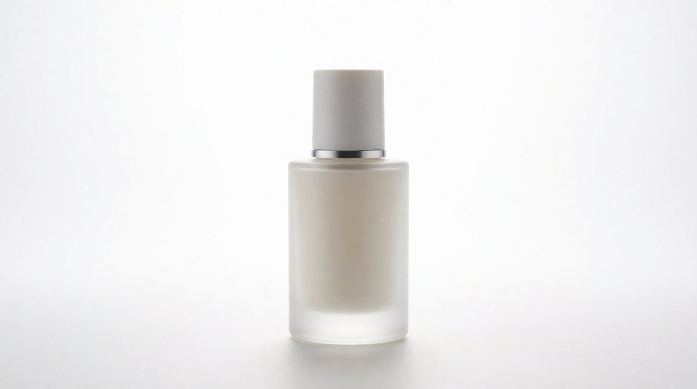
A brand identity mood board for a minimalist skincare line, airy collage: milk and lavender color chips, frosted glass jar photos, water ripple macro, soft fabric texture, thin sans-serif type specimen blocks blurred, pale stone props, bright diffuse light, flat view, photorealistic, no readable text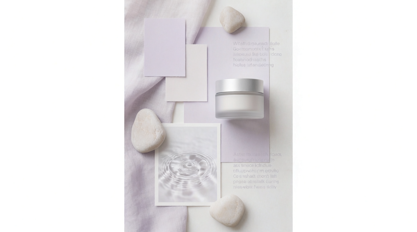
Variation tips: A sage palette still works when the water macro remains the main softness cue.
Water and frosted glass pair with fabric or pale stone, giving the open composition visible surface contrast. Together, these surface cues give the airy composition substance while clarifying softness and the product finish.
Blurred type specimens retain typographic weight and spacing without relying on generated words. The thin sans-serif blocks also connect the clinical side of the brand with its lighter lifestyle photography.
Fashion mood board prompts
5. The autumn-winter knitwear capsule - Best for texture-led seasonal design
Prompt:
A fashion designer mood board for an autumn-winter knitwear capsule, pinned board: chunky rust and oatmeal yarn swatches, cable-knit close-up photos, moorland landscape photo, camel coat editorial tear-outs, brown kraft labels, wool texture everywhere, warm side light, flat view, photorealistic, no readable text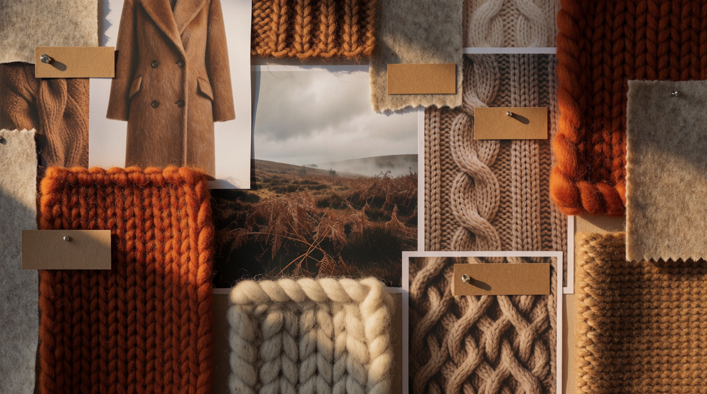
Variation tips: Use forest green as the accent and retain the moorland image as the climate anchor.
The moorland photograph gives the yarn, knit structures, and camel coat references a shared climate. Rust and oatmeal then read as colors found within that setting rather than an isolated seasonal palette.
Warm side light makes the yarn thickness and cable relief visible. Texture matters more here than the orderly presentation used for the branding boards, so the pinned layout can remain slightly uneven.
6. The summer resort collection - Best for sunlit fabric and color stories
Prompt:
A fashion mood board for a summer resort-wear collection, sun-bleached collage: striped cotton swatches, citrus and azure color chips, editorial tear-outs of linen dresses by the sea, raffia texture sample, shell and sand props, bright hard light, flat view, photorealistic, no readable text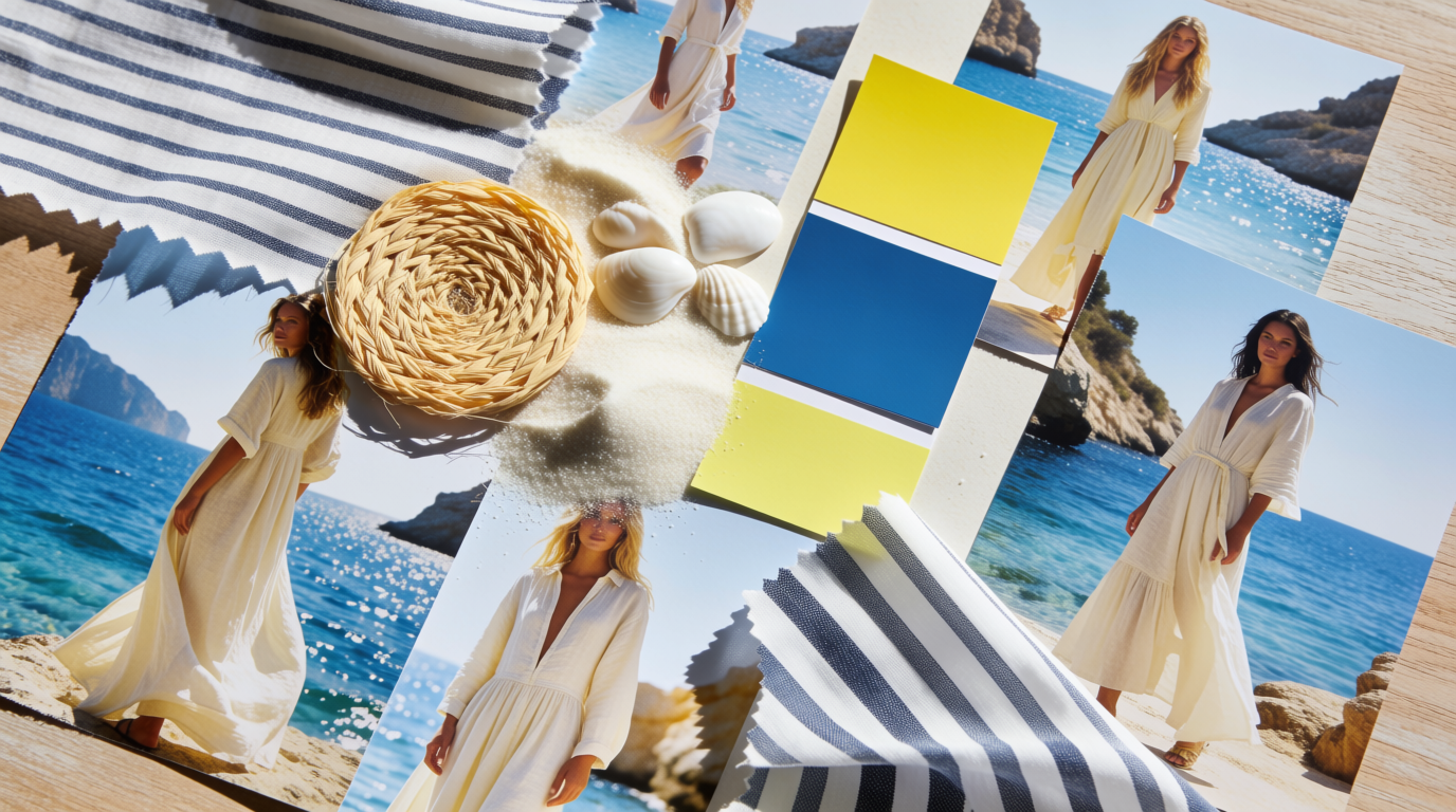
Variation tips: To test a coral palette, leave the hard sunlight unchanged.
Retain the hard light. Its crisp shadows unify the fabric, found objects, and natural textures while preserving the bleached summer palette.
Azure and citrus stop the natural materials from reading like an interior board. The two color chips also connect the striped fabric with the sea photographs without requiring additional references.
Campaign mood board prompts
7. The tech product launch - Best for motion-led digital campaigns
Prompt:
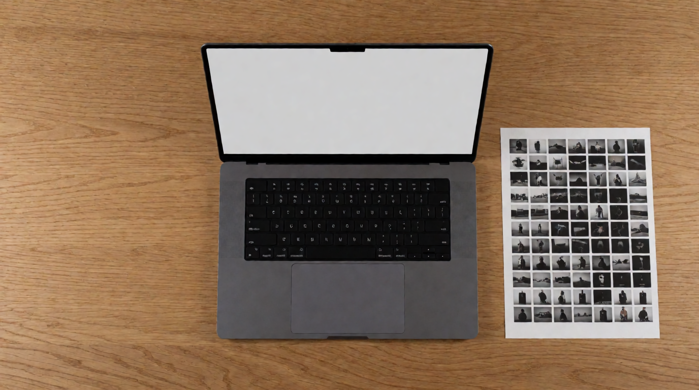
A campaign mood board for a tech product launch, dark grid collage: electric blue and black color chips, neon light-trail photos, macro shots of brushed aluminum, motion-blur city night images, bold geometric shapes, printed contact-sheet strips, flat view on dark surface, photorealistic, no readable text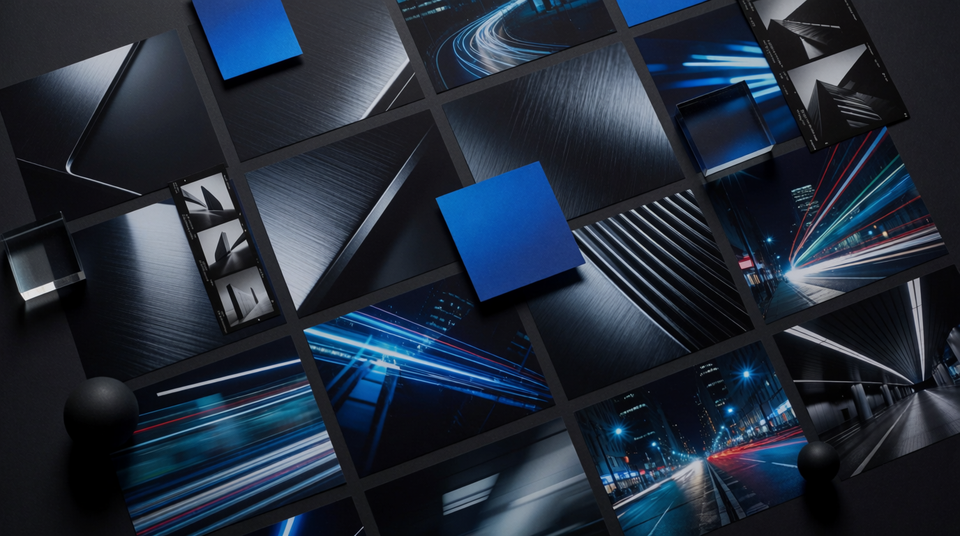
Variation tips: Acid green can carry the electric accent within the existing contact-sheet structure.
Contact sheets and motion blur imply sequence and pace inside a still board. The repeated frames suggest how a launch could unfold across teasers, product details, and city imagery.
One electric accent controls the neon trails, geometric forms, and brushed aluminum. Adding several bright colors would make those references harder to translate into one launch system.
8. The holiday retail campaign - Best for warm seasonal merchandising
Prompt:
A campaign mood board for a cozy holiday retail campaign, pinned collage: deep red and gold color chips, ribbon and kraft wrap textures, photos of warm window displays and candlelit tablescapes, pine sprig, gift-tag cards blank, soft evening light, flat view, photorealistic, no readable text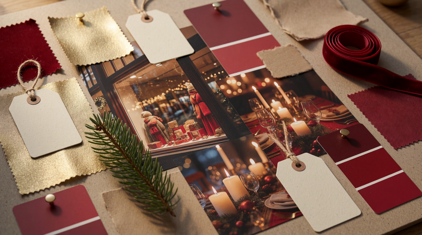
Variation tips: For a cooler metallic note, use silver over the same kraft base.
Blank gift tags are more useful than decorative generated copy. Their shape, stock, and placement remain available for evaluation without letting unreliable wording dominate the board.
Kraft gives the palette and seasonal details a material already used in retail packaging. Without it, the board could become a collection of seasonal symbols with no connection to merchandising.
Start with one board
Choose one board above for your first generation in Krea’s image generator. Keep its layout and anchor, then replace one supporting sample, and run the ten-second test on the result before you change anything else.
Sources
- Ebaqdesign, mood board class guidance (collect dozens of references, cull to 12 to 18 elements, balance imagery with colour and tactile or typographic references).
Related reading
Frequently asked questions
What makes a mood board “good” in this post?
How many elements should I include in my own mood board?
What does the “control to preserve” mean in these examples?
How should I write prompts for Krea to get a focused mood board?
Can I swap one element without breaking the overall direction?
Make your first mood board on Krea
Paste one of the board prompts above, then change one anchor at a time until the direction holds.
Try Krea Image