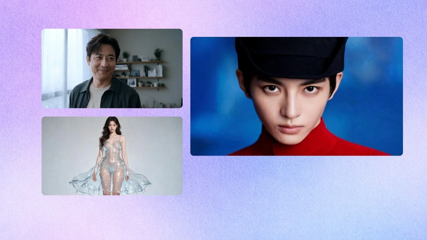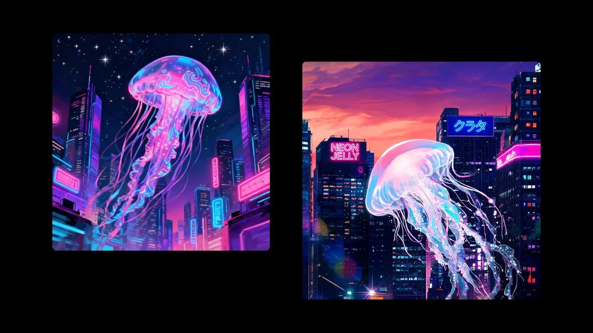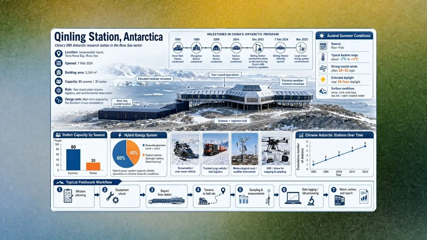
Generating infographic is an incredibly hard task for image generation models. One has to render text, lines, and graphics with incredible precision. This is often harder that it seems for models. However, Seedream 5.0 Pro on Krea handles complex infographic perfectly with built-in reasoning at generation time.
Seedream 5.0 Pro fits structured visual work that depends on clear relationships, hierarchy, and spatial constraints, while Krea adds value by making precise corrections to individual elements without requiring a full regeneration. These examples focus on complex visual tasks that combine structured layouts with targeted corrections.
How We Chose These Examples
A useful complex-visual prompt defines an information relationship, a visual hierarchy, and a correction path after generation. ByteDance says Seedream 5.0 Pro handles logical reasoning and layout planning, and its official examples range from dense information graphics to a UI interaction crossing a frame boundary in its Seedream 5.0 Pro introduction.
Arena.ai data reported around July 11, 2026 placed Seedream 5.0 Pro second in Multi-Image Edit at 1,415 points and fourth in Single-Image Edit at 1,393 points. ねこ社長’s detailed comparison mentions that Seedream 5.0 Pro is especially good at structured layouts & design work with a need for precise editing.
Try Seedream 5.0 Pro on Krea: Generate one low-risk version first with Seedream 5.0 Pro on Krea, then use an edit tool to identify the prompt’s weak point.
Design your first infographic now
Open Seedream 5.0 Pro on Krea and turn a dense brief into a readable layout.
Generate an infographicAt-a-Glance Comparison
| # | Prompt pattern | Best job | Reasoning instruction to specify | Evidence basis | Best Krea follow-up |
|---|---|---|---|---|---|
| 1 | Antarctic research station | Multi-source scientific infographic | Chart hierarchy and evidence zones | ByteDance Seed blog | Edit one chart region |
| 2 | Six-teas flavor wheel | Comparative product education | Central metaphor and linked scales | ByteDance Seed blog | Separate title text |
| 3 | Birdwatching guide | Labeled reference grid | Repeated taxonomy structure | ByteDance Seed blog | Correct one species label |
| 4 | Sports-car blueprint | Technical drawing | Orthographic views and dimensions | fal.ai documentation | Refine measurement area |
| 5 | Architecture system diagram | Building-process explanation | Systems, paths, and sectional relationships | fal.ai documentation | Reposition an annotation |
| 6 | Pet-commerce UI | Spatial UI mockup | Layer and boundary interaction | ByteDance Seed blog | Anchor-move the hero object |
| 7 | Sci-fi film storyboard | Narrative sequence | Causal scene progression | Krea launch post | Batch scene variations |
| 8 | Brand-system sequence | Consistent campaign assets | Shared reference and art direction | Krea launch post | Export separated assets |
| 9 | Manga storyboard page | Dense panel storytelling | Recurring character and panel rhythm | X practitioner example | Sketch a panel correction |
| 10 | Green-energy explainer | Conceptual education diagram | Metaphor linked to process | morphic.com example | Change one material/color zone |
| 11 | Stegosaurus study sheet | Annotated classroom visual | Diagram labels and classification | morphic.com example | Isolate caption text |
| 12 | Localized data poster | Multilingual information design | Language, reading direction, and hierarchy | Krea model documentation | Revise text layer only |
1. Antarctic Research Station Infographic
Prompt:
Create an Antarctica Qinling Station research infographic with a central station building, timeline, bar chart, pie chart, line chart, summer weather panel, realistic equipment photos, and a seven-step fieldwork flowchart. Establish the reading order before styling the information.Use a local field site instead of Antarctica. Limit the data story to three claims. Reserve one correction zone for chart labels.
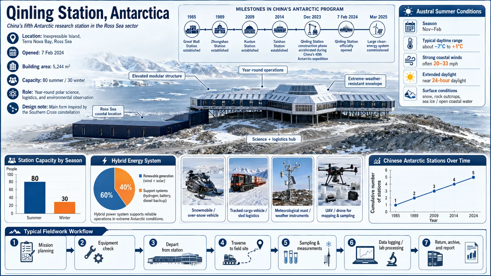
The Antarctic research-station pattern fits a visual that must connect several evidence types while retaining reading order. ByteDance’s Qinling Station example combines comparative charts, fieldwork process diagrams, and equipment-and-sampling imagery. Naming the components and their hierarchy gives the model a concrete layout problem, whereas “scientific infographic” leaves the relationships undefined. The first pass can establish the evidence zones; a region edit can then repair the chart area that fails.
2. Six-Teas Flavor-Wheel Explainer
Prompt:
Design a six-major-teas infographic around a delicate watercolor-gradient flavor wheel. Connect top-down tea-leaf images, oxidation bars, and brew-temperature thermometers in a minimalist zen layout on textured handmade rice paper.Try coffee, chocolate, or wine instead. Use one comparison variable per spoke. Keep the center metaphor dominant.
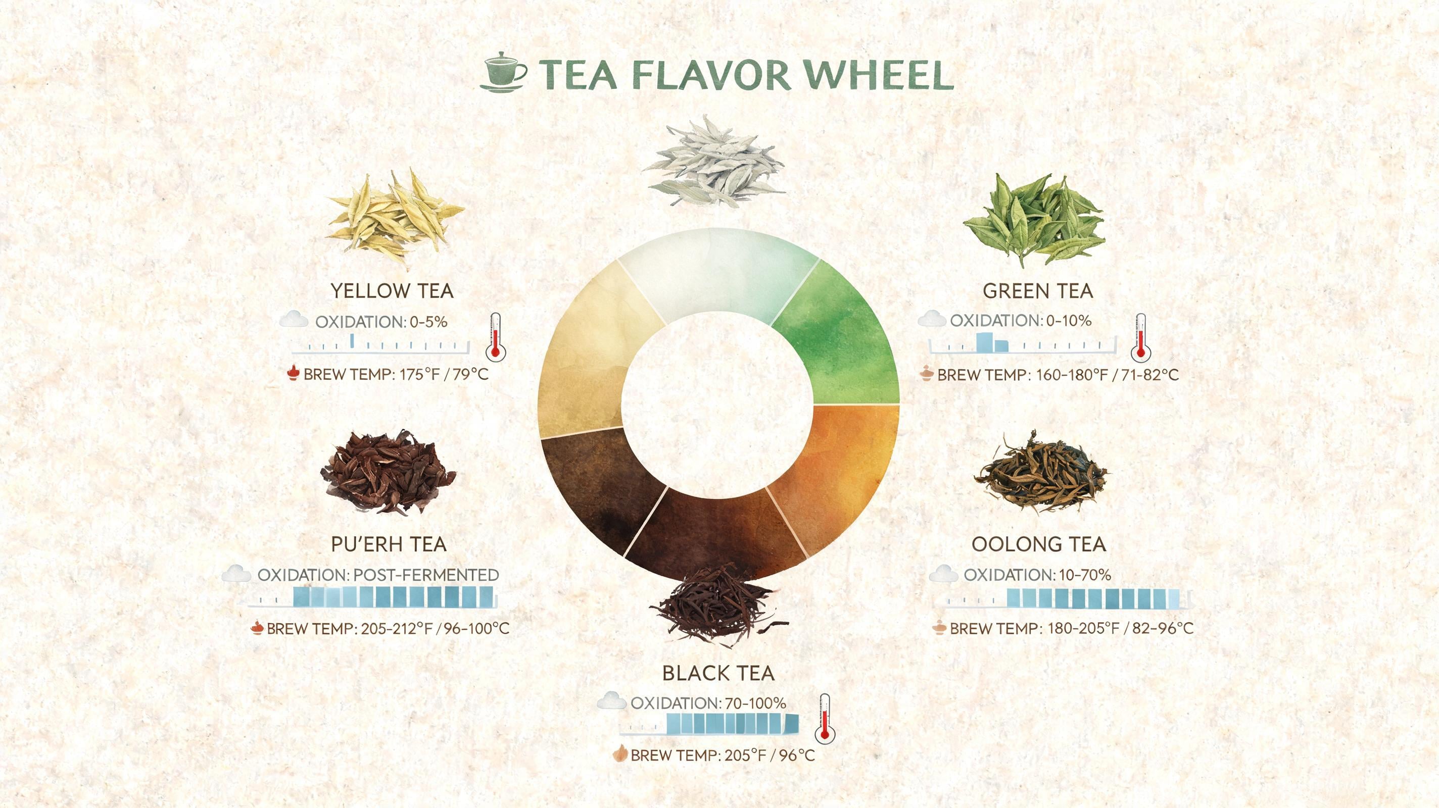
In a flavor-wheel pattern, a central metaphor organizes several measurable attributes into a single, scan-friendly comparison. ByteDance’s tea example links leaves at different oxidation levels to oxidation bars and brew-temperature thermometers around one wheel. State what each connector means, because decorative lines otherwise give readers no reason to connect an image with a scale. This pattern turns the visual center into a comparison system that a customer or learner can scan from attribute to attribute.
3. Birdwatching Identification Grid
Prompt:
Create a beginner’s guide to birdwatching in a clean grid: eight common species, scientific illustrations, English and Chinese names, and the key identifying features for each species. Keep every card structurally consistent.Use a regional species list. Add one difficulty indicator. Keep names in their own editable area.
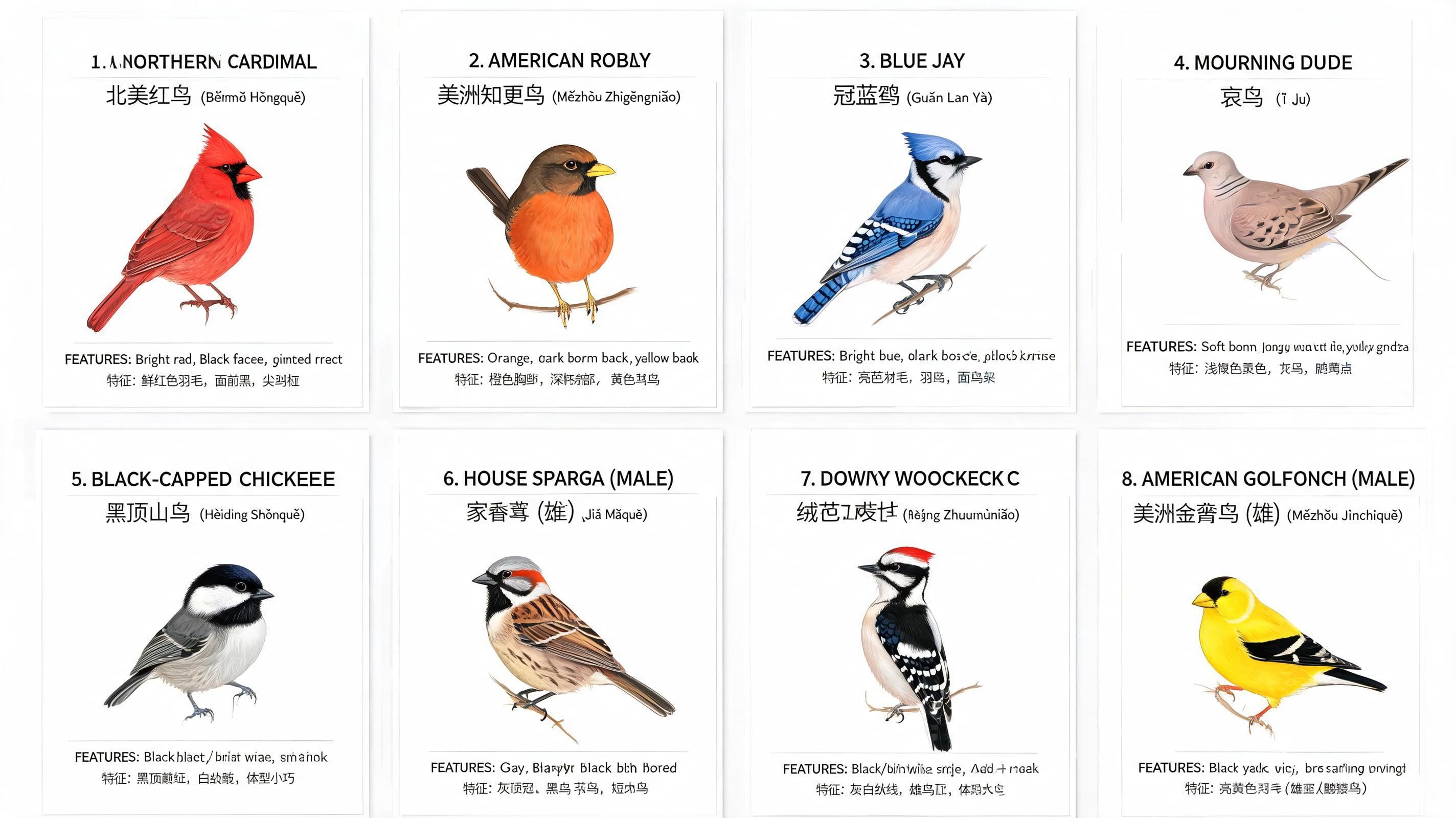
The pattern works for repeatable reference cards because a fixed visual rhythm makes a growing set feel like one coherent reference tool. ByteDance’s natural-science example uses eight species with scientific illustrations, bilingual names, and identifying features. Repeating one card schema lets readers compare entries without relearning the layout each time. It also gives you a predictable correction target: one wrong species name can be isolated instead of disturbing the full sheet.
4. Multi-View Sports-Car Blueprint
Prompt:
A technical drawing of a futuristic sports car in blueprint style. Include line drawings from the front, side, and rear views, exploded parts sketches, parts assembly diagrams, and structural diagrams with disassembled components. Use abundant lines and measurement values to indicate the dimensions of each part. Use grayscale tones and scattered thumbnails.Variation: Replace the car with a product enclosure, specify needed views first, and flag dimensions for human verification. State the required views before generating the prompt. Flag dimensions for human verification.
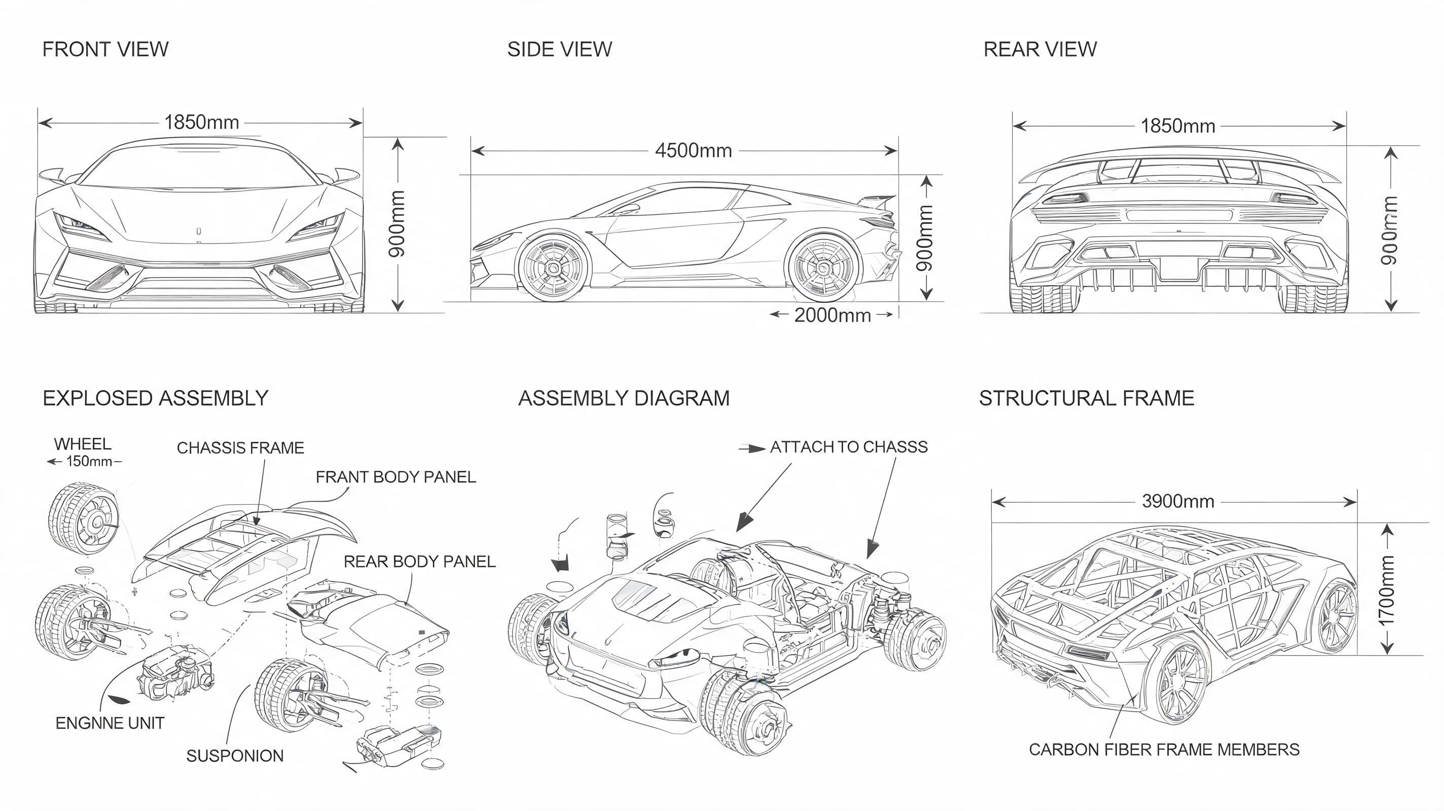
The sports-car blueprint pattern fits objects that must stay coherent across views, assemblies, and annotations. fal.ai supplies this multi-view, exploded-parts prompt as a Seedream technical-drawing example in its API documentation. Pouya Eti’s early hands-on test found that a blueprint’s 320 mm and 420 mm proportions appeared to make dimensional sense. Treat generated measurements as provisional: verify them before relying on them for engineering. Ask for view relationships explicitly, then verify every critical dimension before it reaches fabrication.
5. Architecture Systems Diagram
Prompt:
Create an architectural visualization that explains the building as a system: show the exterior massing, a sectional cutaway, circulation paths, structural relationships, and numbered annotations. Preserve alignment between every callout and the element it identifies.Variation tip: Choose one building scale. Separate circulation from structure by color. Keep dimensions out of conceptual drafts.
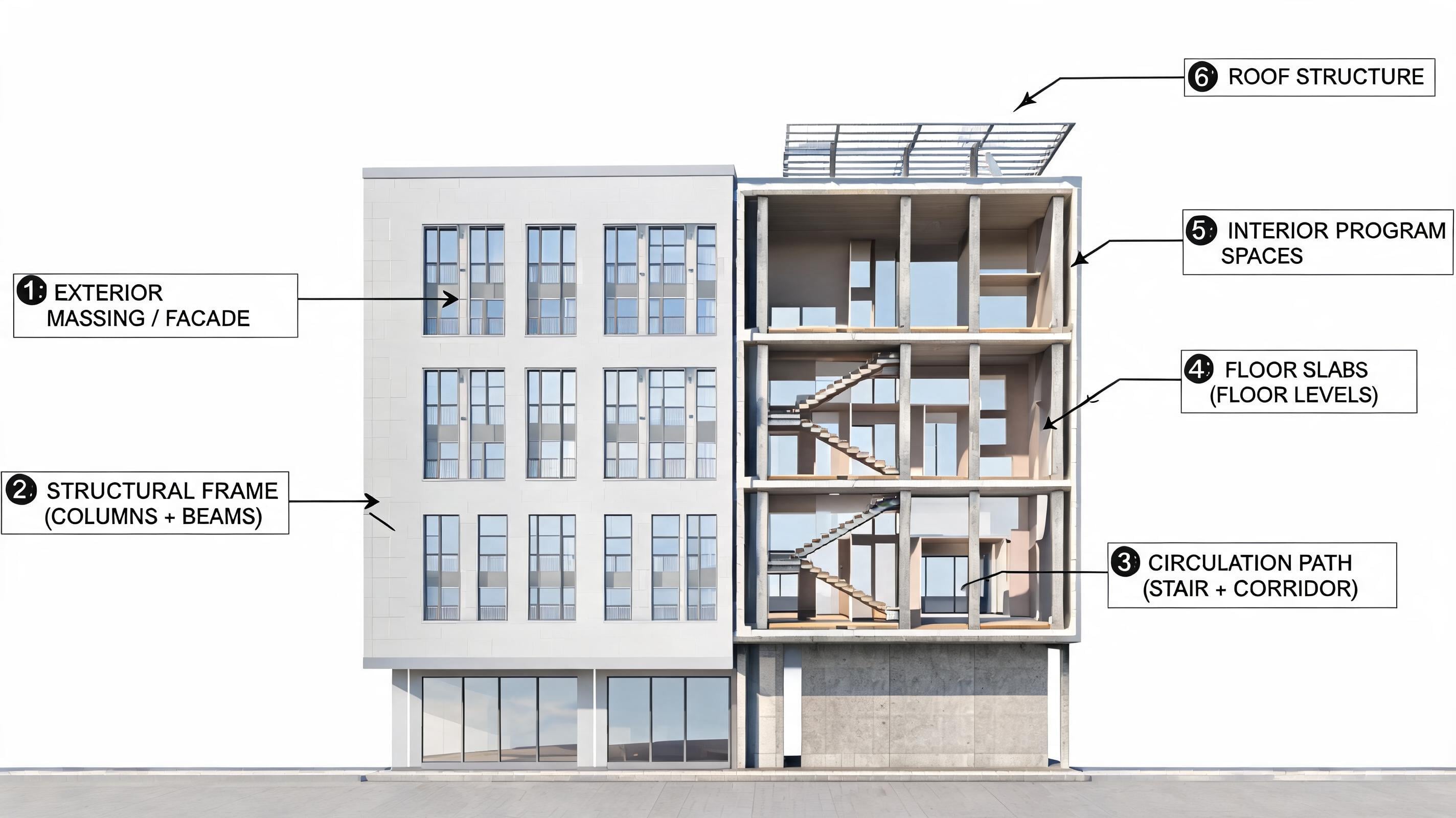
The architecture-systems pattern shows how building parts relate through a diagram. fal.ai lists architectural visualization alongside high-density infographics and technical blueprints among documented Seedream use cases. For sections, paths, and systems with aligned callouts, the prompt should directly define relationships among circulation, structure, and annotations. Preserve the massing and correct only the misplaced callout.
6. E-Commerce UI
Prompt:
Create a 16:9 pet e-commerce homepage in warm sunset tones with top navigation, a cream-beige content area, text and product cards, layered shadows, and a golden capsule button. Place a 3D Golden Retriever at right with its paw breaking the frame boundary to press the button.Variation: Swap the pet for a product mascot, define the action before the style, and anchor-edit the subject after generation. Define the action before the style. Anchor-edit the subject after generation.
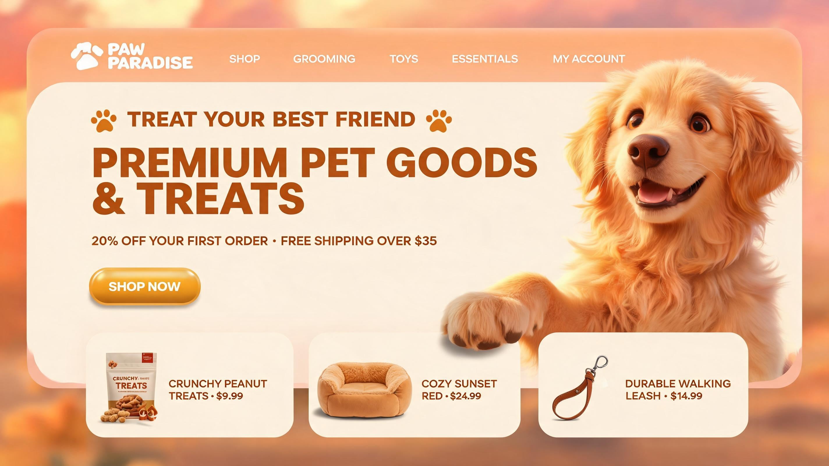
Its defining dependency is contact: the foreground figure must cross the content boundary and land on the call-to-action at the intended point. This is a positional-topology problem, because a visually complete page still fails if that relationship is wrong. The example demonstrates why moving the anchored figure is safer than rebuilding the established interface. ByteDance requires the Golden Retriever’s paw to cross the frame boundary and press a button. That request tests positional topology, which is more demanding than asking for navigation, cards, and a mascot in the same composition. If the page structure works but the paw misses its target, anchor-moving the dog protects the approved interface around it.
7. Four-Scene Sci-Fi Film Storyboard
Prompt:
Create a cinematic realistic sci-fi film storyboard in four scenes: an astronaut repairs a spacecraft, a meteorite belt hits, the astronaut dodges urgently, and the injured astronaut escapes. Keep the astronaut, spacecraft, and art direction consistent across all frames.Variation: Start with four causal beats, reuse one subject description, and generate alternates only for the weakest frame. Reuse one subject description. Generate alternates only for the weakest frame.
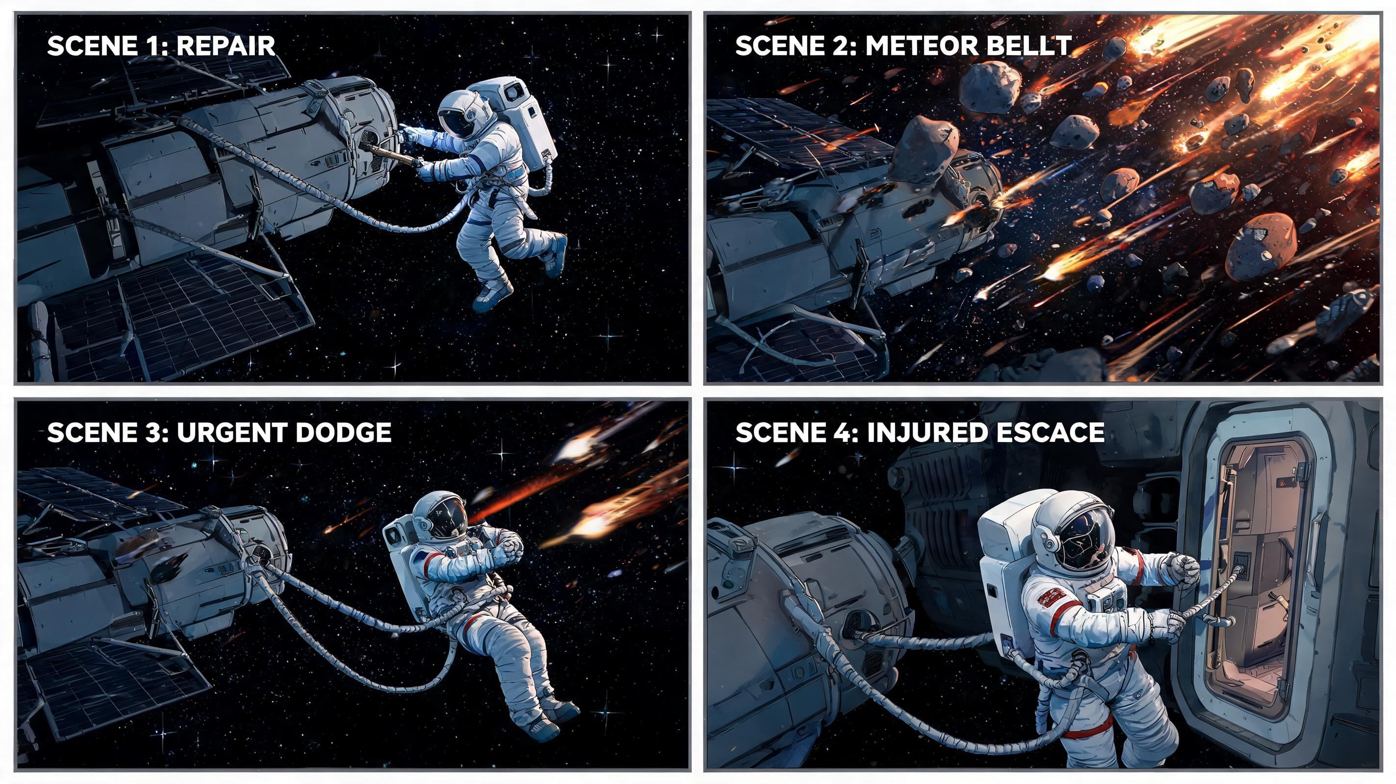
The sci-fi storyboard pattern turns a causal sequence into frames with a shared subject and setting. Krea’s July 8 launch post shows Seedream’s storyboard purpose: an astronaut’s repair, meteor strike, and escape create a connected action path with continuity from one frame to the next. Writing the cause-and-effect order reduces the chance of receiving four visually strong yet interchangeable scenes. Once the character and spacecraft hold together, batch variations can focus on the frame whose action is least clear.
8. Reference-Led Brand-System Sequence
Prompt:
Using a logo reference, create a consistent brand visual system for packaging bags, hats, cards, and lanyards. Maintain a fun, modern, green tone while adapting the design to each object.Use the logo as the primary reference. Limit the asset family. Split the selected asset for final polish.
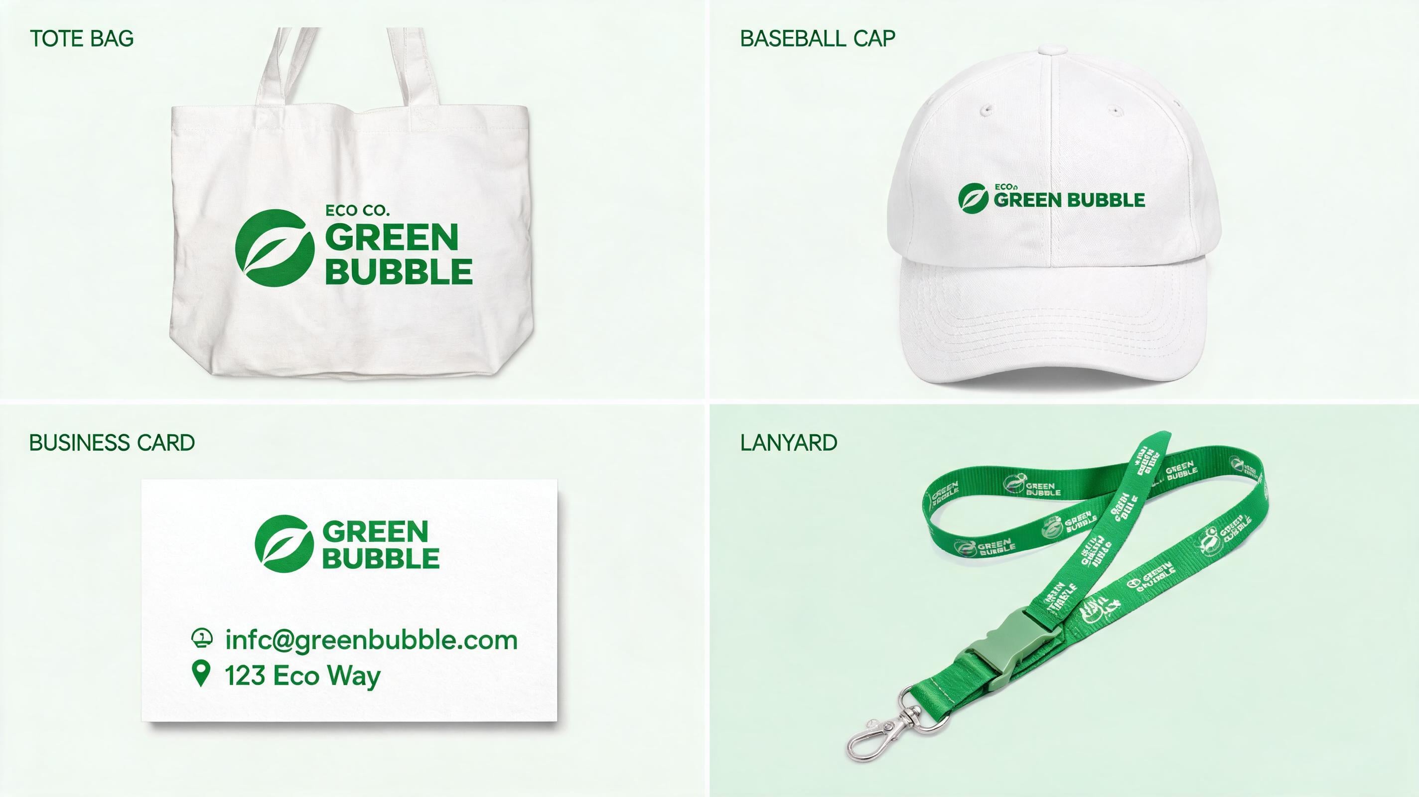
A single visual reference can keep varied formats consistent while letting each one respond to its own material and use. Krea’s launch material shows how one logo reference can guide a small family of assets in a fun, modern, green direction. The prompt separates fixed brand traits from each object’s physical adaptation, so consistency becomes a set of usable constraints. That distinction helps a team judge whether a design belongs to the same campaign before polishing individual assets.
9. Japanese Manga Storyboard Page
Prompt:
Create a gritty black-and-white Japanese manga storyboard page with a dense irregular panel grid, recurring character consistency, dramatic lighting, cross-hatching, and onomatopoeia placed to support the action.Set the panel count. Describe the recurring character once. Sketch over one panel to revise it.
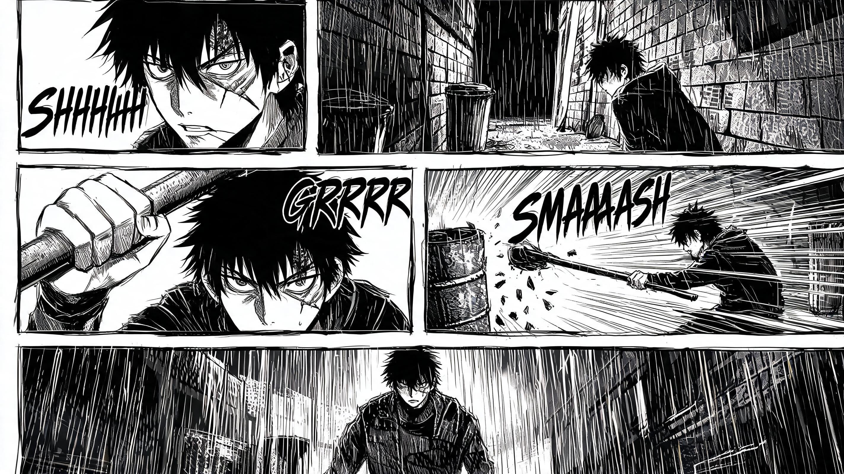
The manga-page pattern fits sequential storytelling where panel structure, recurring subjects, and text placement must cooperate. An X practitioner used a full black-and-white manga page with irregular panels, consistent recurring characters, and dramatic cross-hatched lighting. Listing this page grammar prevents the model from reducing the job to one illustration styled like a comic. A sketch correction on one weak panel keeps the remaining action rhythm intact.
10. Green-Energy Ecosystem Explainer
Prompt:
Create a green-energy infographic centered on a light-bulb ecosystem diagram. Connect each energy input, conversion stage, and outcome with directional labels and preserve a clear path from source to result.Use a single process direction. Replace the metaphor with a local system. Restrict color to functional categories.
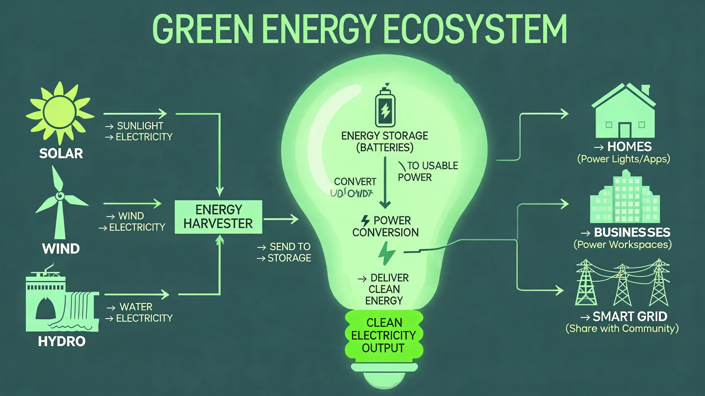
The green-energy pattern suits educational visuals that use a metaphor while keeping the real process visible. morphic.com provides a green-energy infographic with a light-bulb ecosystem diagram as a Seedream prompt example. Directional labels establish what enters, changes, and results, so the bulb supports comprehension instead of becoming decoration. This format is strongest when a learner can trace one path from source to outcome without guessing what an arrow represents.
11. Labeled Stegosaurus Study Sheet
Prompt:
Create a labeled Stegosaurus educational infographic with classification, size, and annotated anatomical features. Use a classroom-friendly hierarchy that separates the specimen illustration from the factual labels.Adjust the complexity to suit the learner’s age. Use a single viewpoint. Keep labels outside the specimen silhouette.
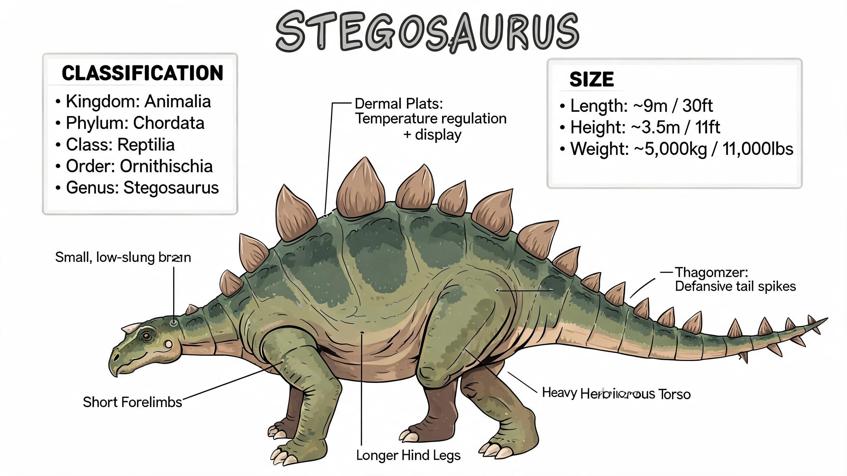
The Stegosaurus pattern is for classroom diagrams where labels must attach to a subject without covering it. morphic.com’s practical examples include a labeled Stegosaurus infographic with classification and size information. Separating the specimen zone from the annotation zone gives the illustration room to remain recognizable and makes factual labels easier to scan. If a caption needs correction, isolating its text avoids changing the animal’s silhouette or the rest of the lesson.
12. Multilingual Localized Data Poster
Prompt:
Create a localized data poster with a clear title, short chart labels, and supporting captions in Arabic, Japanese, Korean, Thai, or Spanish. Adapt typography and reading direction to the chosen language, while preserving the chart hierarchy.Test one language at a time. Use verified source copy. Reserve a text layer for corrections.
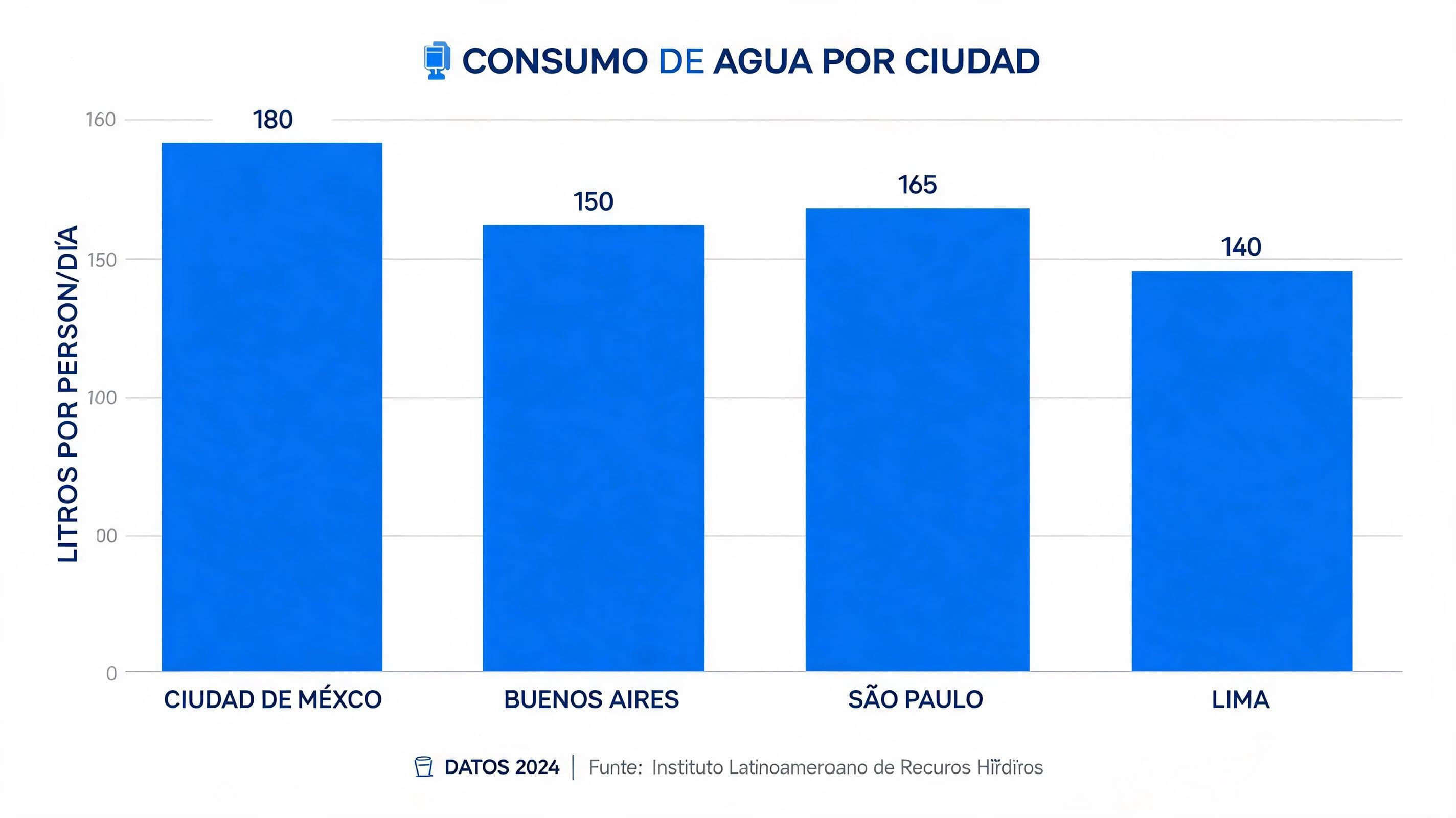
The localized-data-poster pattern tests whether an information hierarchy survives a language and direction change. Krea and fal.ai describe Seedream 5.0 Pro as supporting native text generation in 12 to 14 languages. Its multilingual layout coverage includes Arabic right-to-left text alongside Japanese and Spanish. Language belongs in the first layout instruction because direction and typographic density change where charts, labels, and margins can sit safely. Generate from verified copy, then reserve the remaining revision for the text layer rather than reworking the data design.
How to Turn One Generation Into a Production Workflow on Krea
Use the first generation to check relationships, then correct only the element that breaks the visual argument. Krea documents targeted post-generation corrections through region, point, lasso, and box selections with sketch guidance; anchor repositioning with exact color or material instructions; and reference-driven layered editing with up to 10 reference images, 20 transparent editable layers, and auto-inpaint. Those controls let you preserve an Antarctic layout while revising one chart, or move a UI subject without discarding its cards and navigation.
Dense visuals can still need several iterations, and infographic-specific benchmarks remain scarce. Targeted edits make the iterations diagnostic: a wrong label points to a text zone, while a missed interaction points to a spatial instruction. Start with the pattern whose relationships match the job, keep the first output with the right hierarchy, and revise the one region that does not.
FAQ
Frequently asked questions
Why do structured infographic prompts often fail (even when the style looks good)?
What makes Seedream 5.0 Pro on Krea a good fit for these complex examples?
How should I structure my prompt to get better reasoning and fewer text/label issues?
What’s the recommended workflow on Krea for this blog’s approach?
Are these examples meant for every type of design task?
Create complex infographics with Seedream 5.0 Pro
Generate structured infographics with built-in reasoning, then correct individual regions, labels, and text layers with Krea's edit tools.
Try Seedream 5.0 Pro