
“Anime” is not one look. It is a constellation of studio aesthetics — each with its own palette, line weight, light, and emotional register. Studio Ghibli is not Madhouse. Madhouse is not Kyoto Animation. Kyoto Animation is not CoMix Wave Films.
Krea 2 can hit any of them. This article walks through five of the studio looks creators ask for most, with examples generated for this piece, and the prompt-craft and reference techniques that pin a style down.
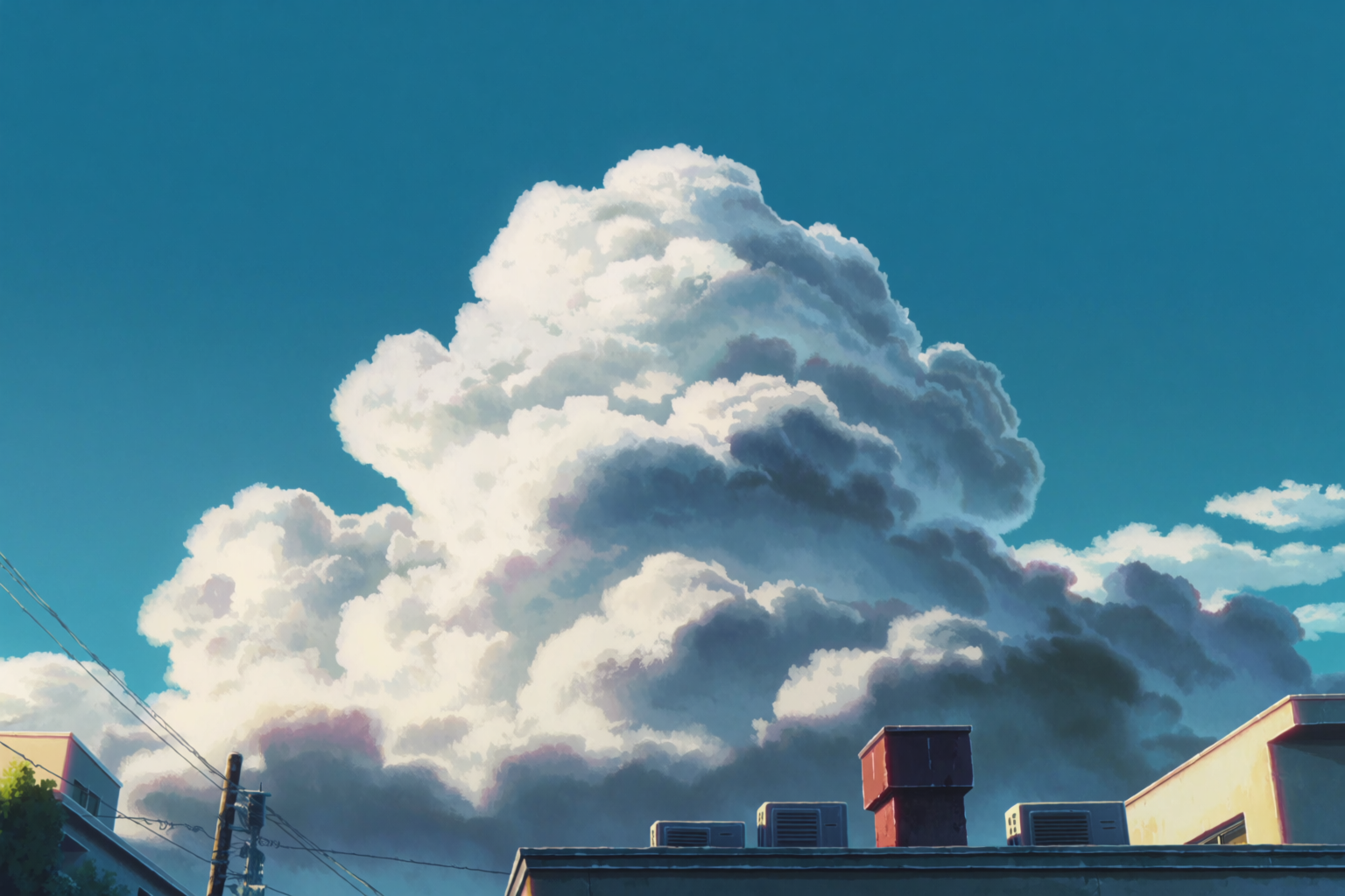
Ghibli: gentle palette, weathered world
Studio Ghibli’s aesthetic is hand-painted watercolor textures, soft midday light, weathered rural architecture, and lush green landscapes. The palette is restrained. The line work is gentle. The mood is calm.
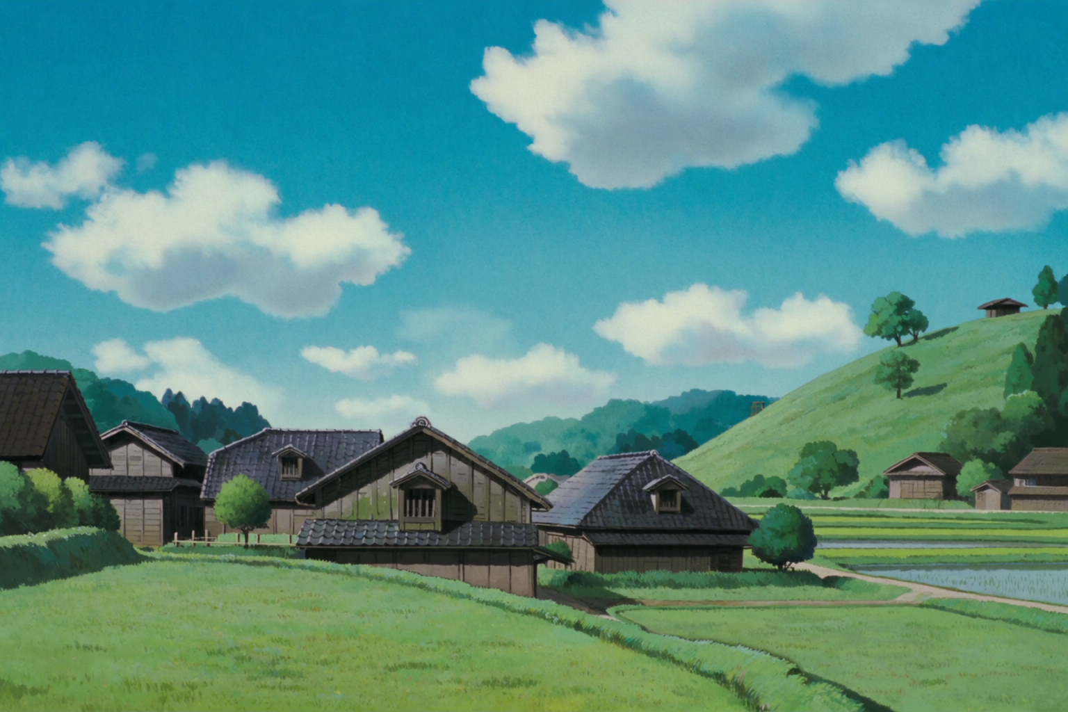
To pull Ghibli specifically, anchor the prompt in the medium — “anime film background painting in the aesthetic of Studio Ghibli” — then name the subject, then the time of day and weather. Avoid saturated color words; Ghibli’s strength is restraint.
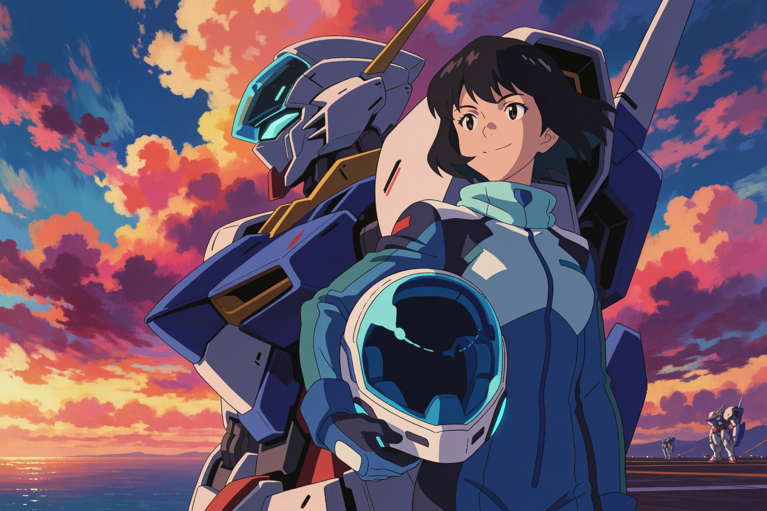
Shinkai (CoMix Wave): the hyper-saturated sky
Makoto Shinkai’s aesthetic at CoMix Wave Films is the opposite of Ghibli’s restraint — hyper-saturated skies, lens-flare suns, neon urban evenings, glowing telephone wires. The light is the subject.
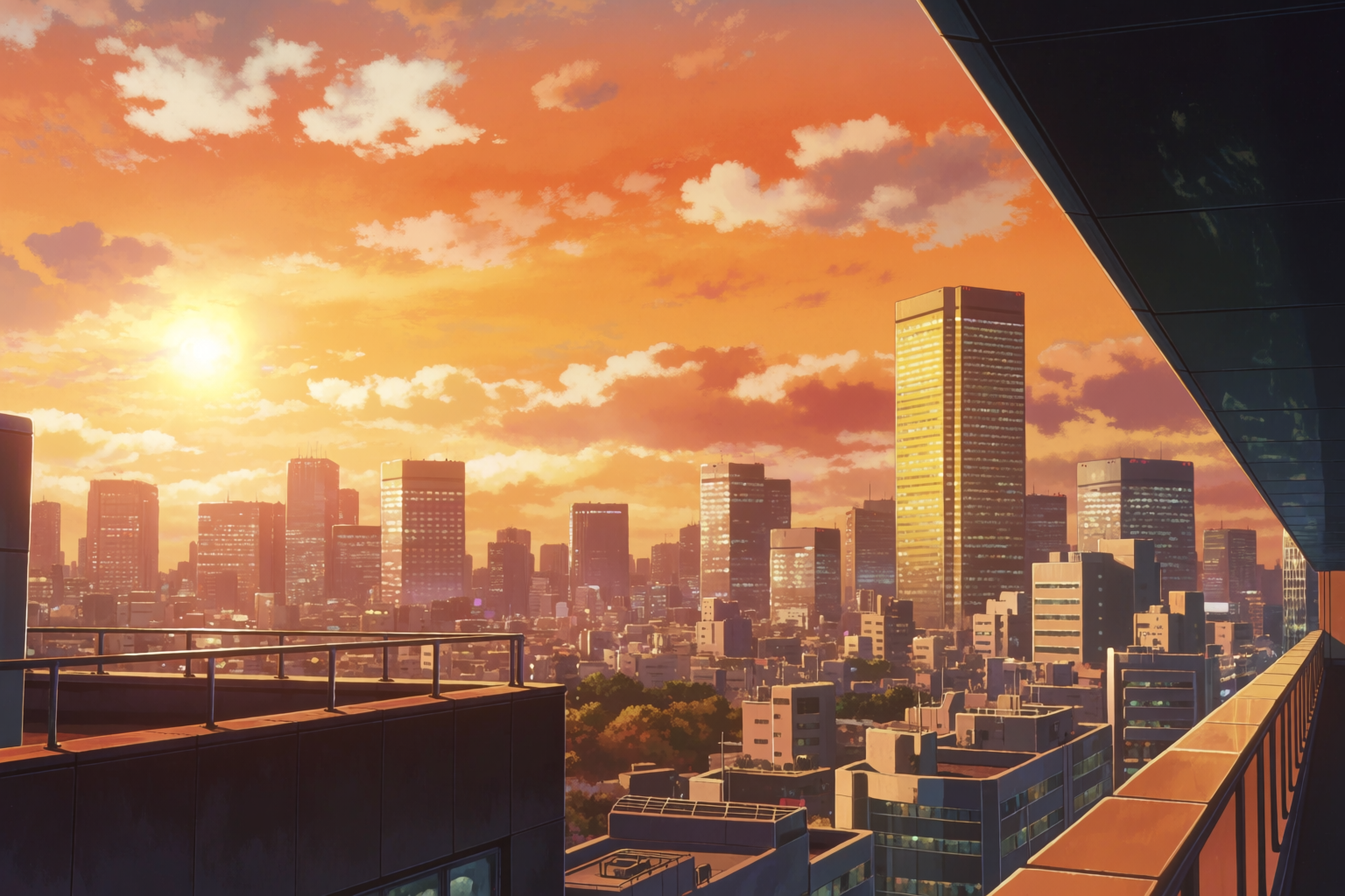
Naming Shinkai pulls strongly in the model. Pair it with explicit color direction (“hyper-saturated orange and magenta sky”) and the model commits to the look. Adding a real frame from a Shinkai film as a style reference locks it tighter still.
Kyoto Animation: warm interiors, careful detail
Kyoto Animation’s look is bright but melancholic — warm natural light through windows, careful interior clutter, gentle but precise line work. It is the aesthetic of slice-of-life adaptations and the most “lived-in” feel in mainstream anime.
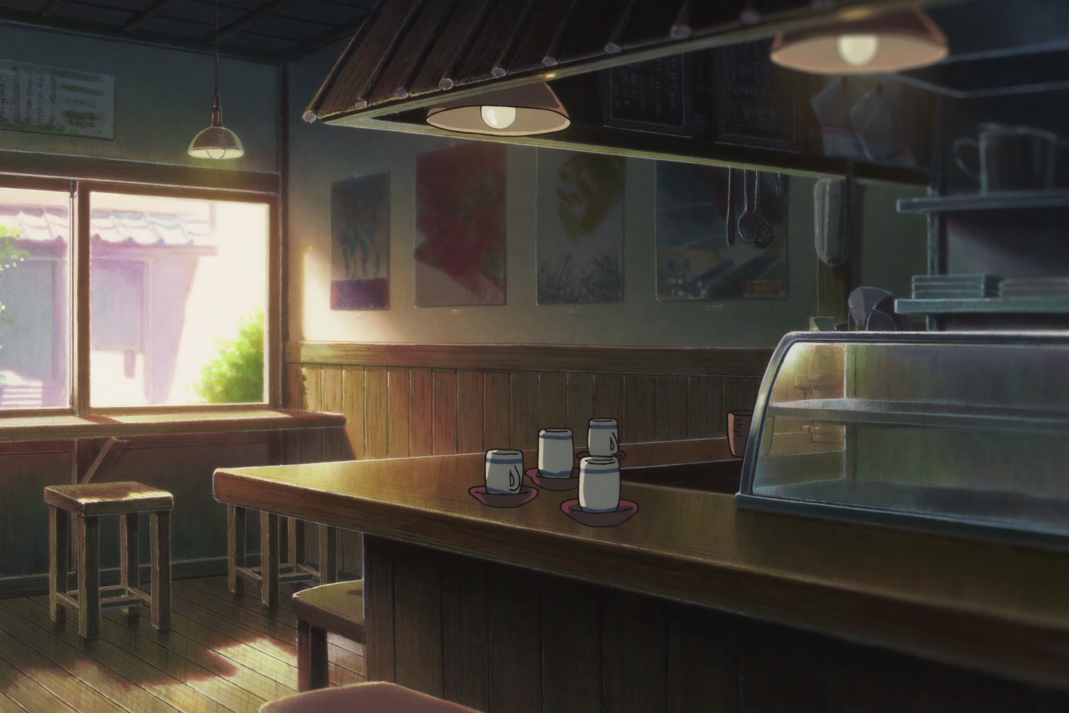
For KyoAni-style interiors, lean into the clutter. Name objects: pendant lights, framed art, a wooden counter, a single open book. The aesthetic is in the specific details, not the broad strokes.
Madhouse: urban noir cool
Madhouse and its peers carry a colder, harder anime tradition — urban realism, sharp shadows, blue and green palettes, rain on asphalt, the visual world of late-night noir and seinen thrillers.
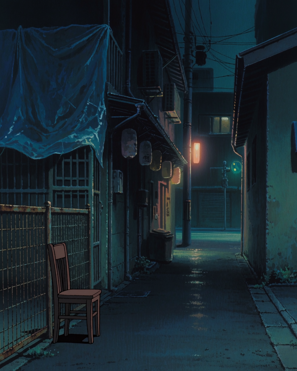
For this look, name the palette explicitly (“cold blue and green,” “sodium-yellow accents”) and ask for sharp cel-shading with hard shadows. Avoid pastel and warm color words.
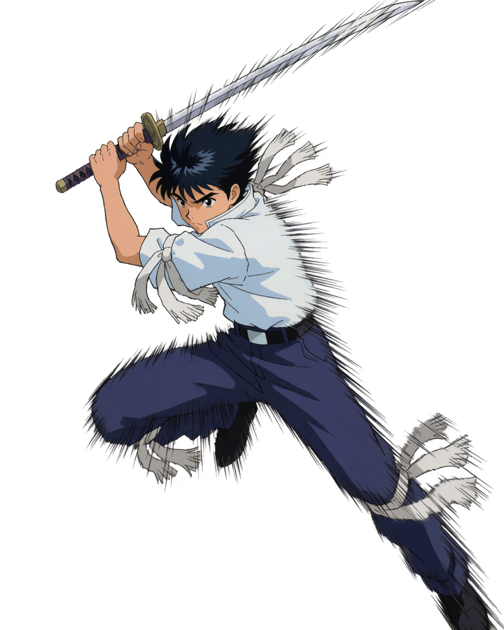
1990s Sunrise: hard cel mecha
The 1990s OVA and mecha tradition — Sunrise, classic Gainax — has a distinctive hard-edged cel-shading, bold line work, industrial palettes, and a sense of weight in every machine.
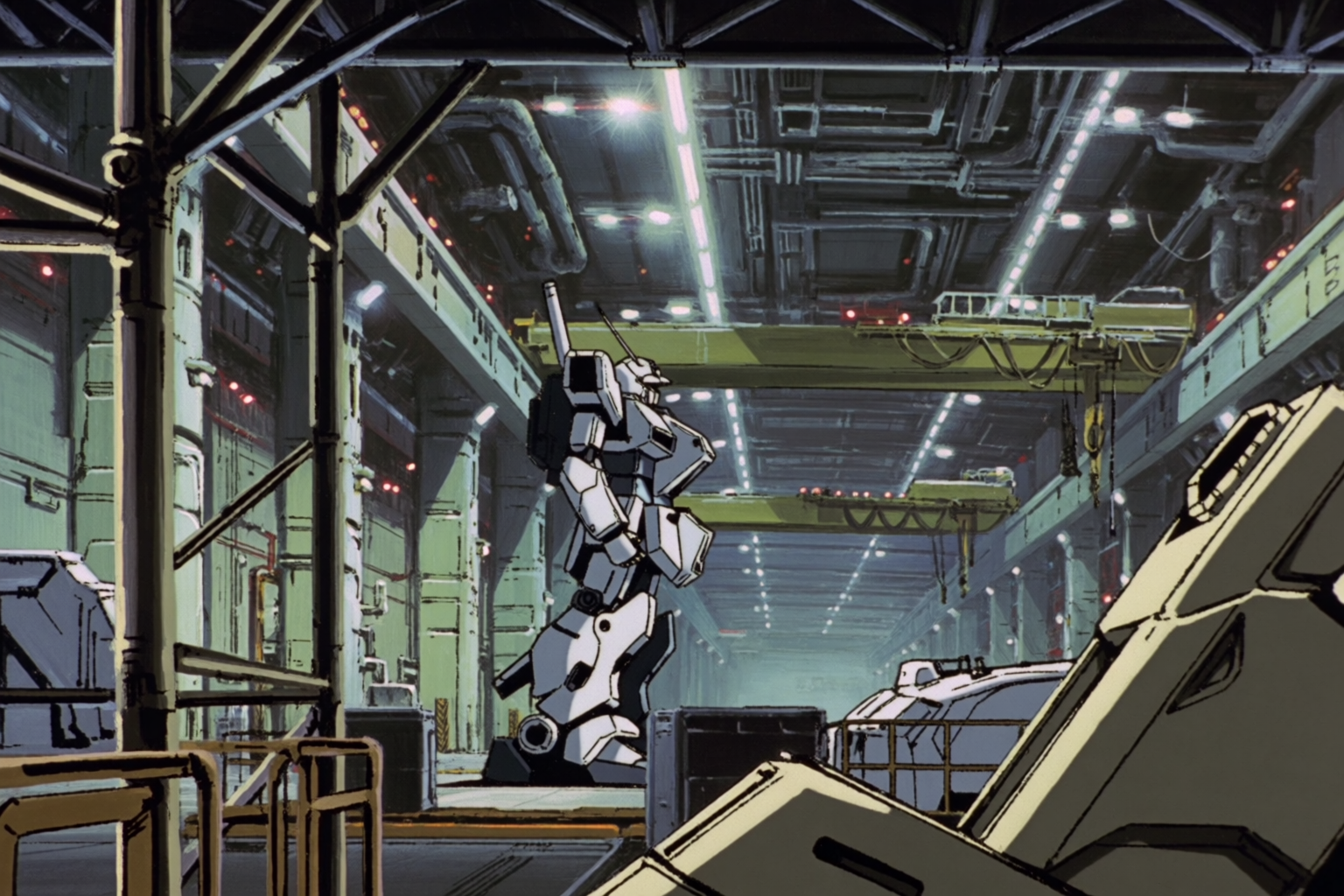
For this style, anchor it in the era — “1990s Sunrise mecha anime,” “classic OVA cel-shading,” “hand-painted.” Modern anime models otherwise drift toward modern digital-clean line work, which loses the period look.
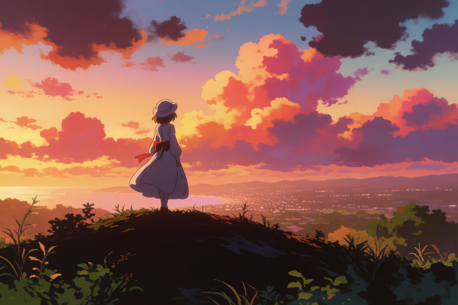
Shoujo and seinen: the registers beyond the headline studios
Two registers worth naming explicitly because they pull strong, consistent aesthetics:
Shoujo and seinen registers
Soft shoujo park path in spring, and a moody seinen Tokyo apartment rooftop at night.
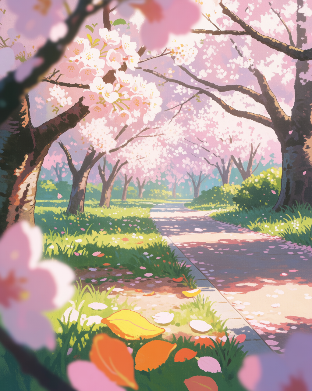
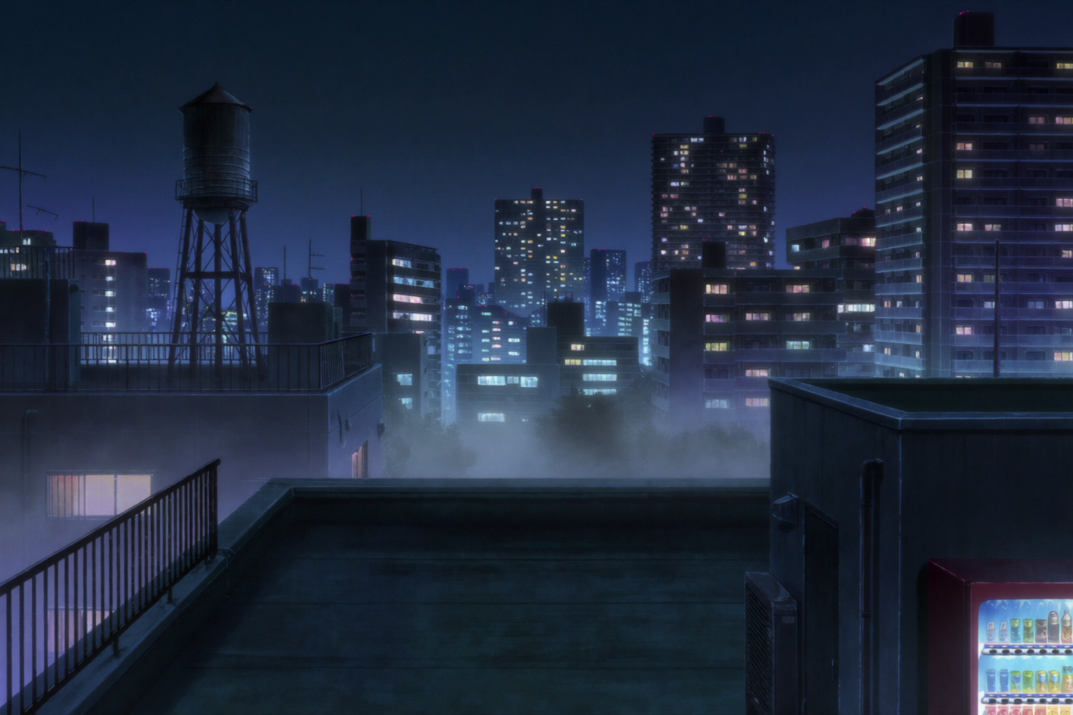
Shoujo pulls pastel palettes, delicate line work, dreamy soft light, cherry blossom motifs. Seinen pulls grounded urban realism, mature color mixes (warm yellow window light against cold blue night), restrained line work.
How to pin a specific studio
Three reliable techniques, in order of strength:
- Name the studio or director in the prompt. “Makoto Shinkai,” “Studio Ghibli,” “Kyoto Animation,” “1990s Sunrise mecha.” The model has strong, specific associations.
- Use a real frame as a style reference. Drop a background painting or key visual from the studio into the prompt as a style reference. Krea 2 extracts the palette, line weight, brush texture, and applies it.
- Build a mood board. For an entire body of work — say, every Shinkai film or every KyoAni interior — gather 20–40 frames into a mood board. The mood board captures the studio’s taste across many scenes, not just one frame.
For most projects, technique 1 alone gets you 70% there. Technique 2 closes most of the remaining gap. Technique 3 is for projects where you need consistency across dozens of generations.
A note on respect
Studio aesthetics are the result of decades of careful, beautiful work by specific teams of artists. Use these techniques to make your work in a style that owes a debt — not to copy or pass off existing art. The studio names anchor a visual language; the work is yours.
Try a studio aesthetic in Krea 2
Free to start. Style references and mood boards are included on every plan.
Open Krea 2